
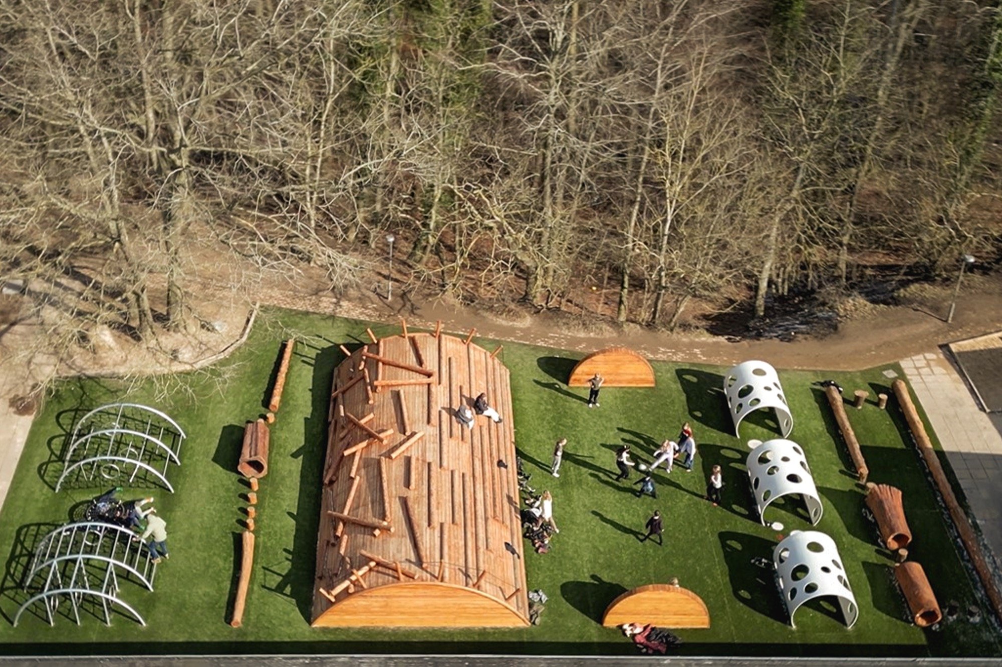
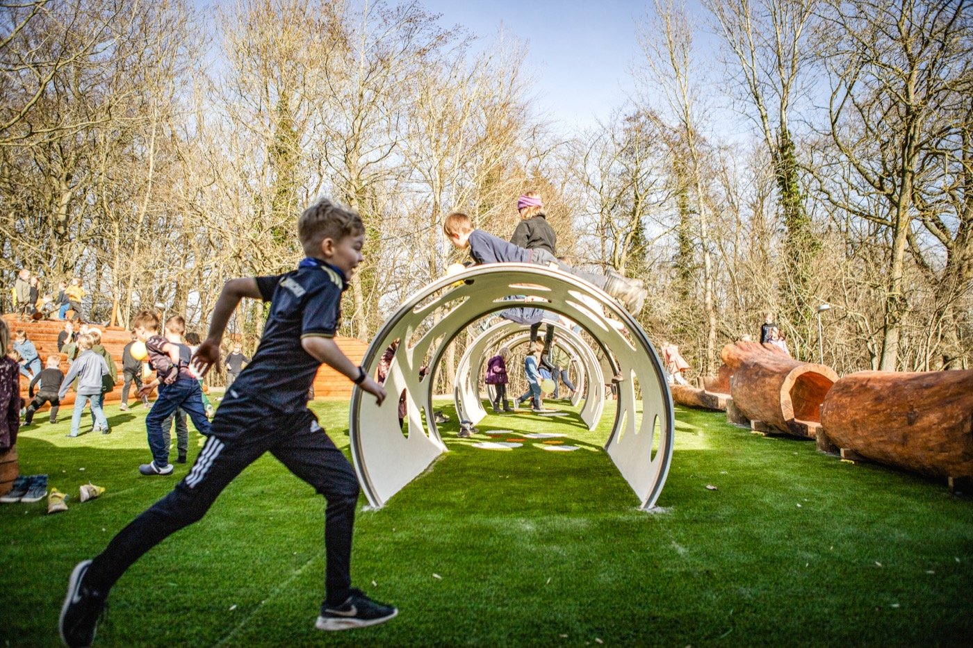
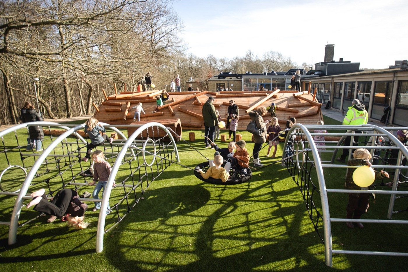
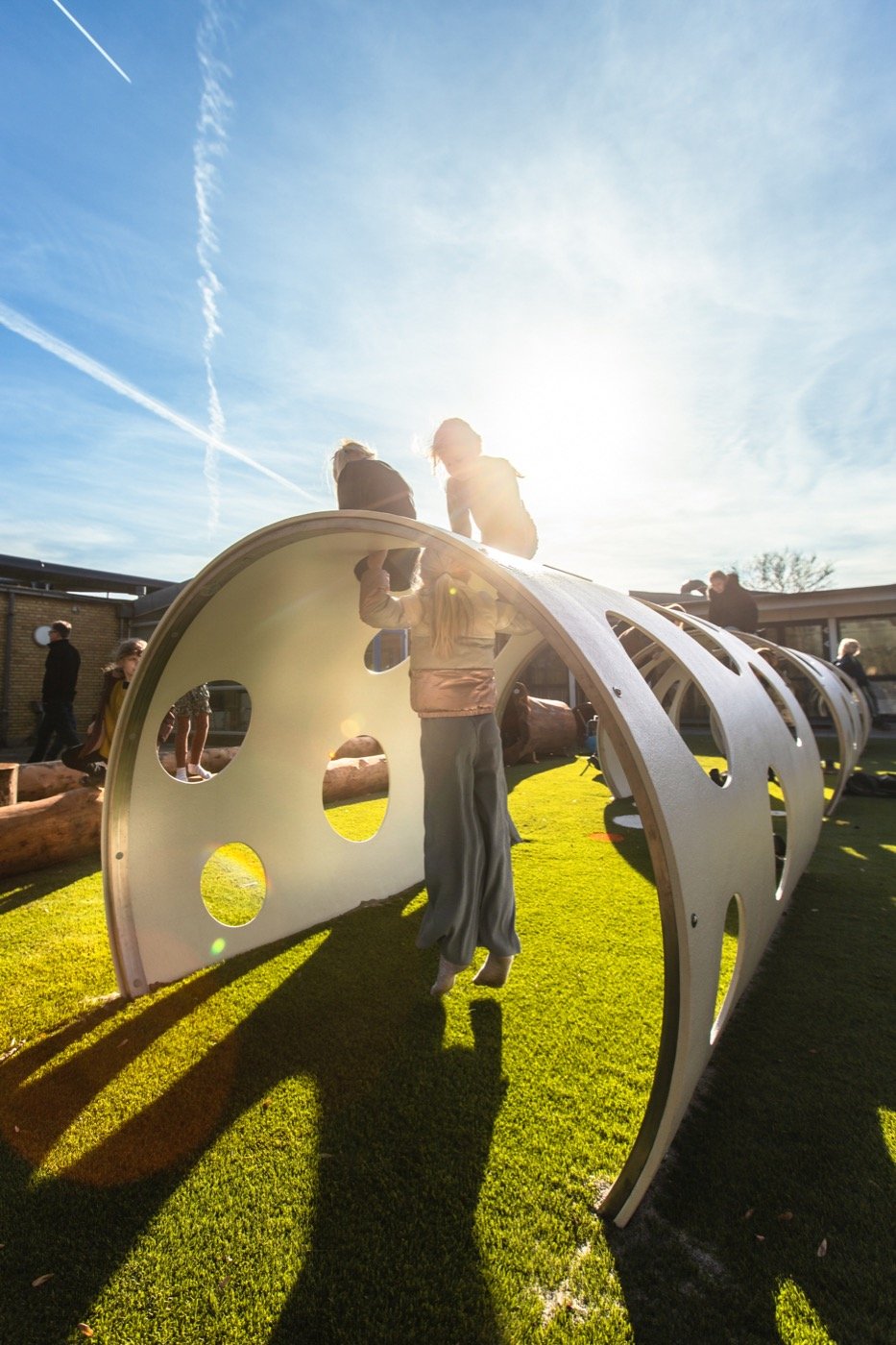
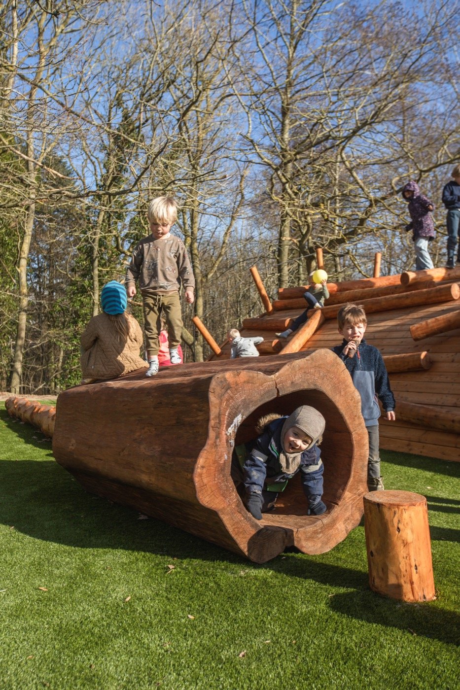
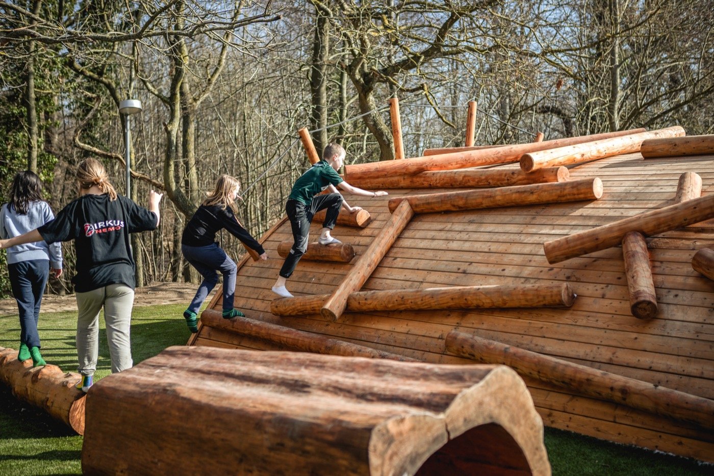
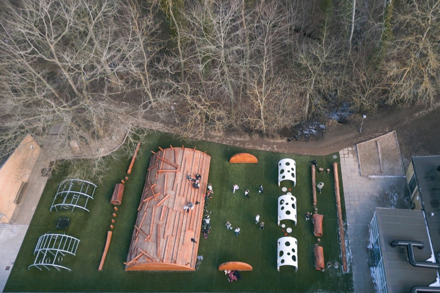
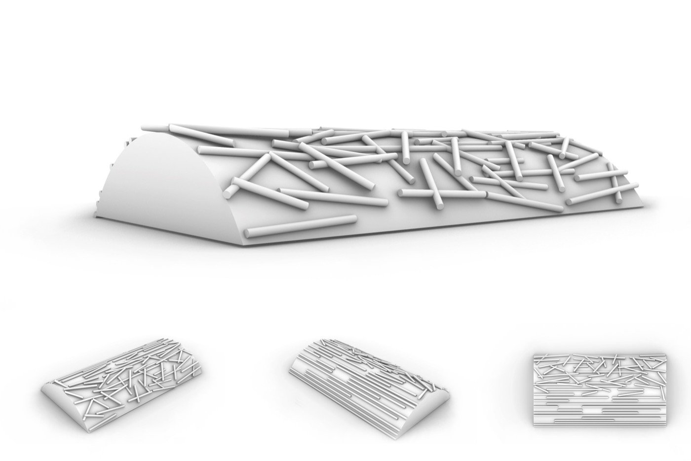
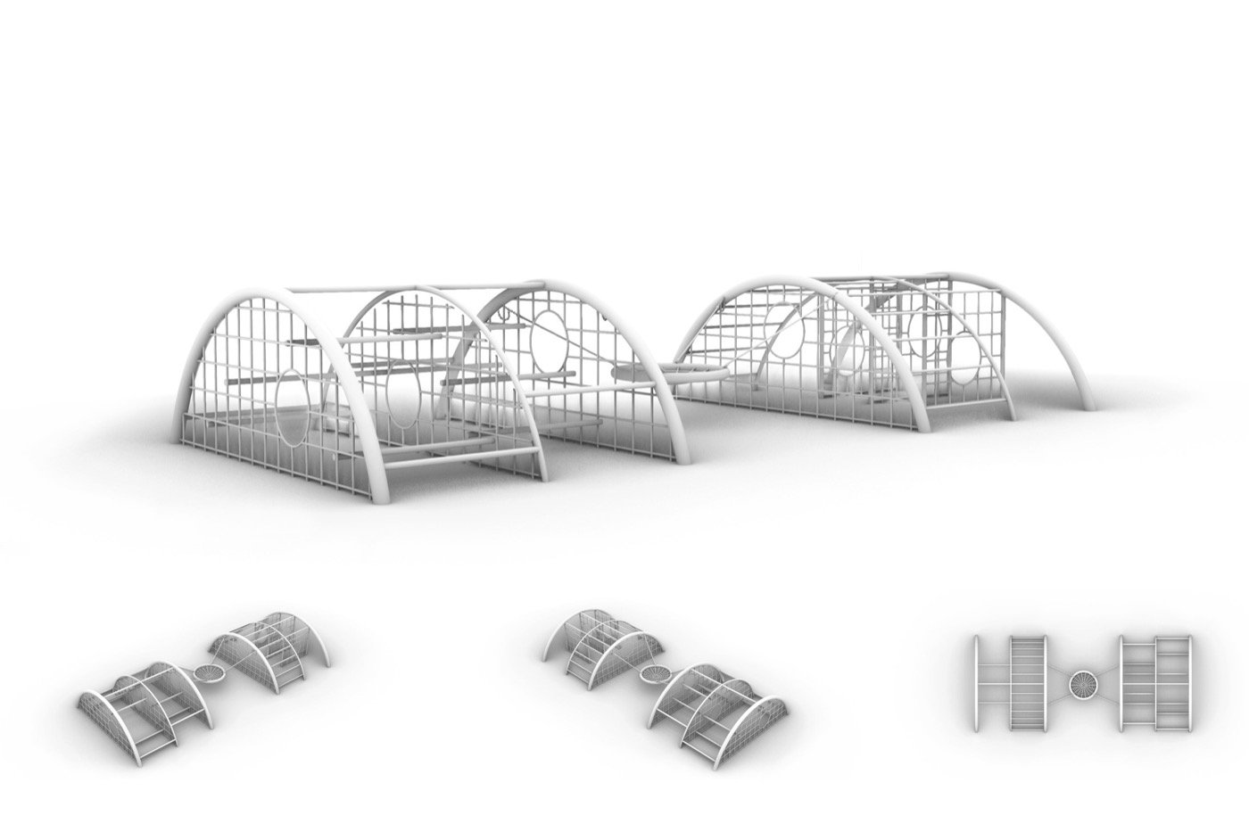
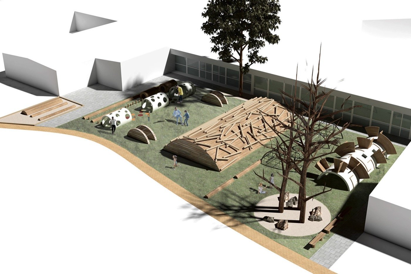
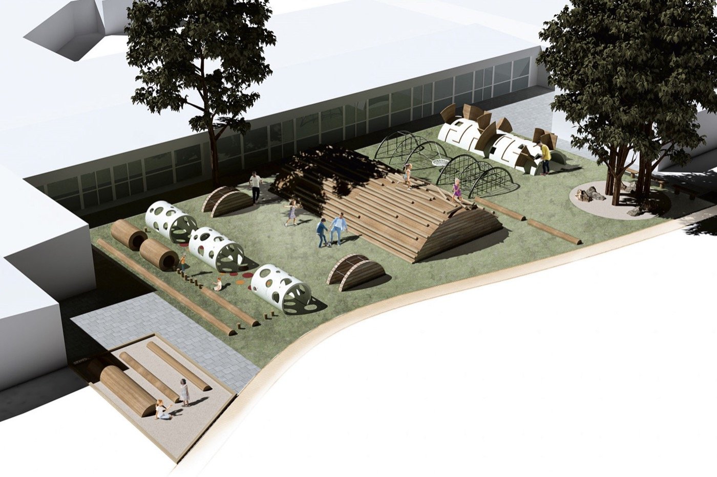
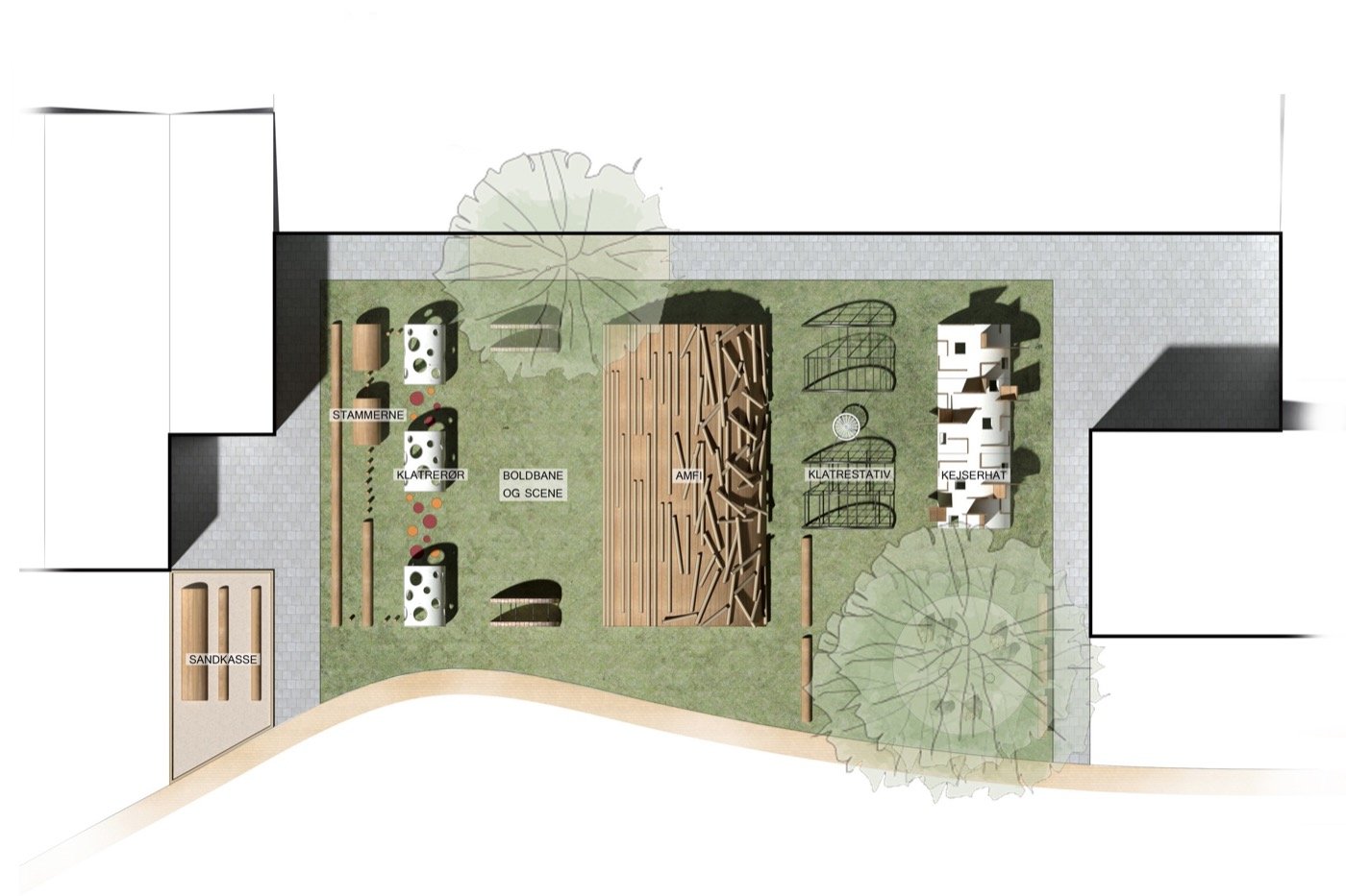
Tree Trunk Funk is a playground tailored for the pupils at Virupskolen, ranging from 1st to 3rd grade. Beautifully situated between the existing forest area and the classrooms, the playground serves as a bridge between the natural environment and the learning spaces. The design of the elements is customized to the area and draws inspiration from the nearby forest by resembling tree trunks arranged perpendicular to the building, thus preserving the view from the classrooms to the forest.


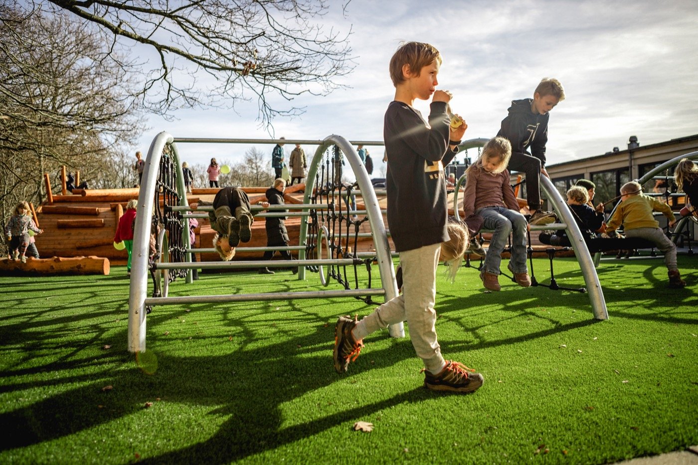
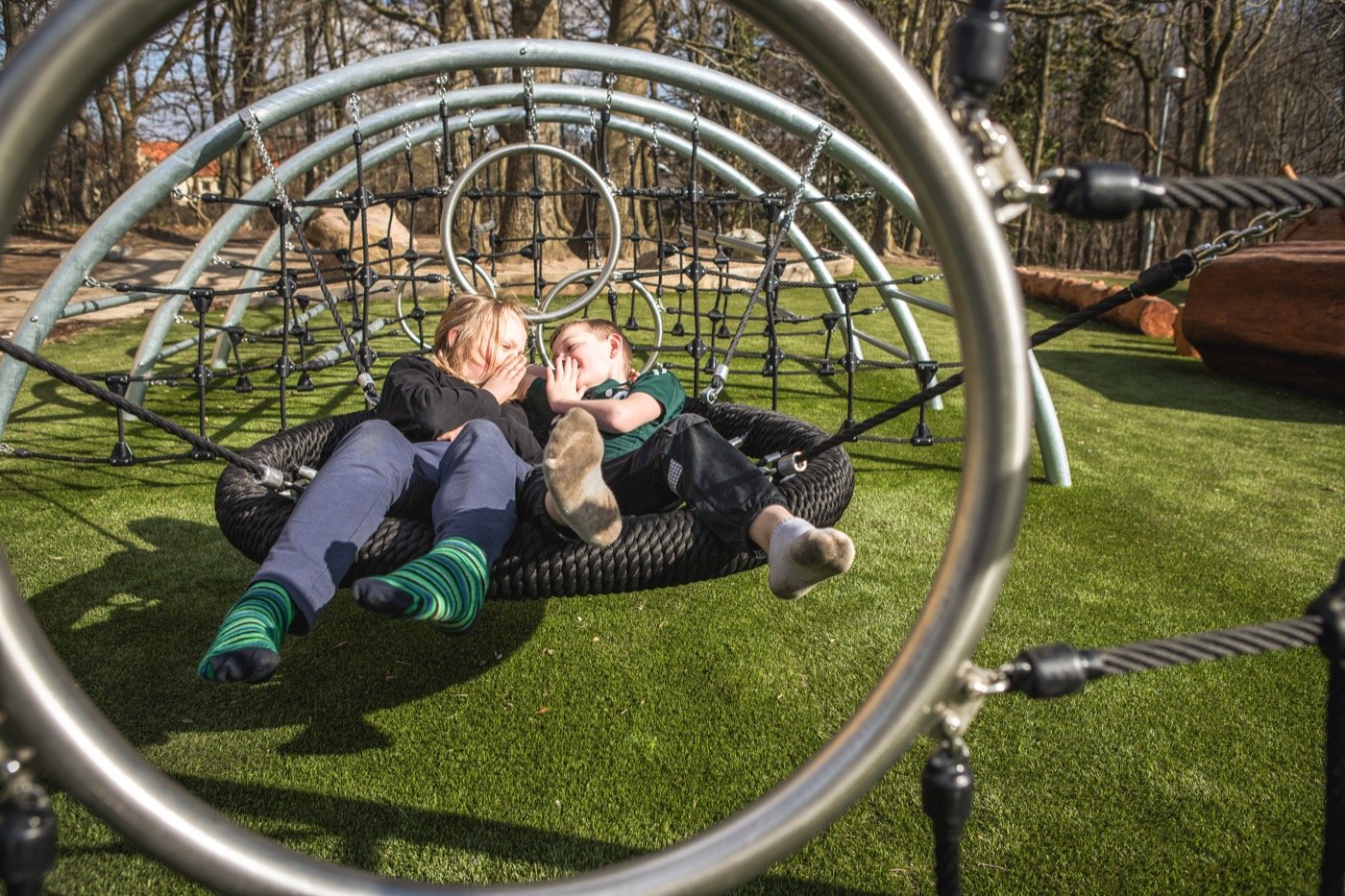
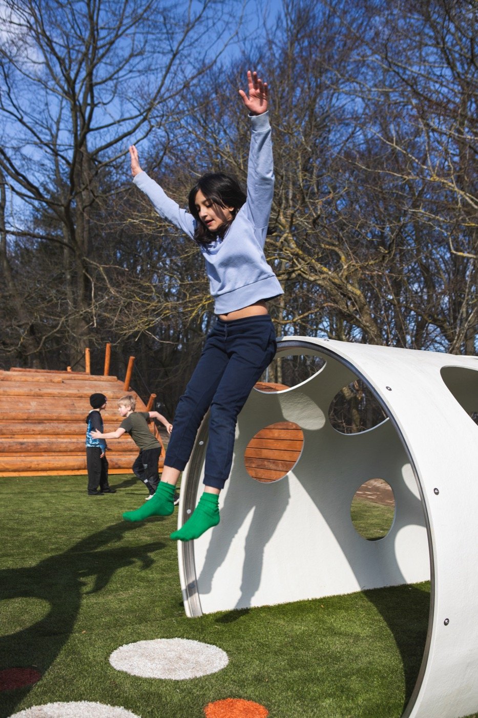
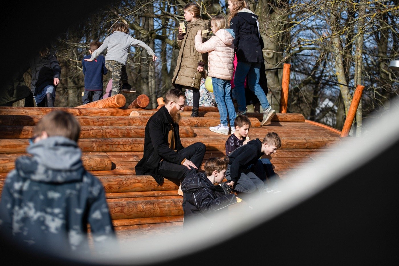
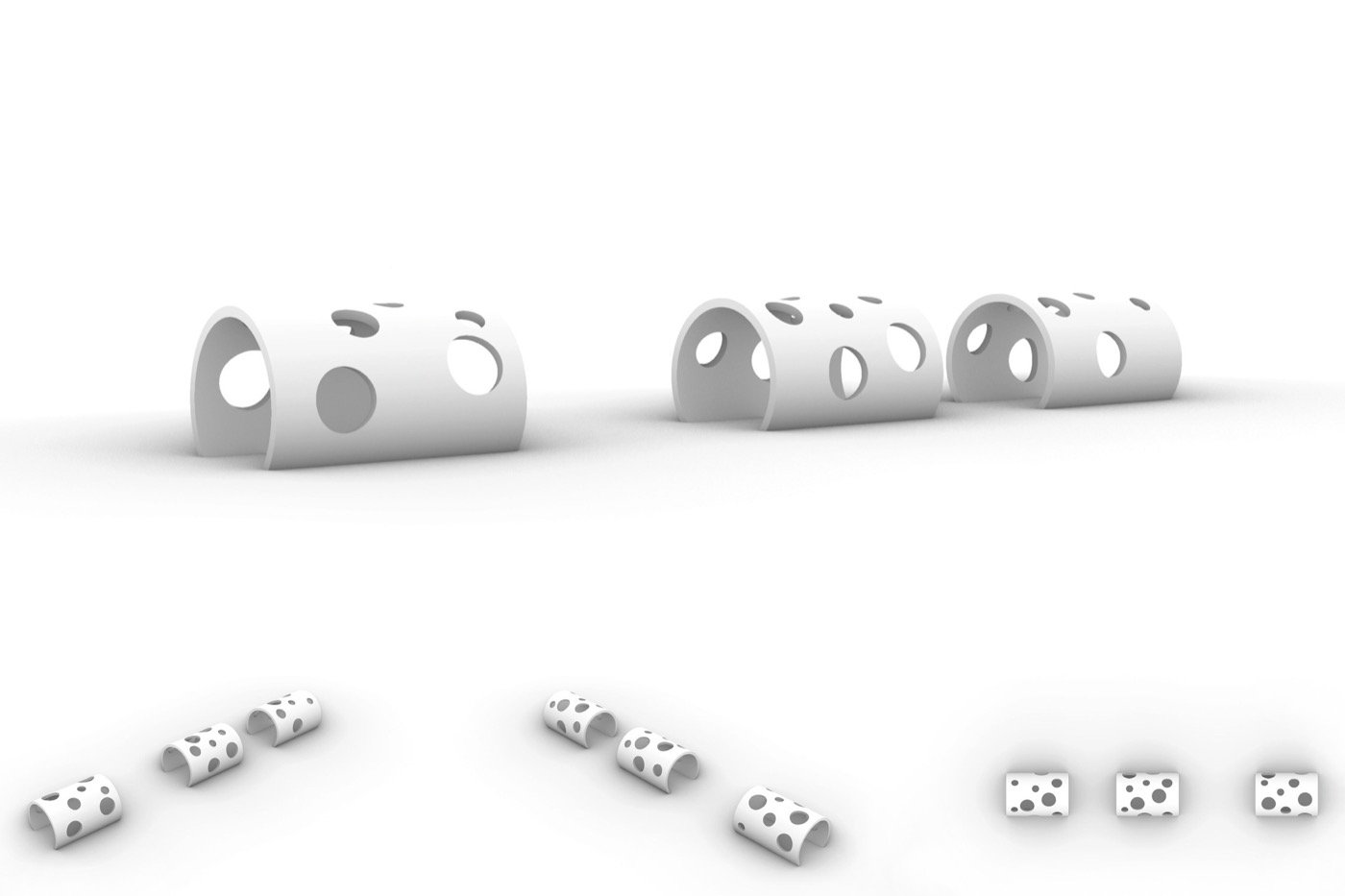
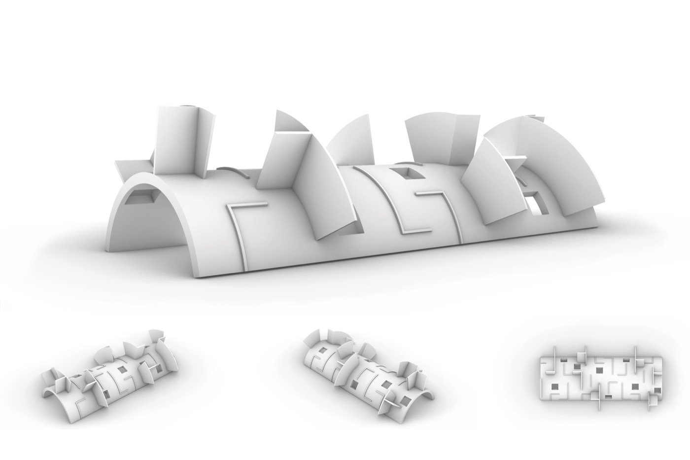
The design encompasses a range of new structures, including climbing frames, balance elements, areas for ball games, and an amphitheater that can be used for both play and teaching. The open and thoughtfully planned spaces combine play opportunities with areas for relaxation, accommodating diverse uses and providing flexibility to adapt to different activities. The multifunctional design offers the children plenty of opportunities for physical activity as well as for spending calmer time together.
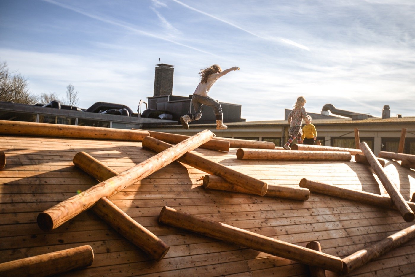
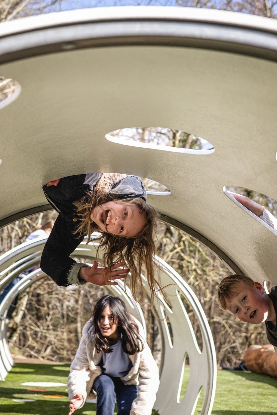
Key to the success of this project was involving the students as co-designers through workshops, allowing them to express their desires for a versatile space. All play equipment needed to offer opportunities for both peaceful stay and more energetic play, catering to a wide range of activity preferences. The aim was to ensure the play experience remains engaging and dynamic, with the playground seamlessly transitioning between various uses and paces, and striking a balance between playful activities and valuable learning experiences.
Moreover, the installation of a new artificial grass surface helps keep the area green and effectively blurs the boundaries between the outdoors and indoors, enabling students to transition between the two zones seamlessly. The kids love to explore this playfield barefoot or in socks, which provides a nice sense of grounding and tactility. It eliminates concerns about dirty shoes and muddy surroundings, which had posed a significant challenge for both students and staff in the past. This transformation ensures a cleaner, more inviting environment for everyone to enjoy and explore.
Landscape architecture: MBYland
Project location: Virupvej 75, 8530 Hjortshøj, Denmark
me+ architect:“面纱”位于胡志明市北部入口,坐落在最具吸引力的市内林荫大道上,是一件在大都市背景中脱颖而出的白色杰作,同时它也是一个多功能的国际会议中心。
:”The Veil” is located in Ho Chi Minh City’s northern entryway, on the most attractive inner-city boulevard, and is designed to be a white masterpiece that stands out in the metropolitan context. It is also a multi-purpose international conference center.
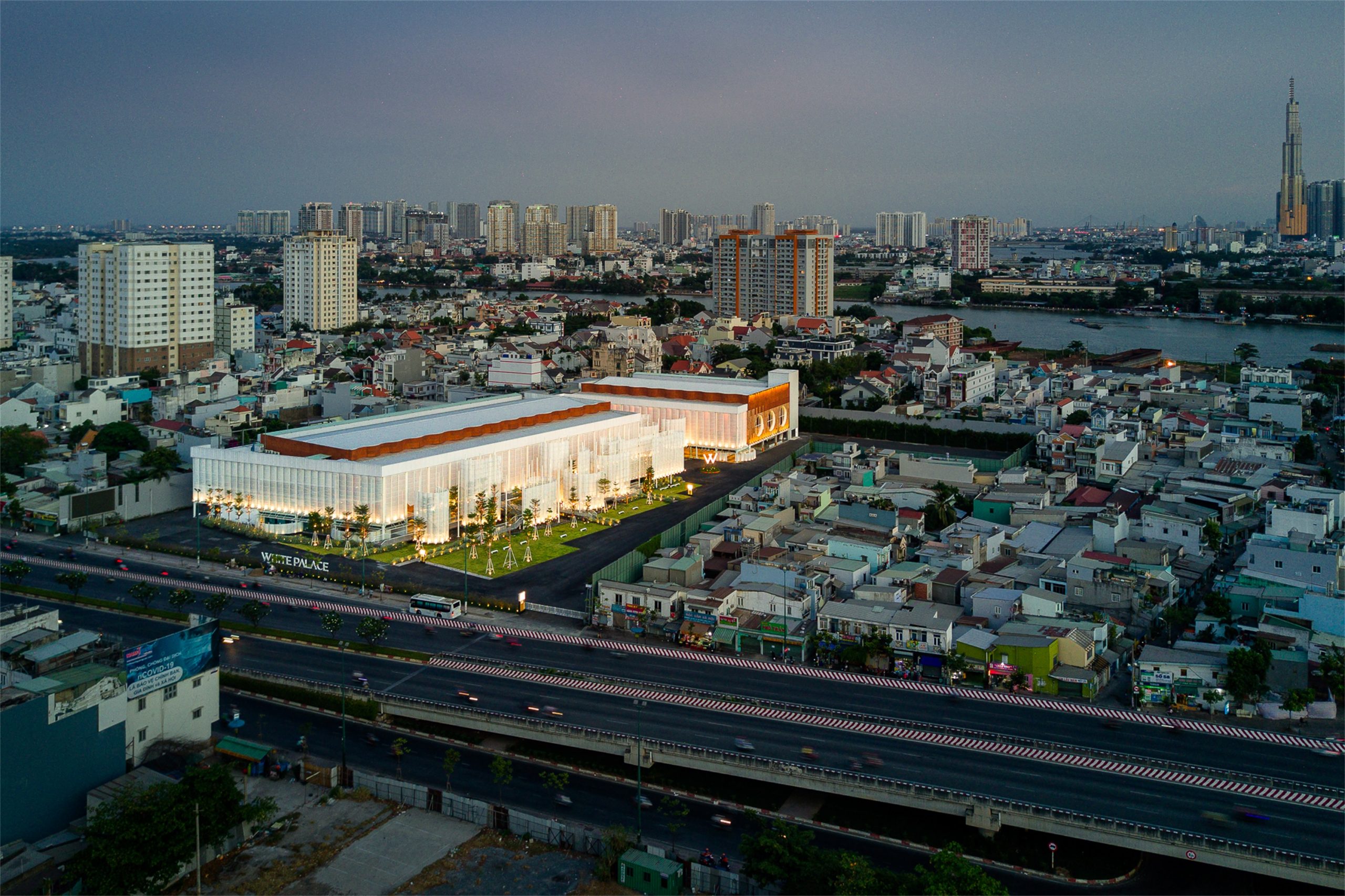
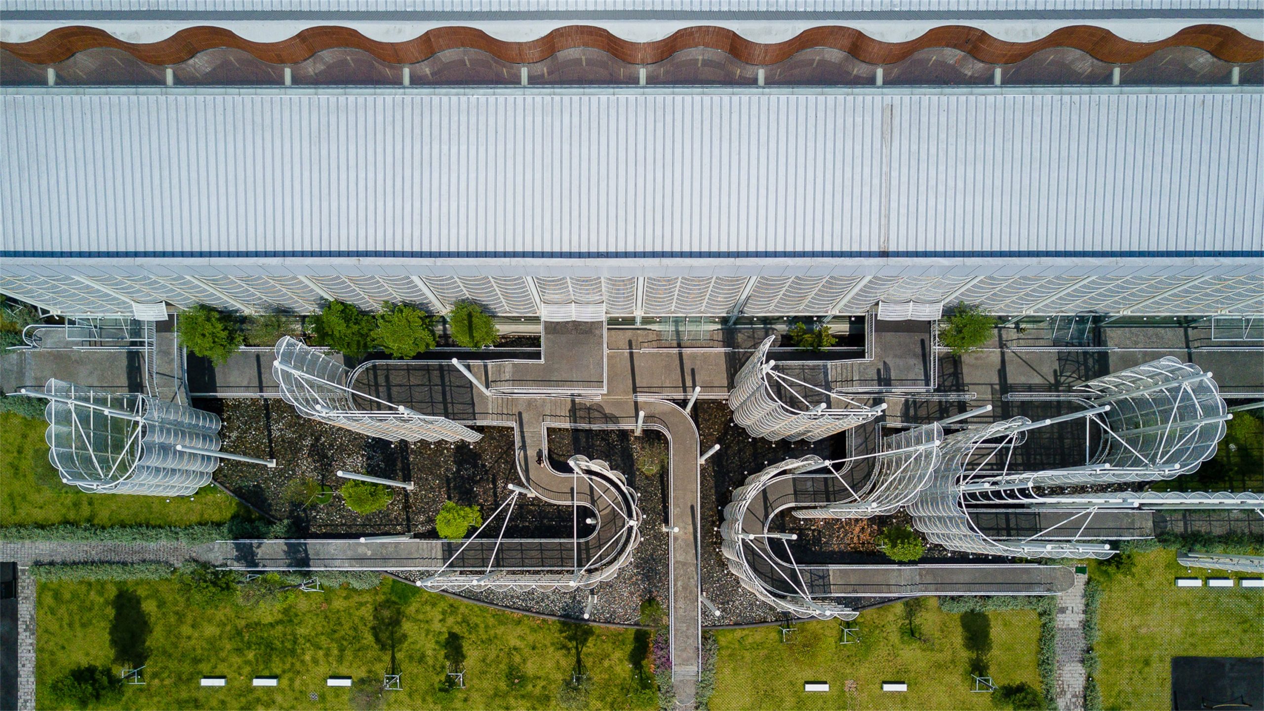
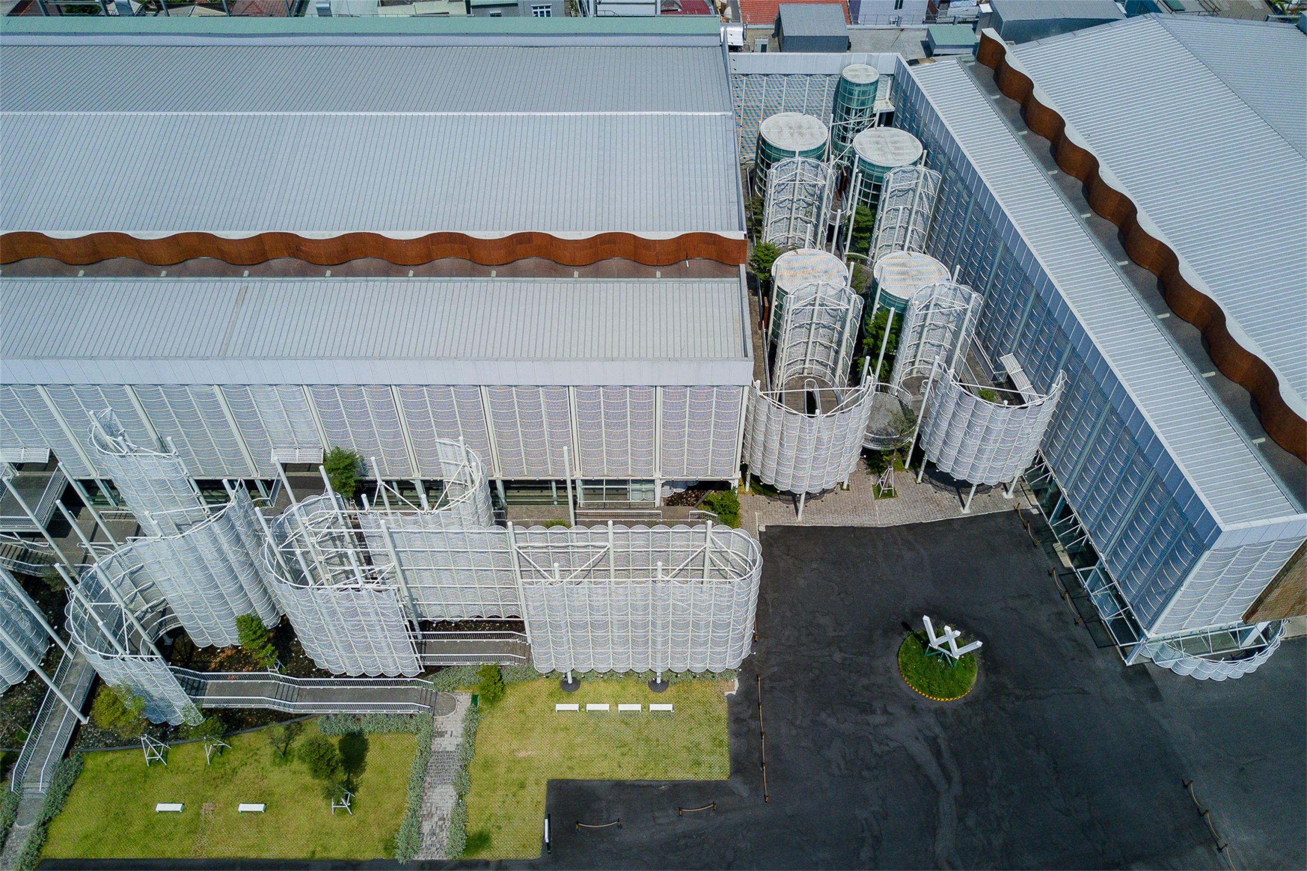
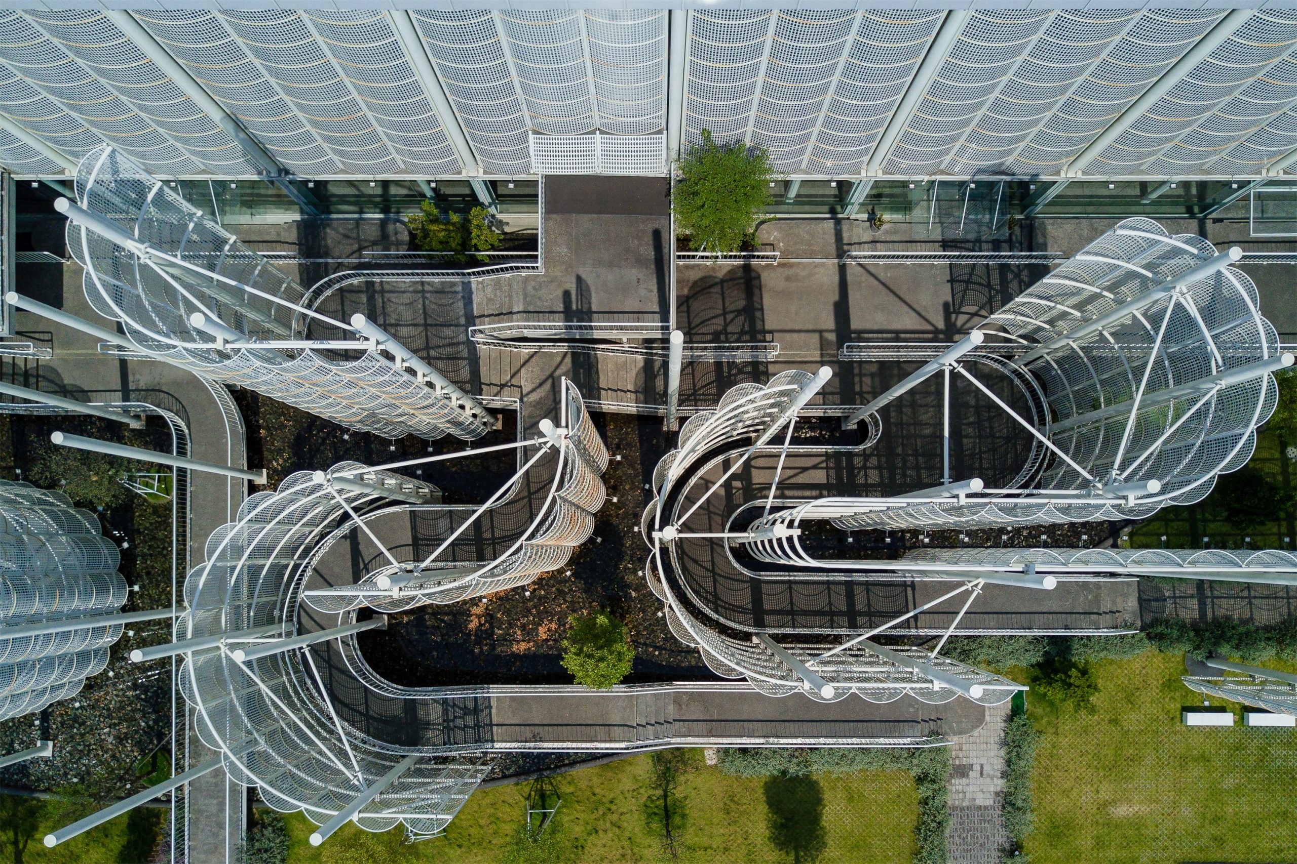
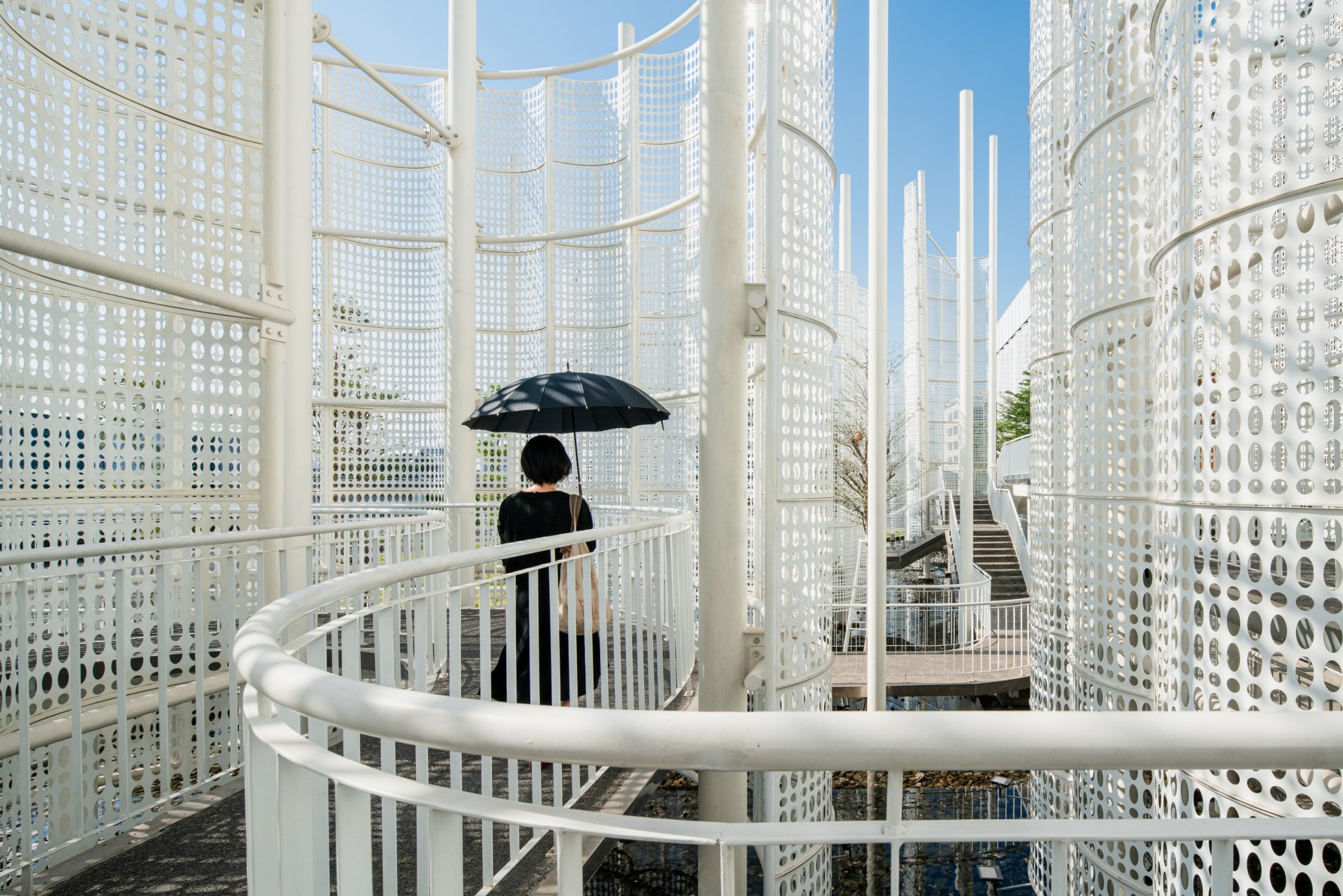
该设计的灵感来自新娘婚礼上的头纱。从外观上看,“面纱”由多段弓形的、激发情感共鸣的层次组成,它们围绕着道路设置,赋予了整体结构别样的质感。从内部看,它不仅创造了一个可爱的空间,还最大限度地扩大了接待区面积,使人可以更频繁地参与到会前活动的有趣空间中,避免因此类充满仪式感和将举办重要活动的建筑氛围让人却步。
The concept was inspired by the bride’s veil in her wedding. From the outside, The Veil has numerous segmental, emotive layers that embrace the pathways and provide textures for the structure. From there, it not only creates a lovely space inside, but it also maximizes the reception area. As a result, people engage more frequently in the pre-event space. Because people nowadays mainly worry about the rituals and key events in similar buildings.
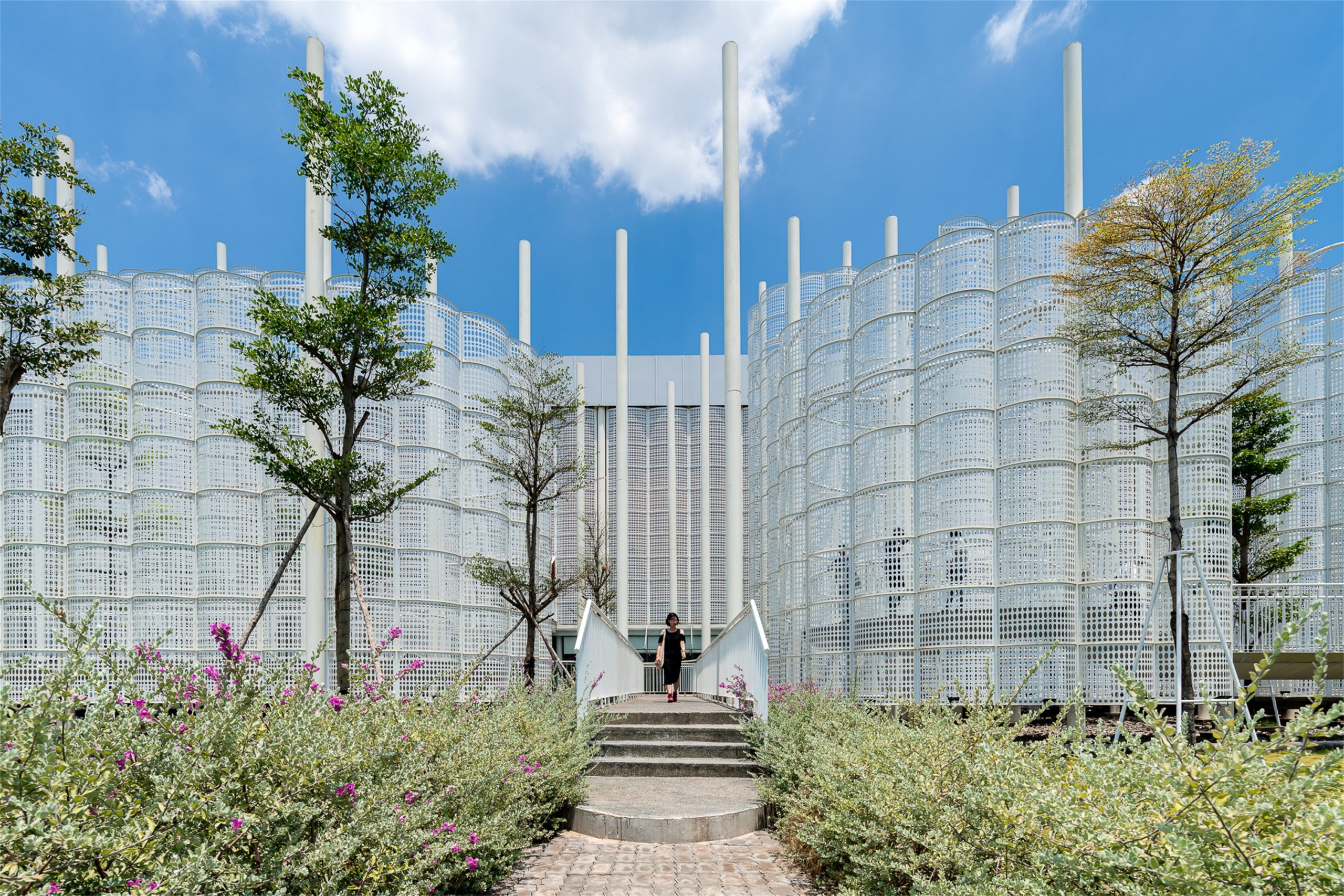
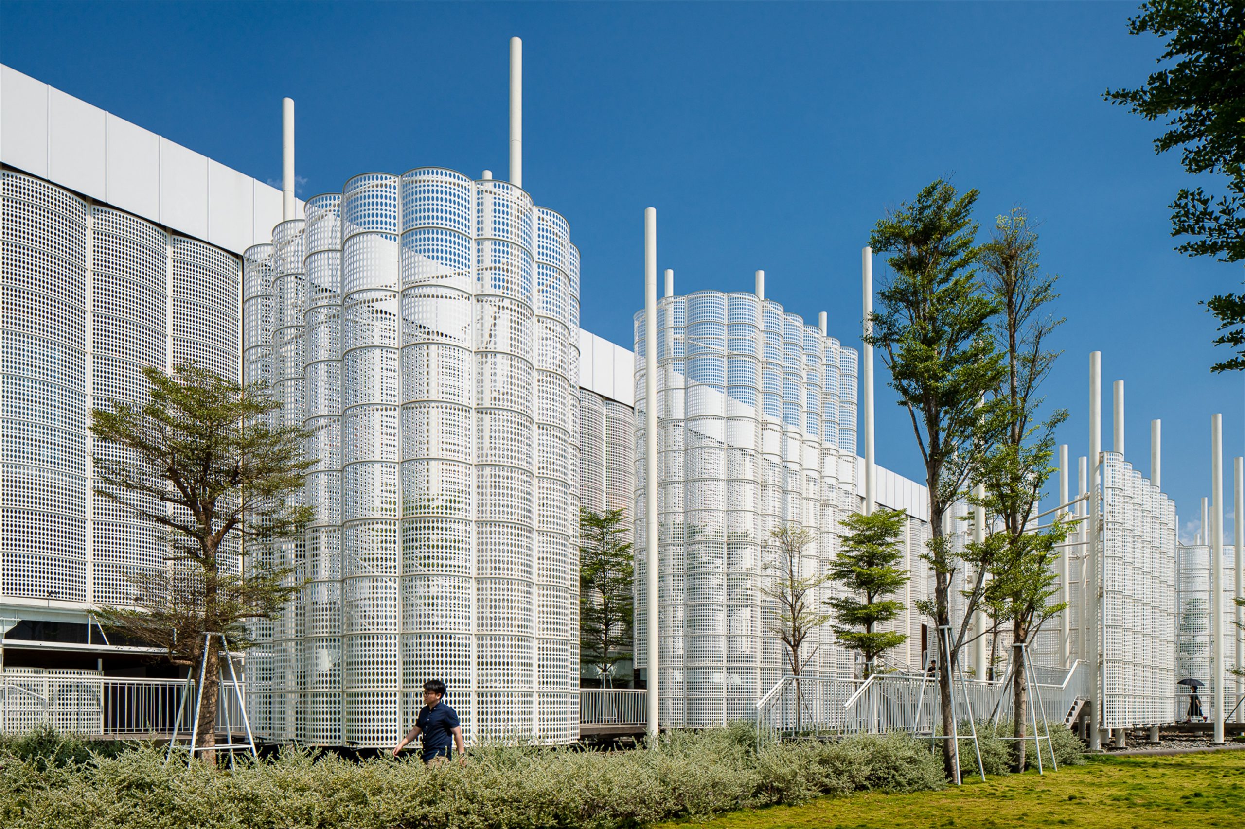
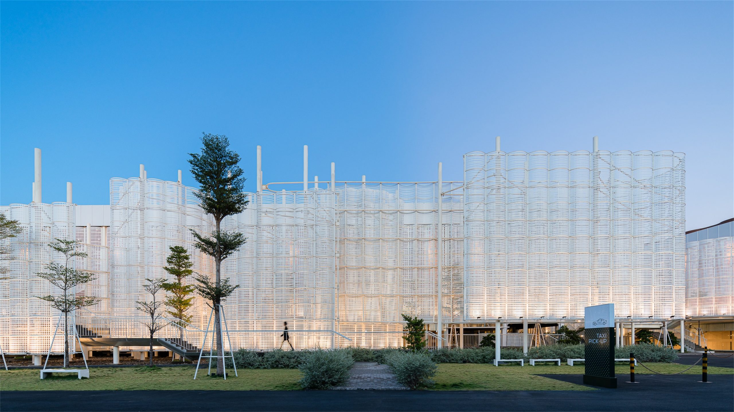

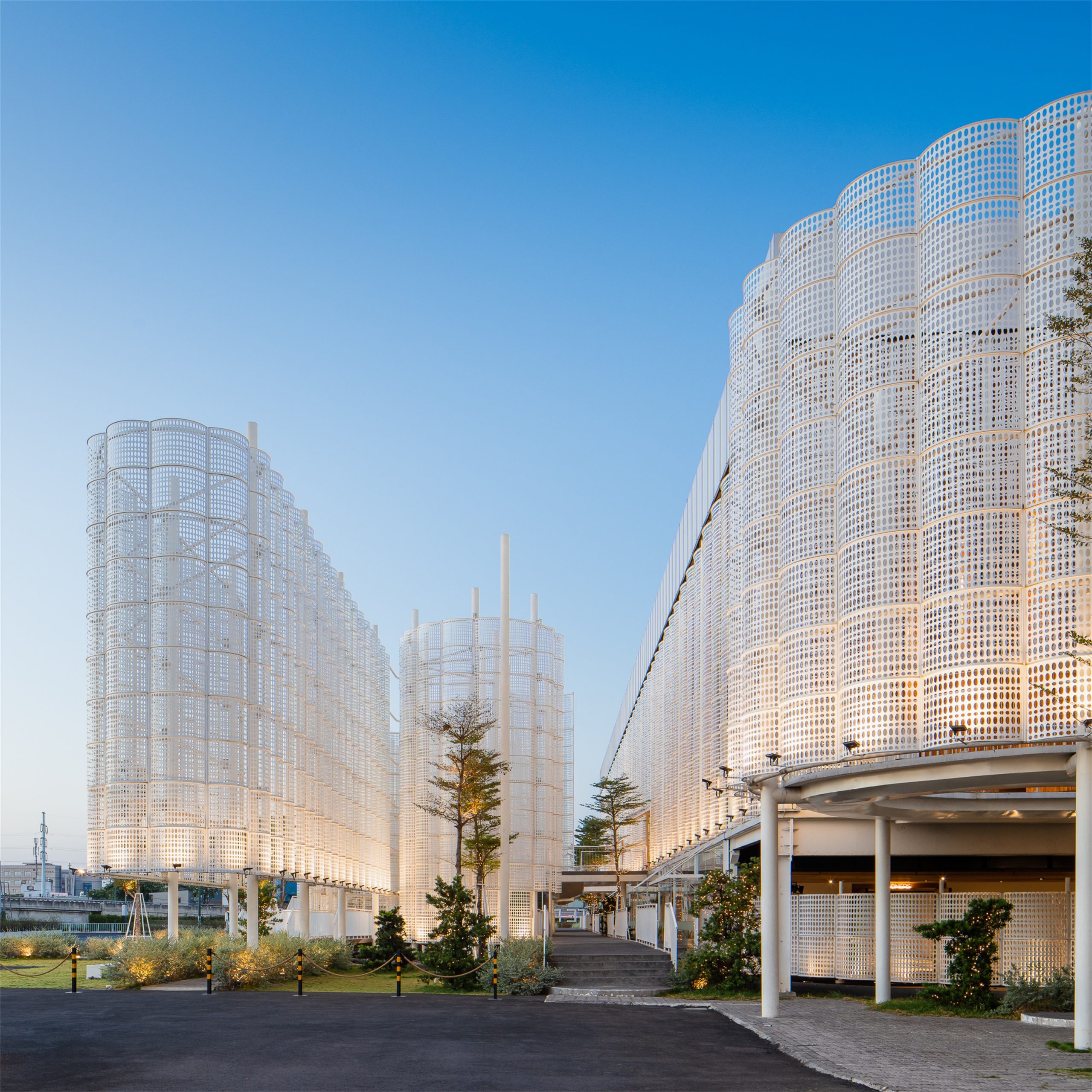
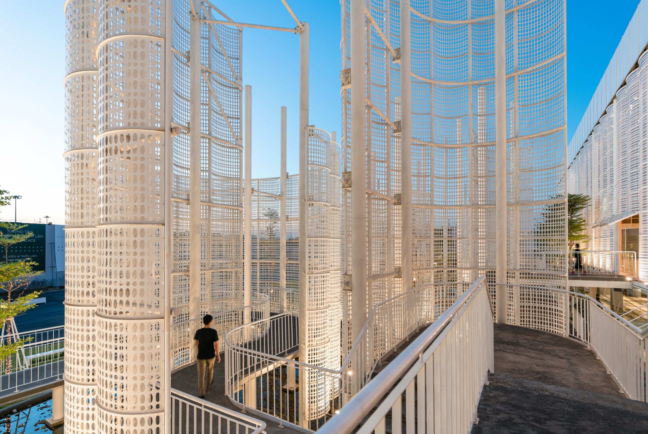
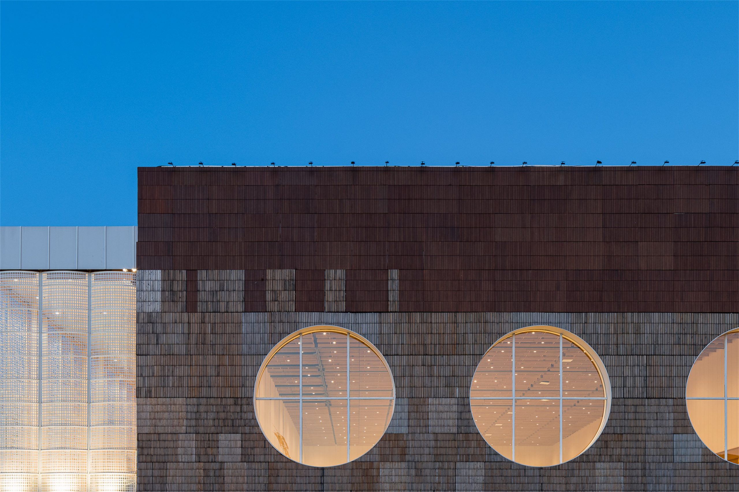
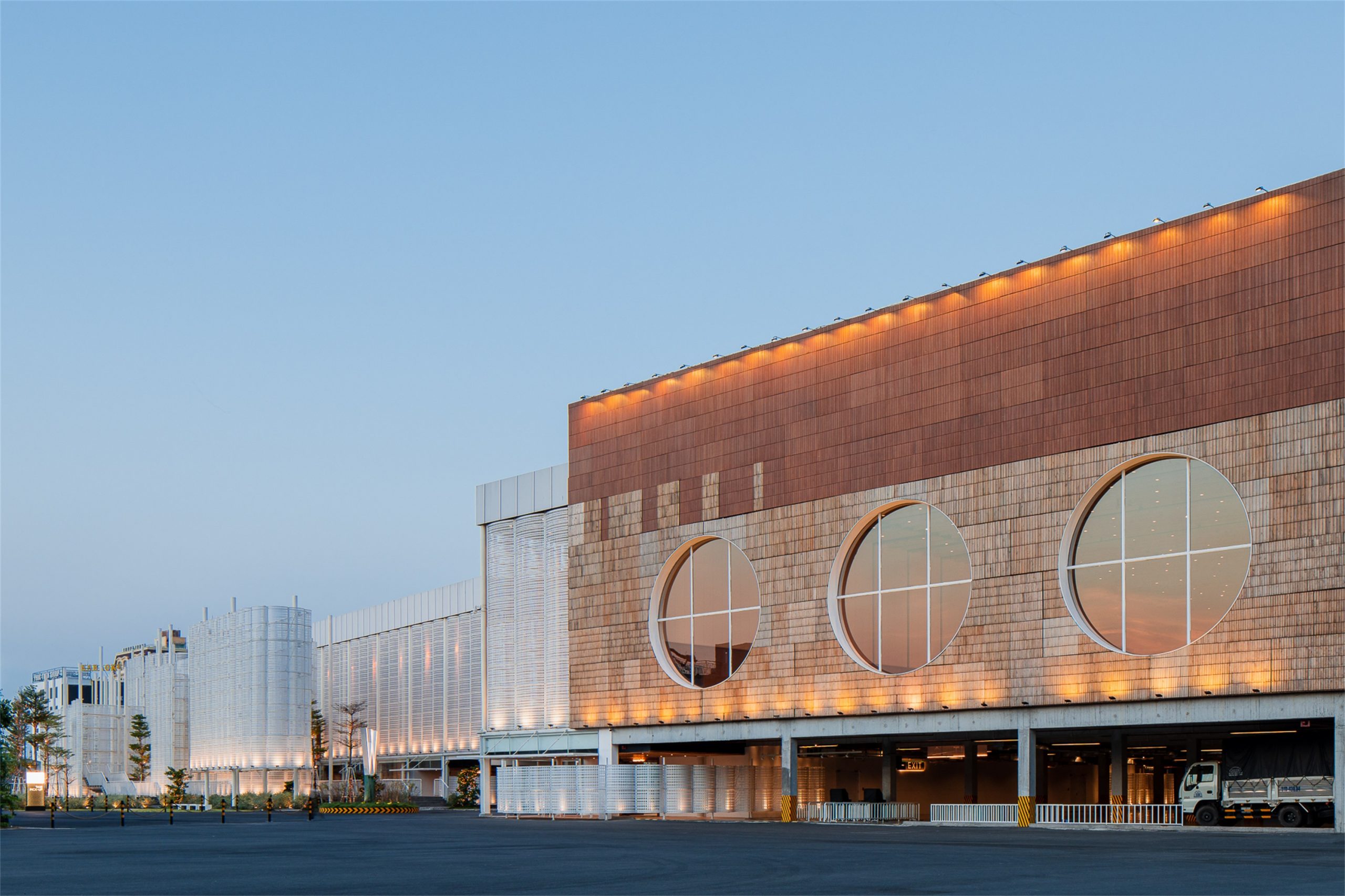
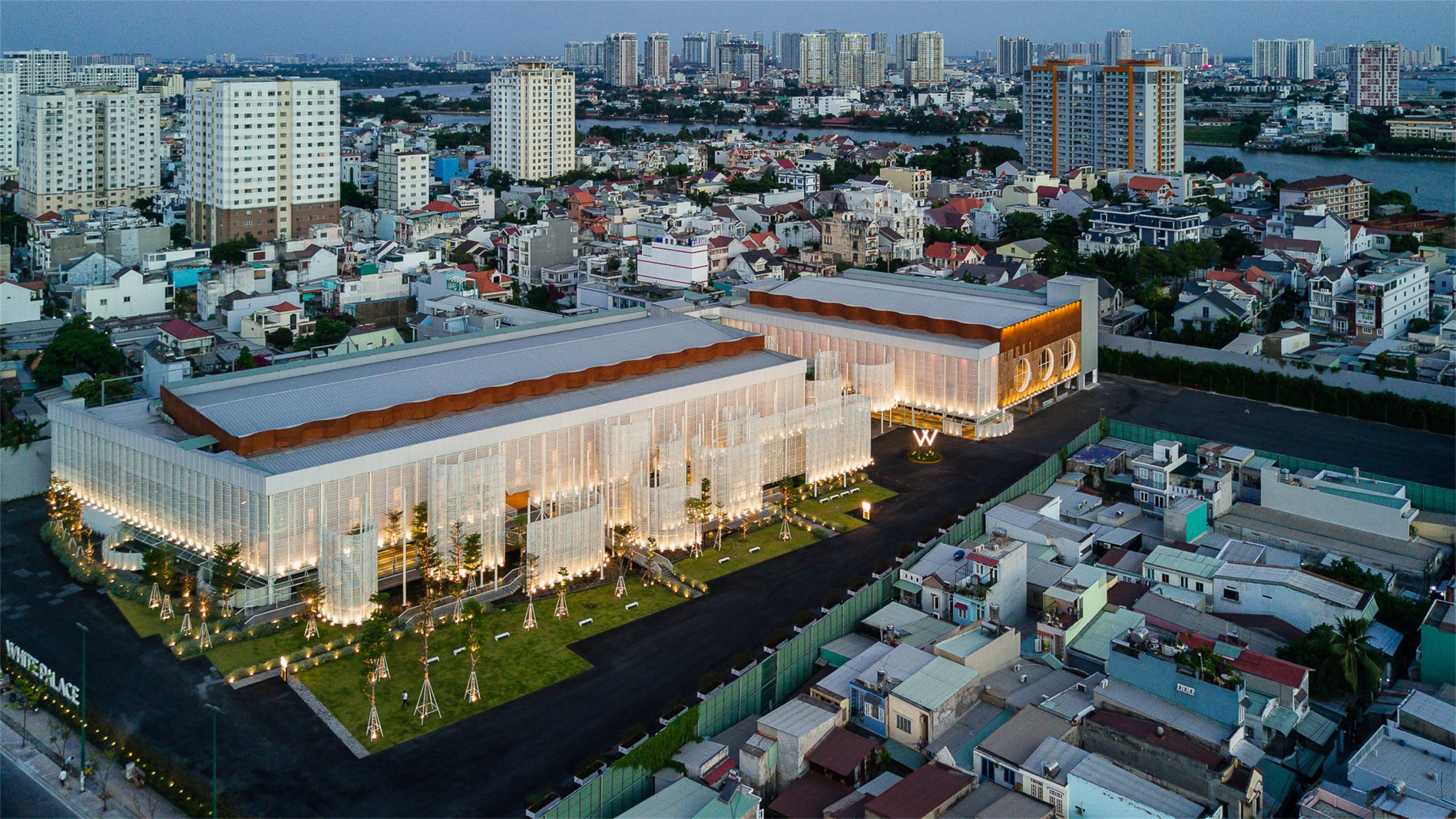
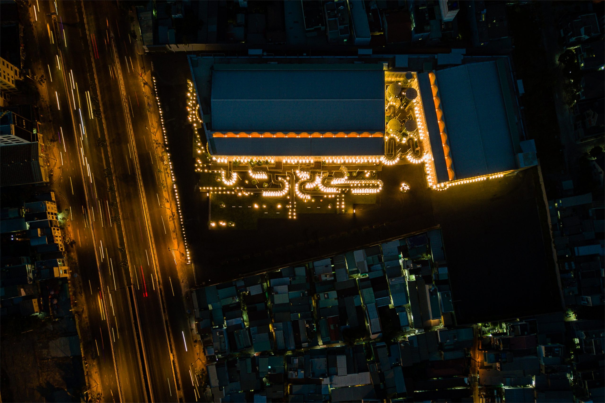
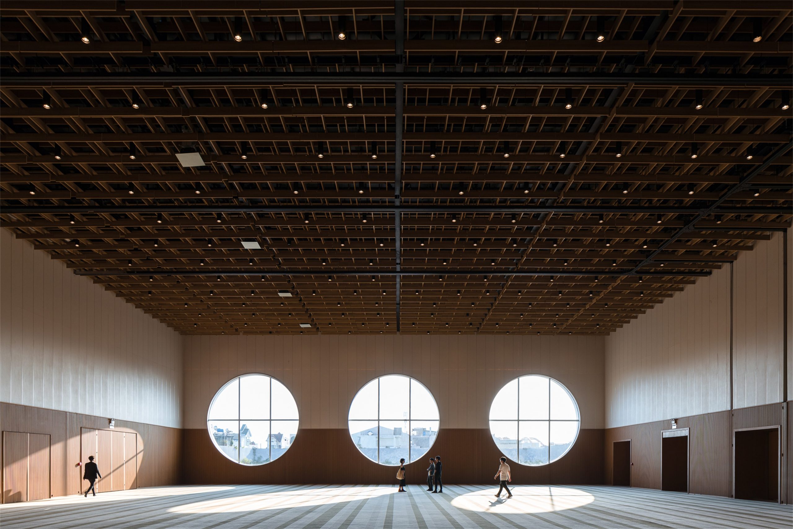
在该项目启动前,建筑的基本结构框架已经完成,me+建筑事务所和 ThoA 公司应邀参与了后续为期 11 个月的装修工程,为建筑披上了华丽的外衣,这原本只是工业化链条的一个阶段,但在该项目中,这是建筑师提出的一种设计方案,而不是室内装饰。当时,该项目包括一个建筑框架,其中有一个活动室和接待大厅,封闭区域比开放空间大三倍。因此,建筑师没有改善空间体验的余地;相反,当前的任务是改善已有的缓冲空间,为人们在参加白色宴会厅的主要活动前提供互动的可能性,同时确保不影响投资方提出的要求。
The main driving force behind this concept comes from the fact that the operator of the investor made most of the decisions on their own and that the structural frame had been completed prior to our arrival. me+ Architects and ThoA are invited with an 11-month budget as a decorator, giving the building a splendid cover, which is just a stage of an industrialized chain, but architects proposed a design rather than a interor covering. Back then, the project consisted of a built framework with an event room and reception hall ratio that was three times larger in closed area than open space. Therefore, there is no room for architects to improve the spatial experience; instead, the task at hand was to improve the buffer space that is already present and provide possibilities for people to interact prior to taking part in main event at the White Palace ballroom while still ensuring not to affect the requirements raised by the investor.
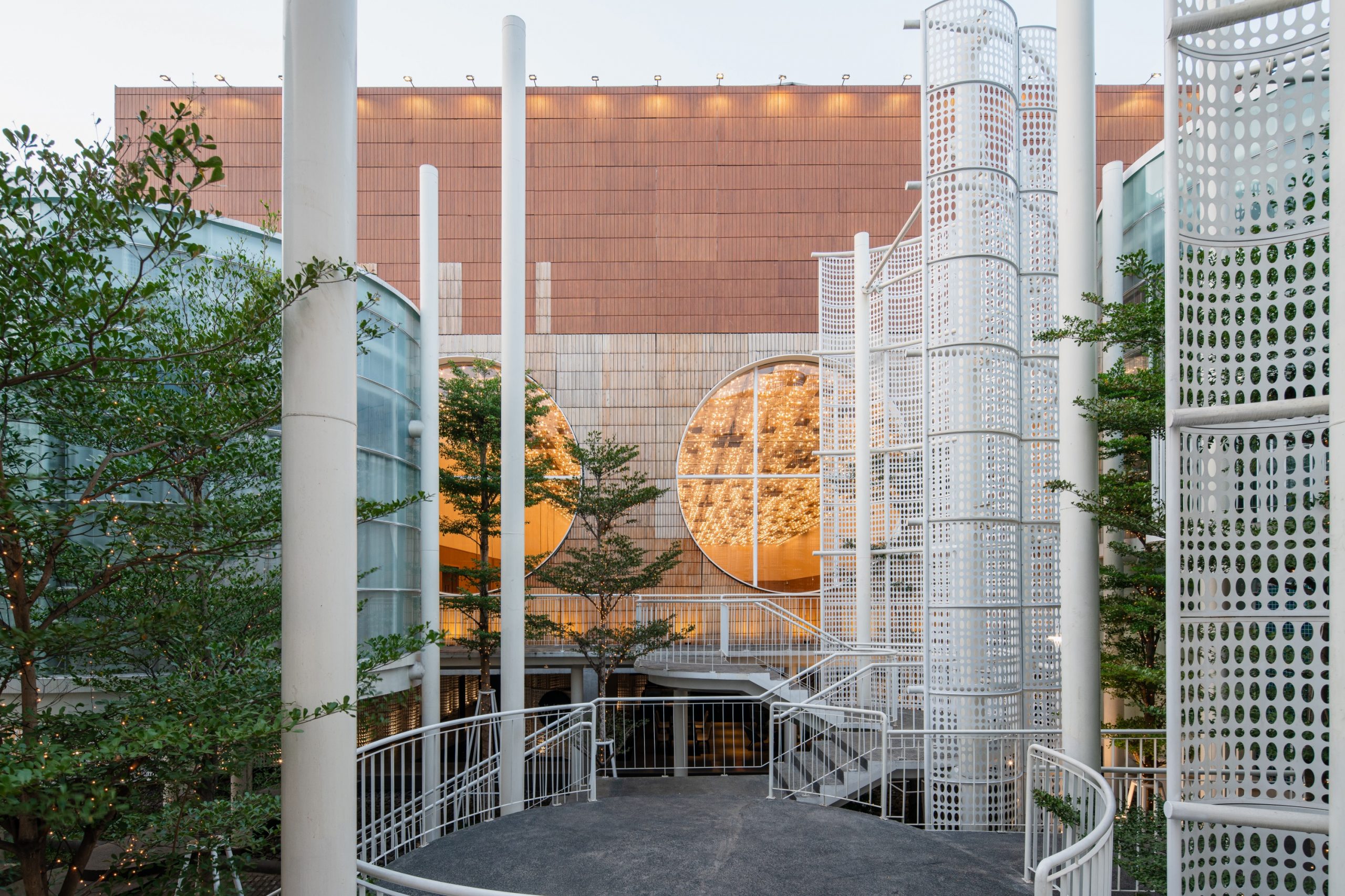
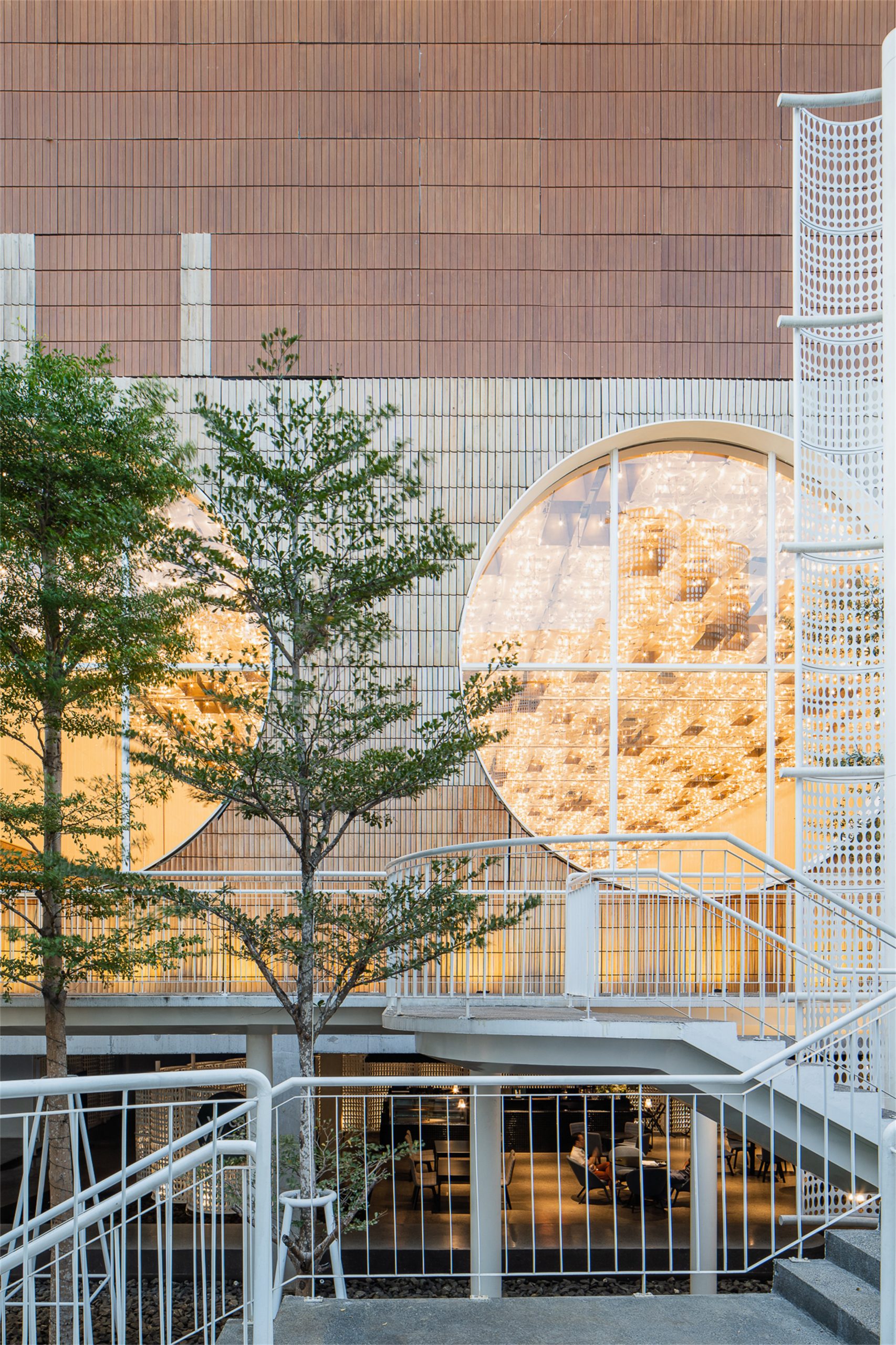
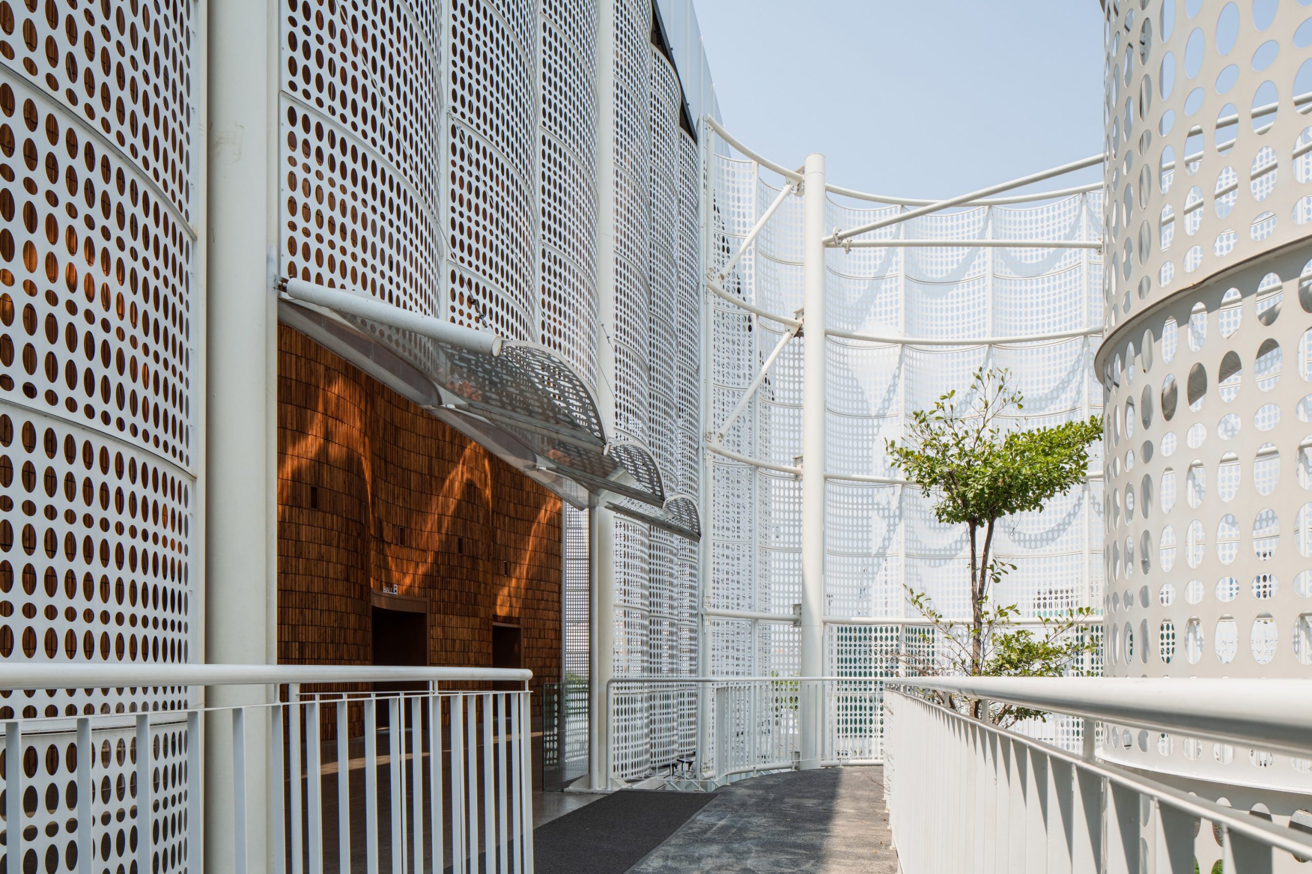
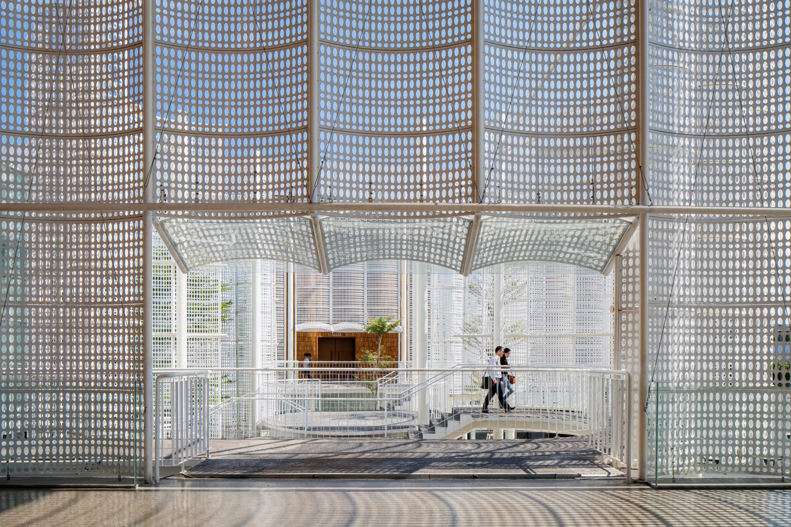
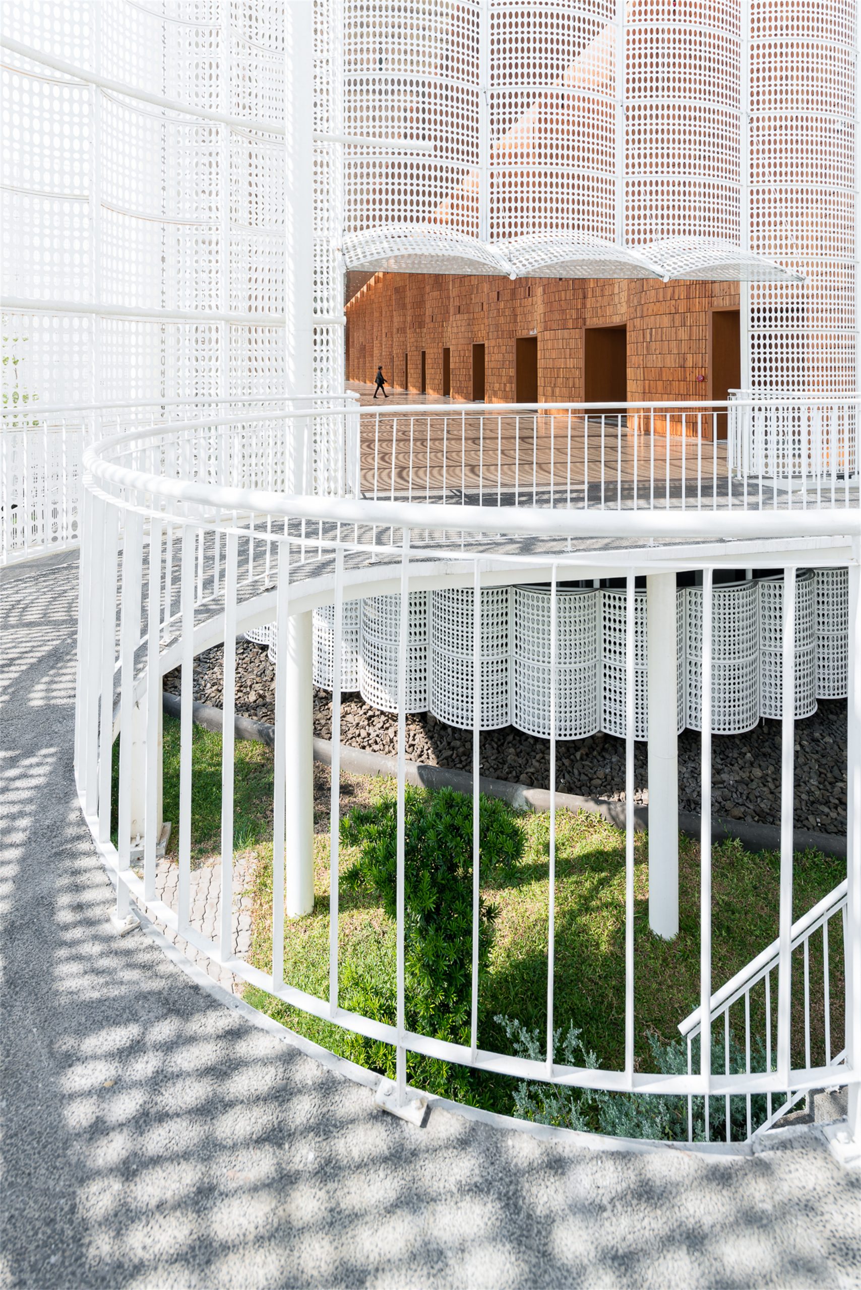
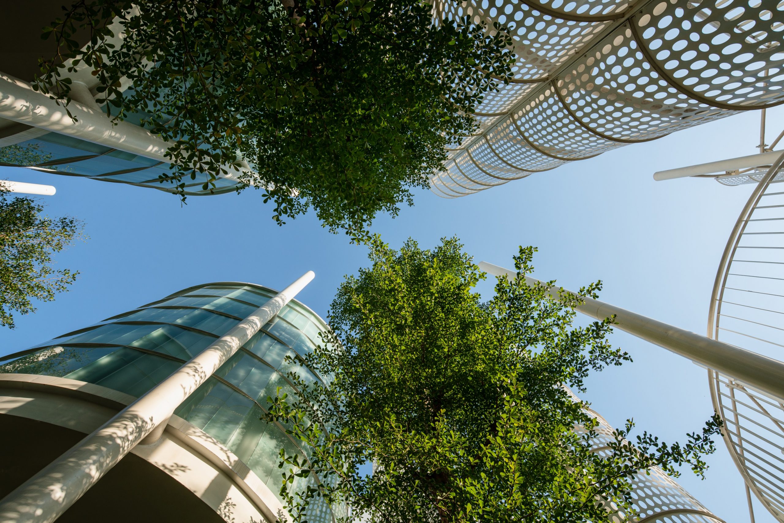
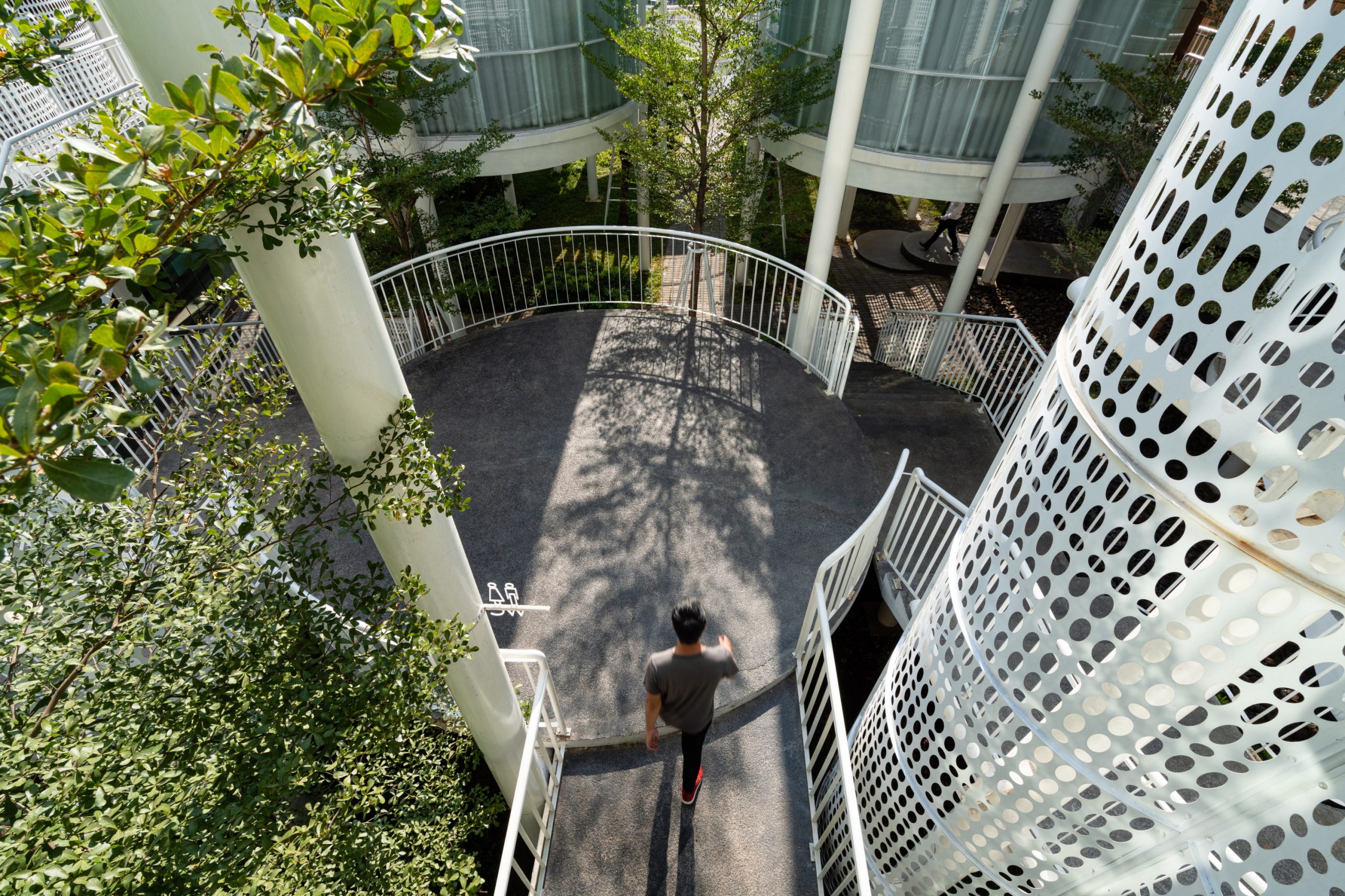
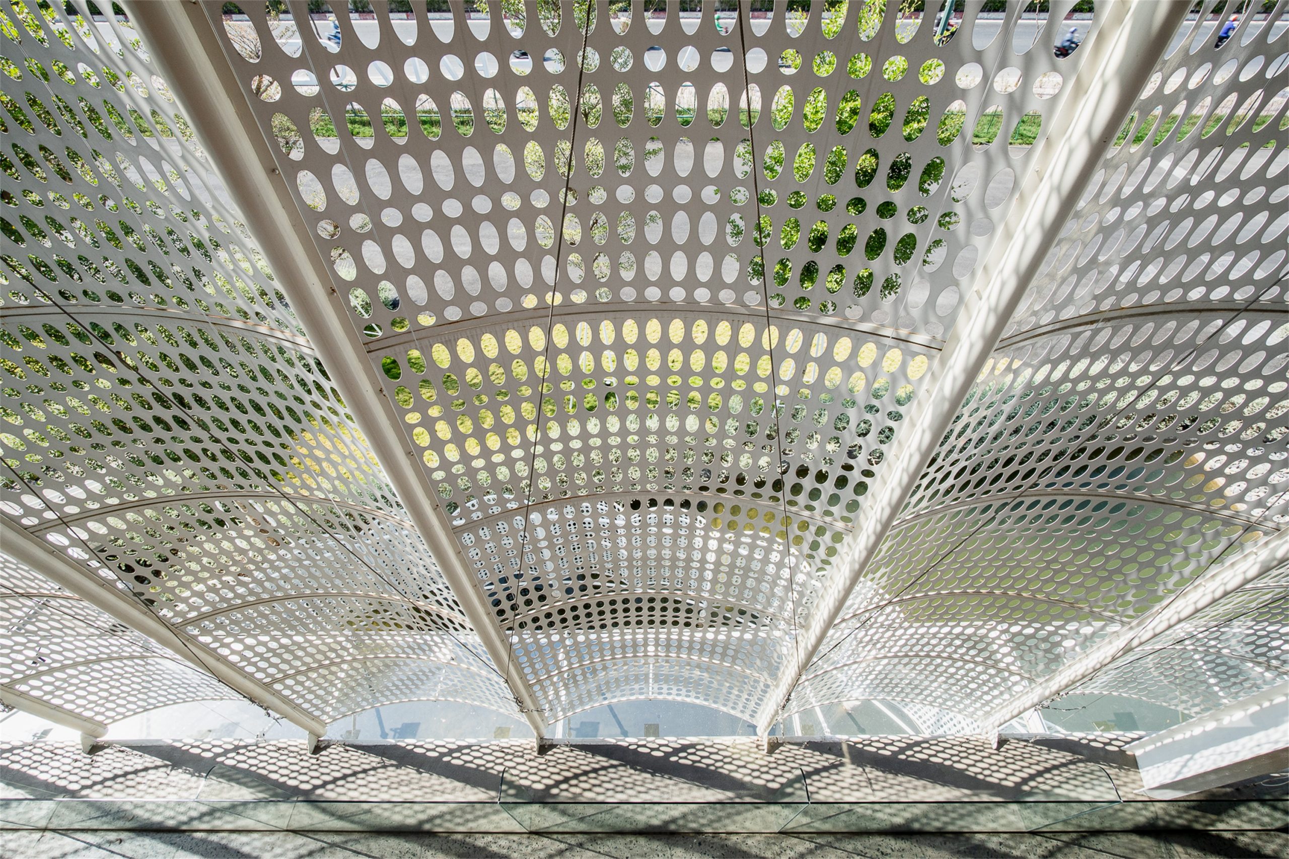
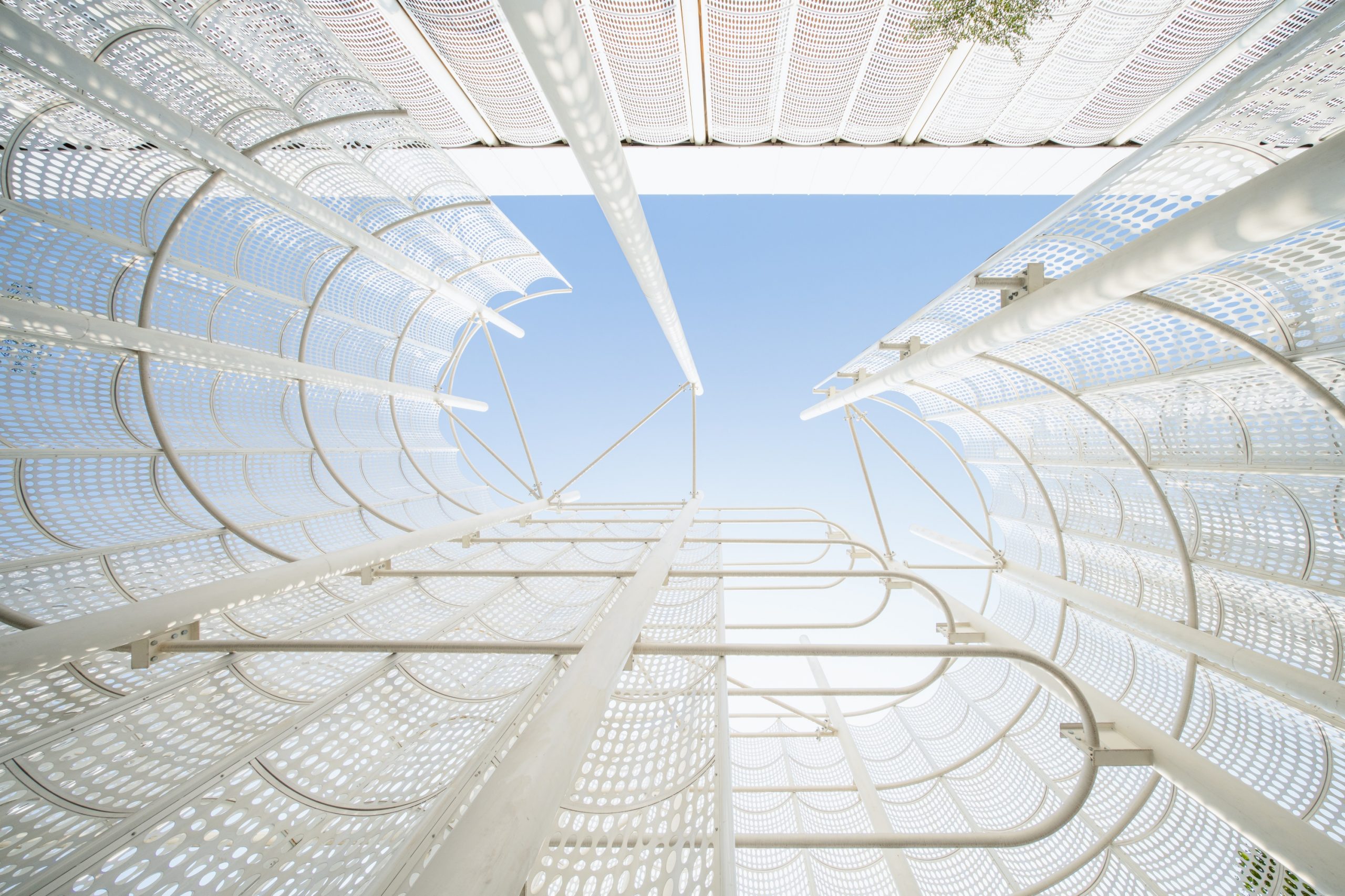
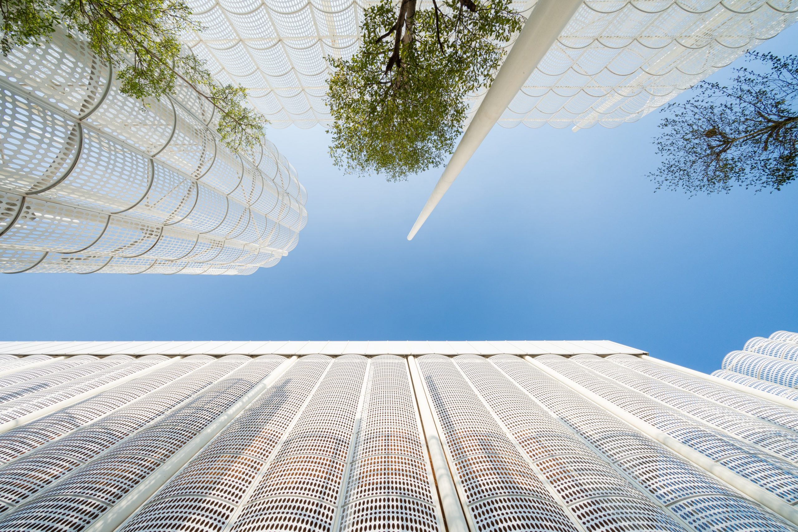
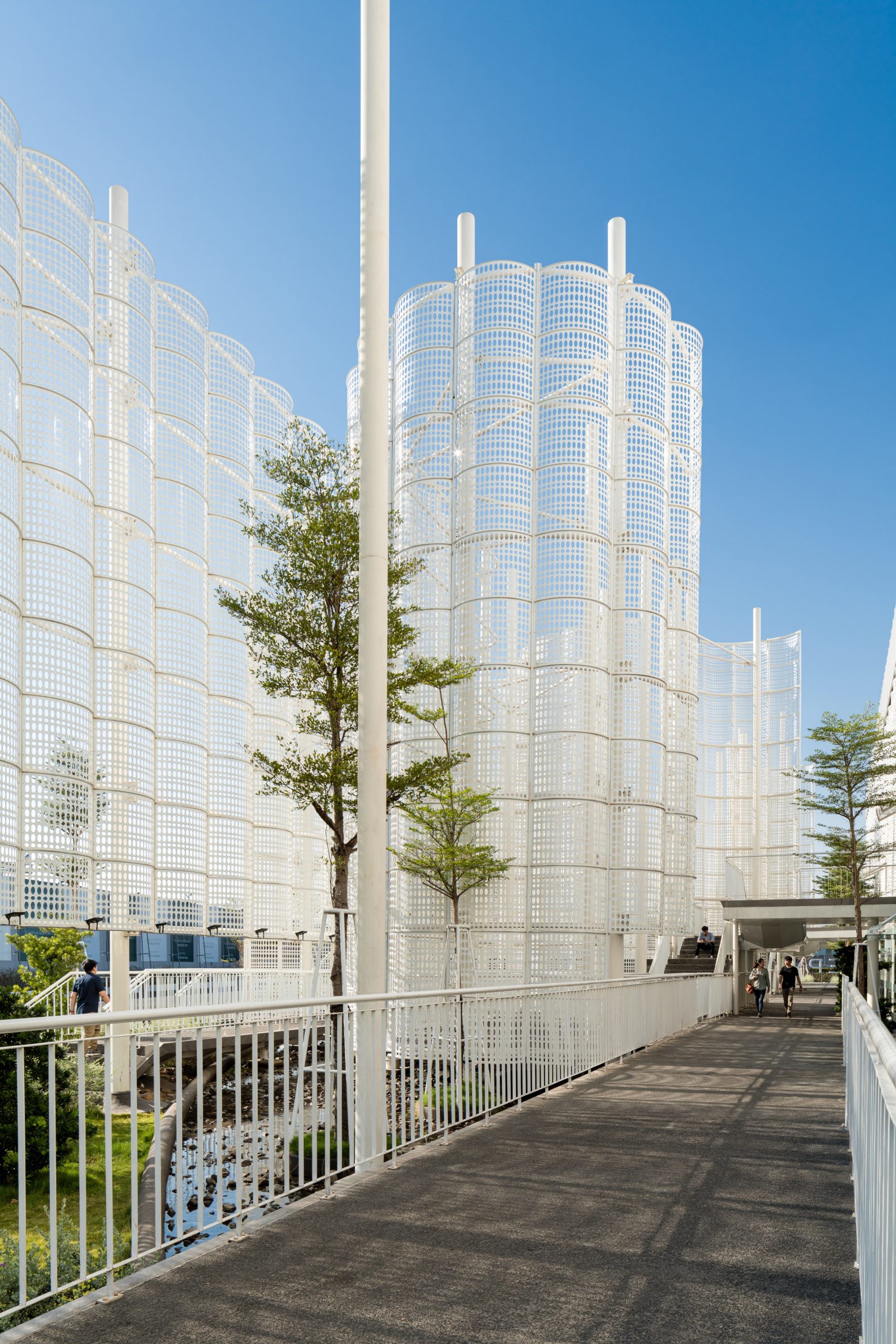
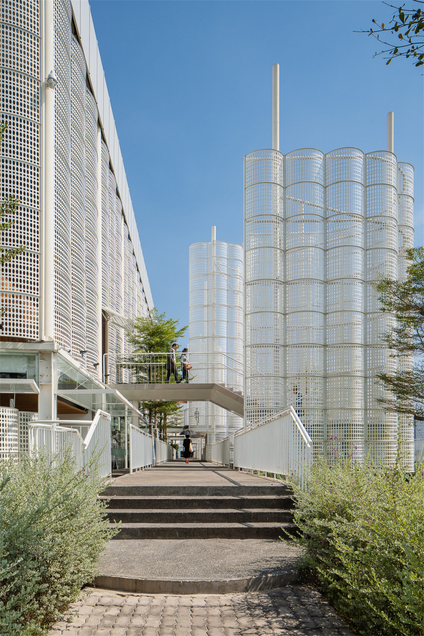
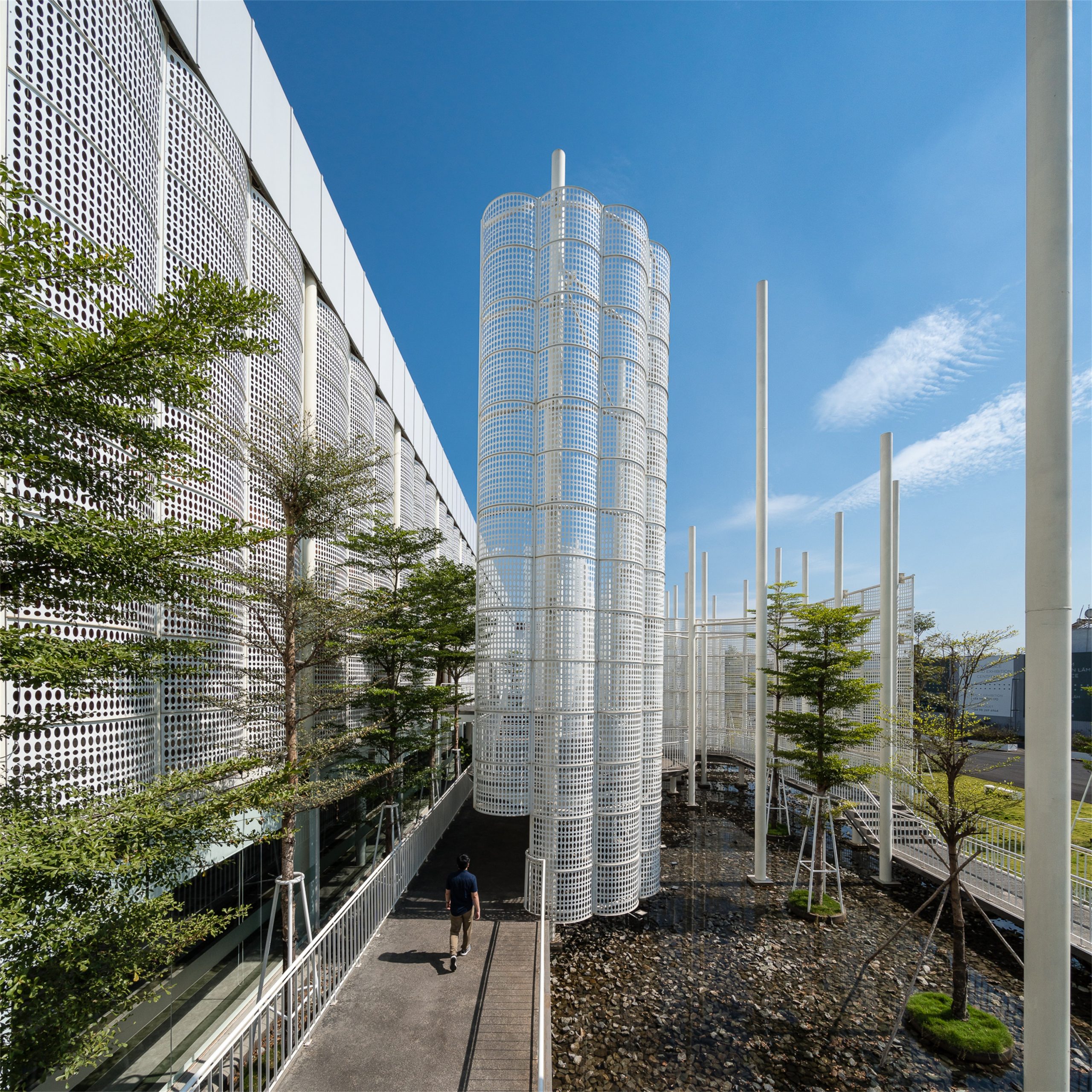
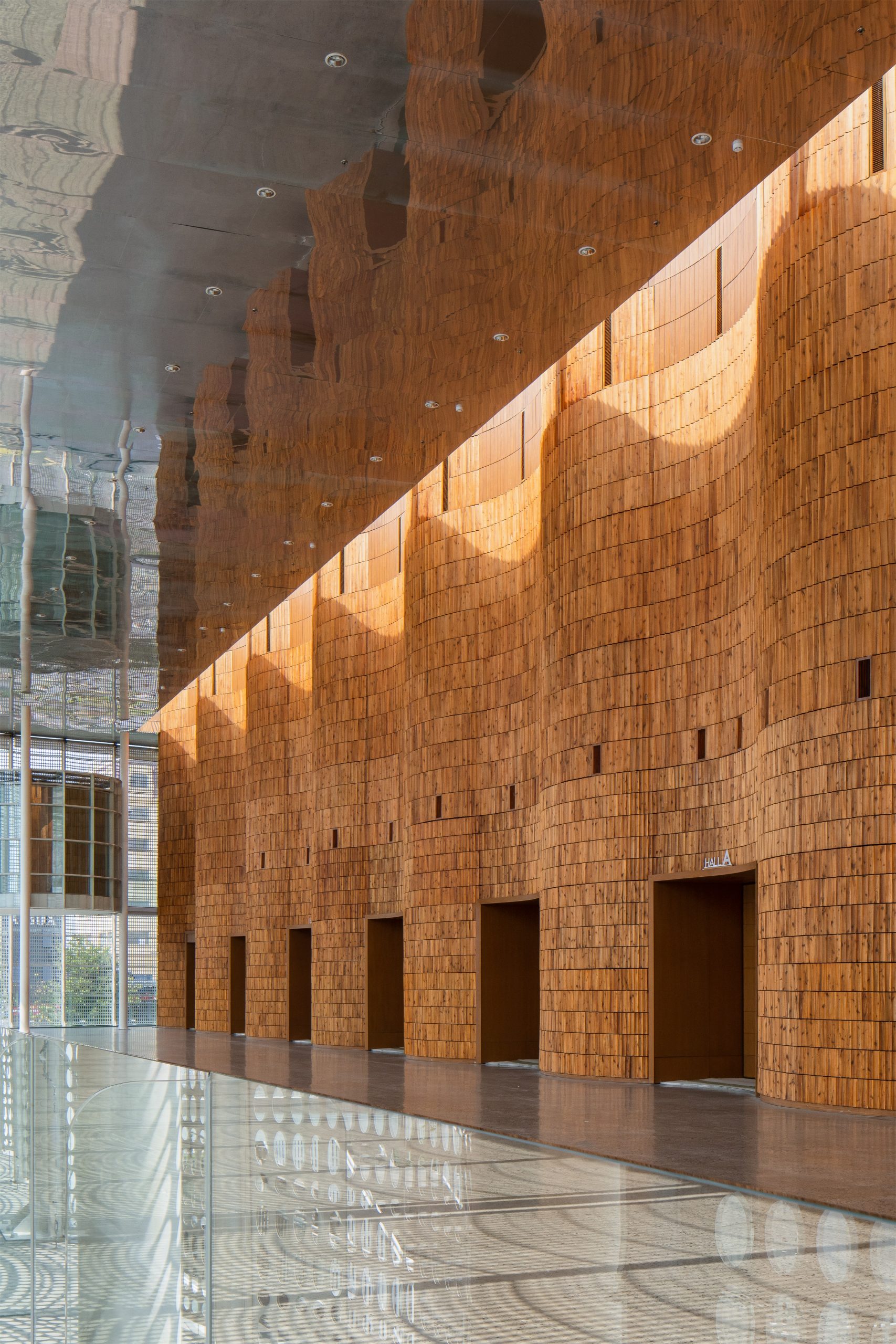
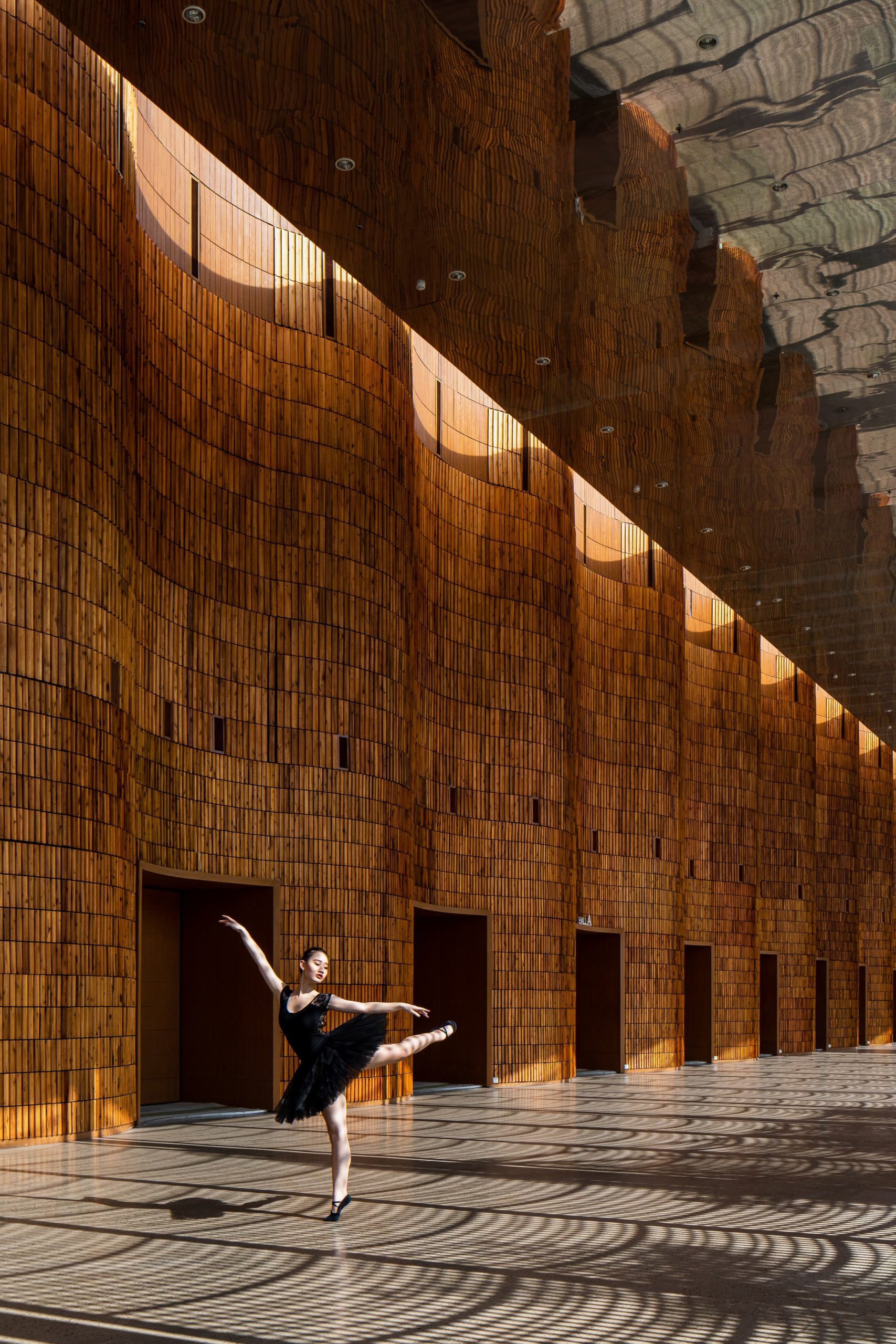
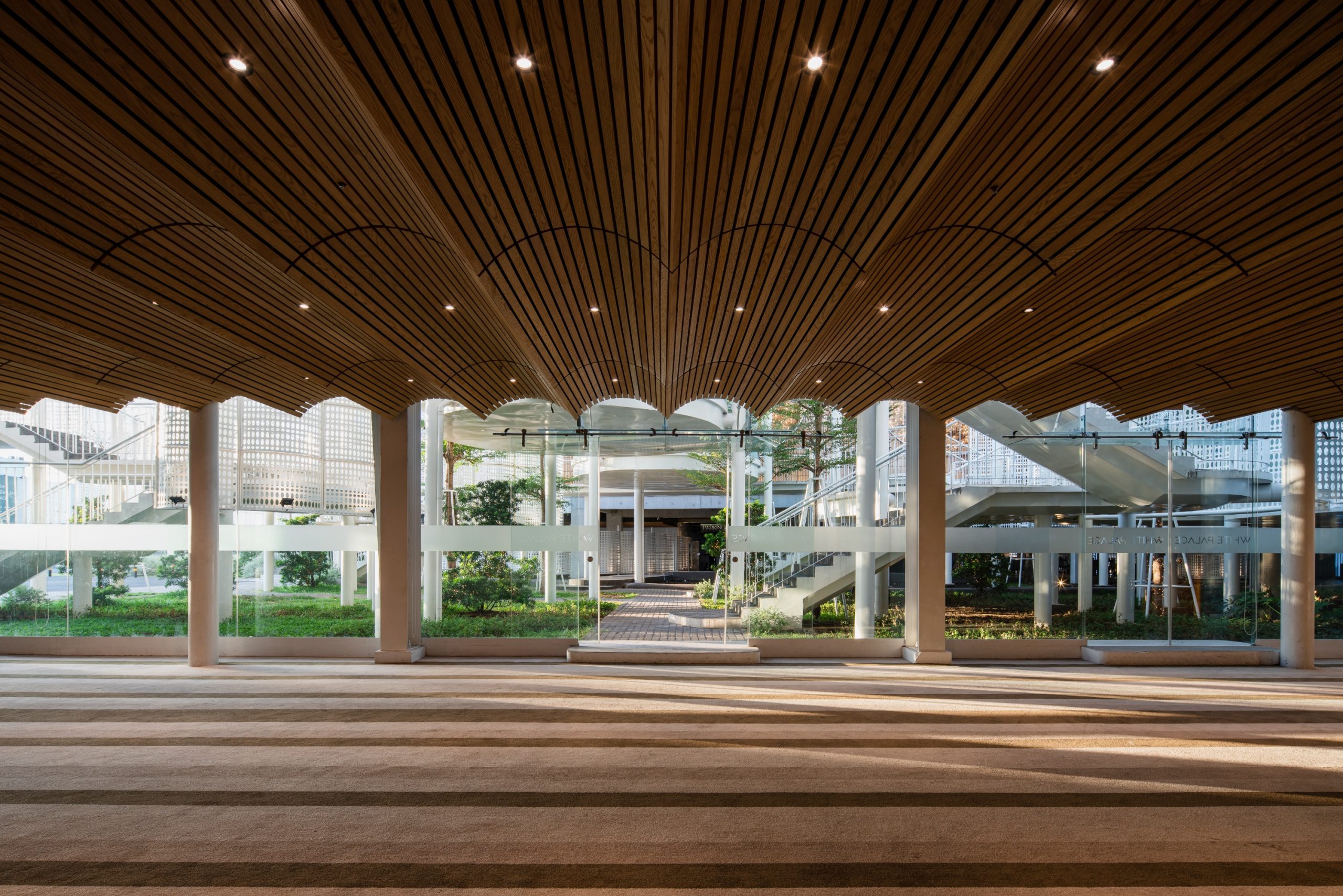
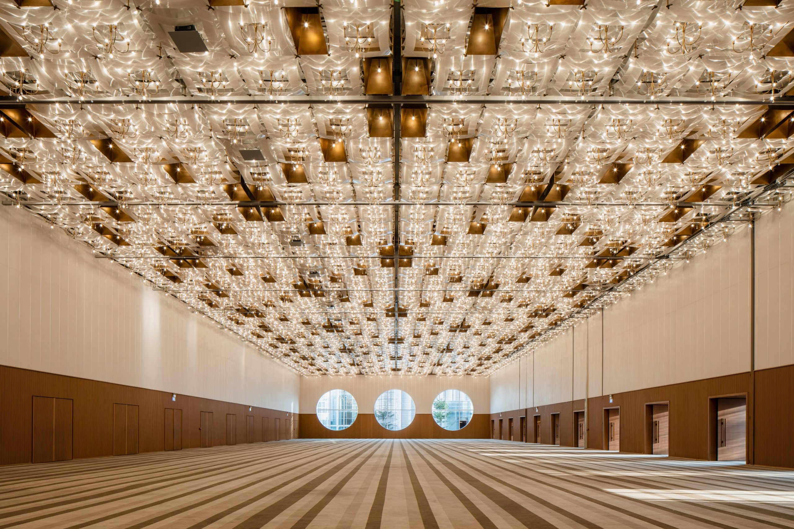
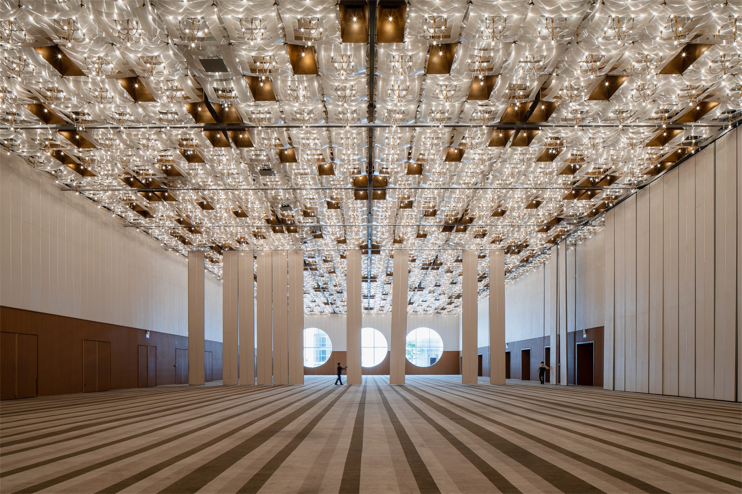
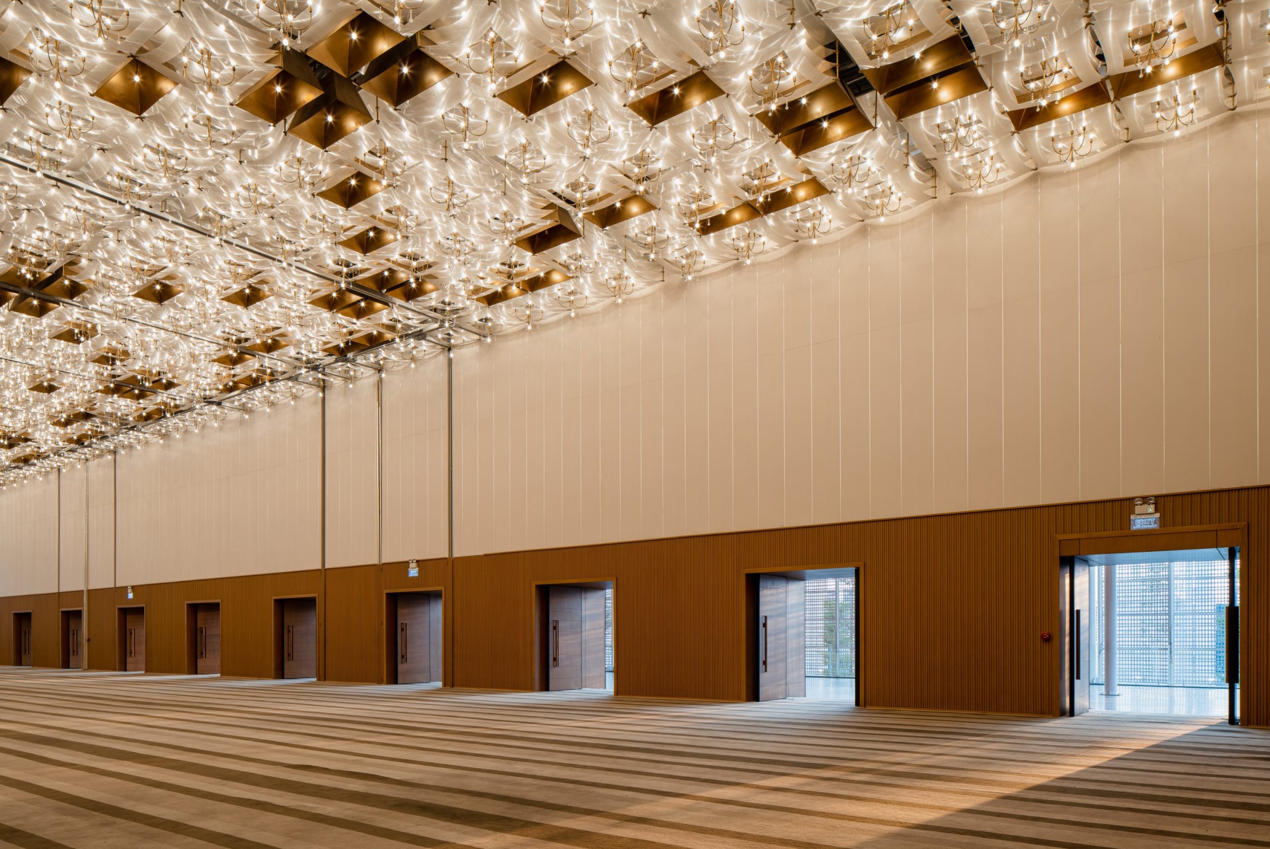
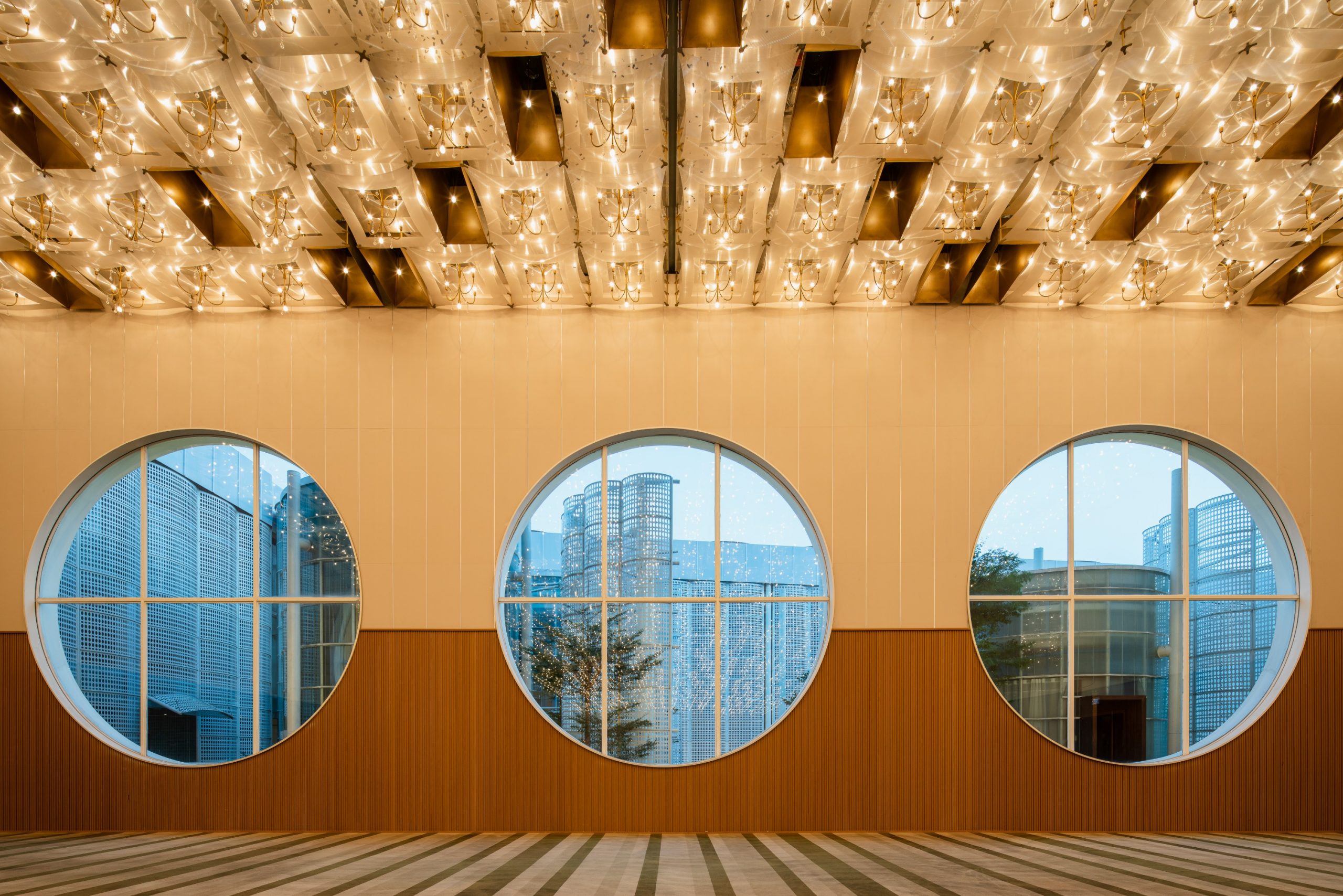
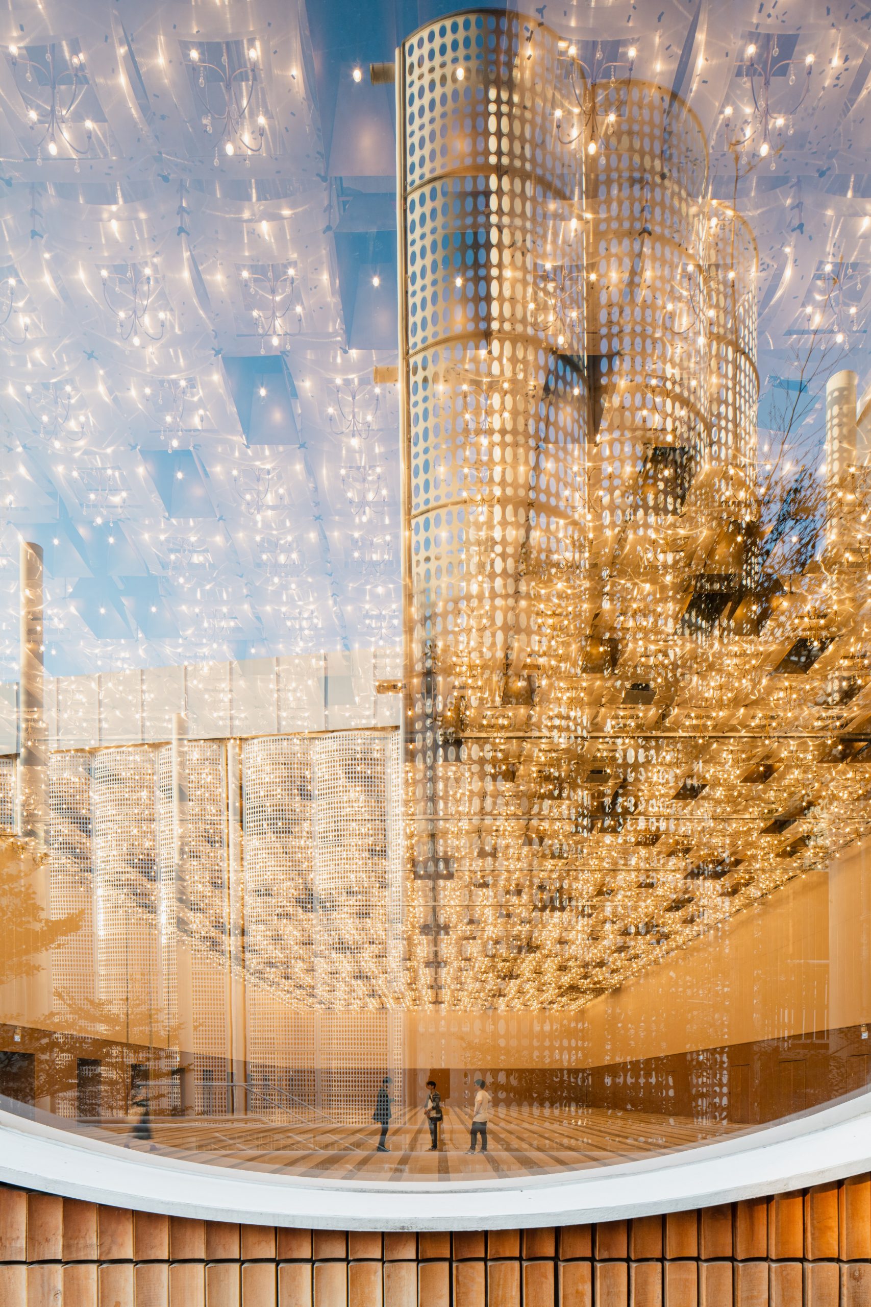
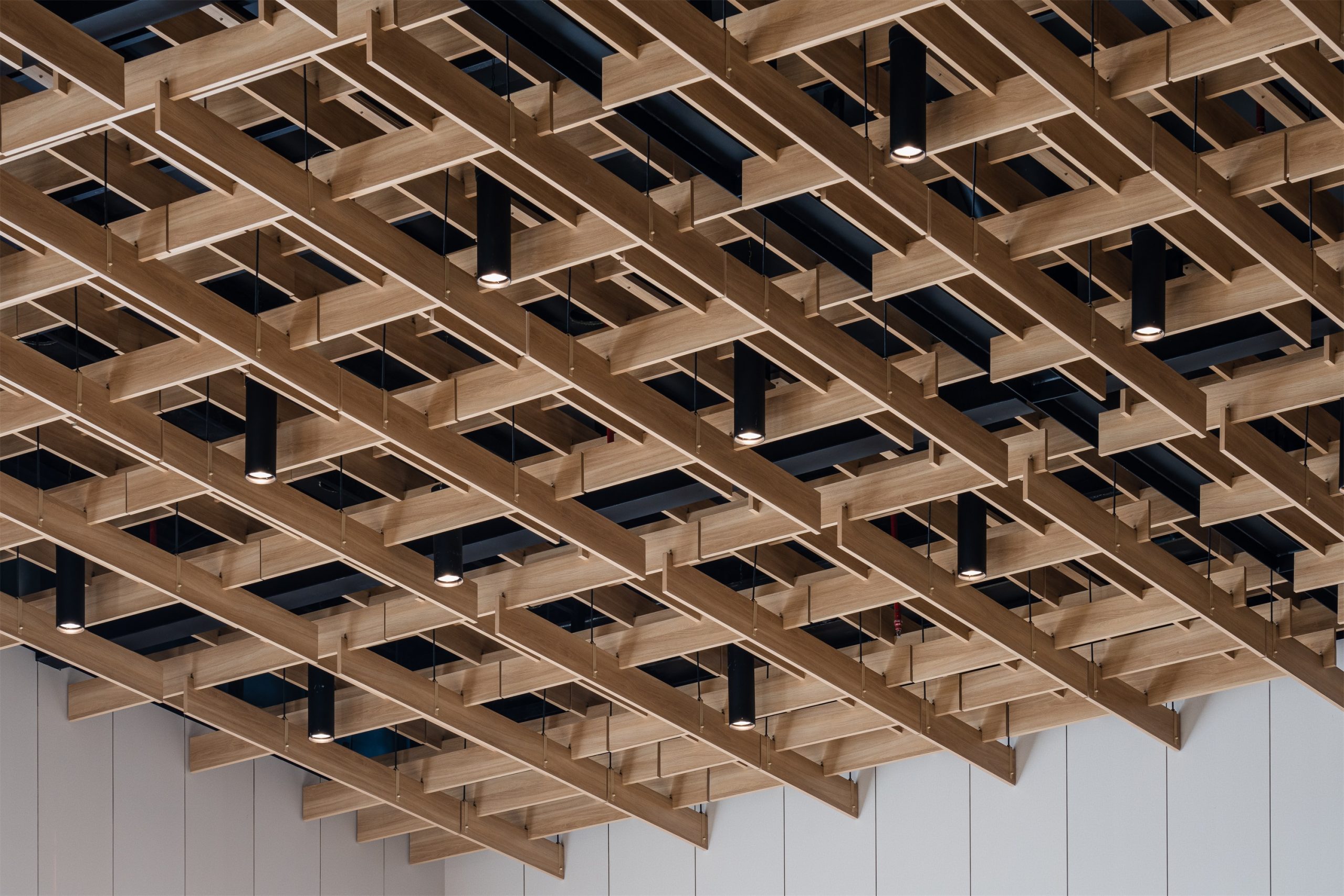
设计师首先对空间进行了纵向扩展。该建筑有两个接待大厅,每个大厅宽 10 米,高 10 米,沿两个街区的长度间隔排列。设计面临的挑战在于打造一个温暖、通风、具有视觉吸引力的区域,鼓励来访者在此停留更长时间,享受会面与互动的体验。因为要扩大可用空间本身已无法实现,所以设计师决定使用可以扭曲空间感知的材料进行实验。吊顶由抛光铝板制成,可以捕捉和反射整个空间和下方的活动场景。如此一来,空间的高度就增加了一倍,客人不仅可以通过这种反射悄悄地“观察”其他活动,还可以“观察”自己。为了进一步传达空间感,宴会厅前的墙壁被塑造成了波浪形,严酷的工业建筑与波浪形的精细木板之间形成鲜明的对比。
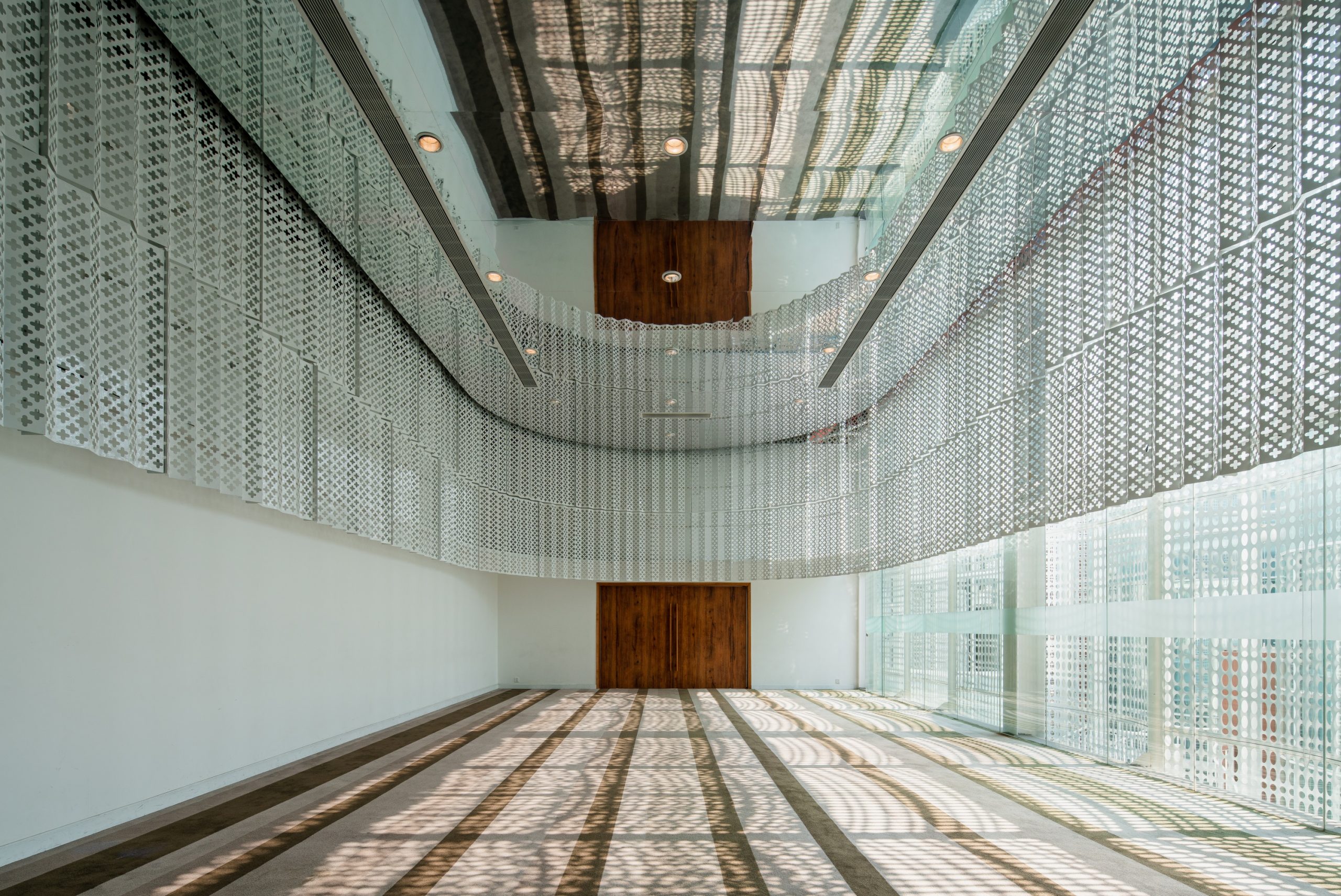
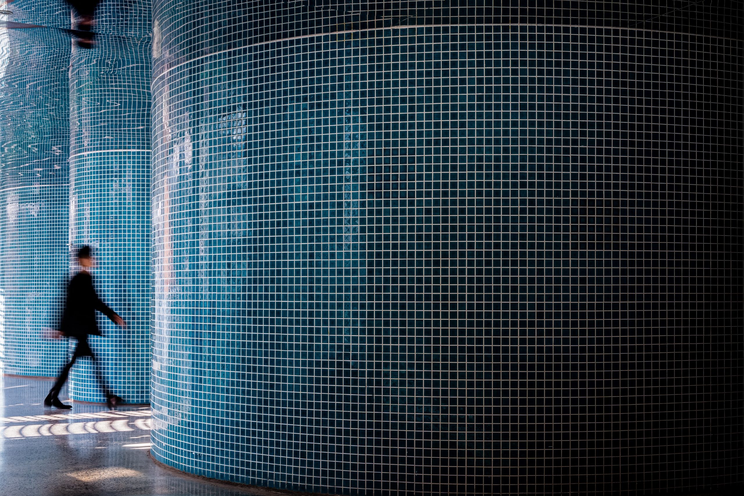
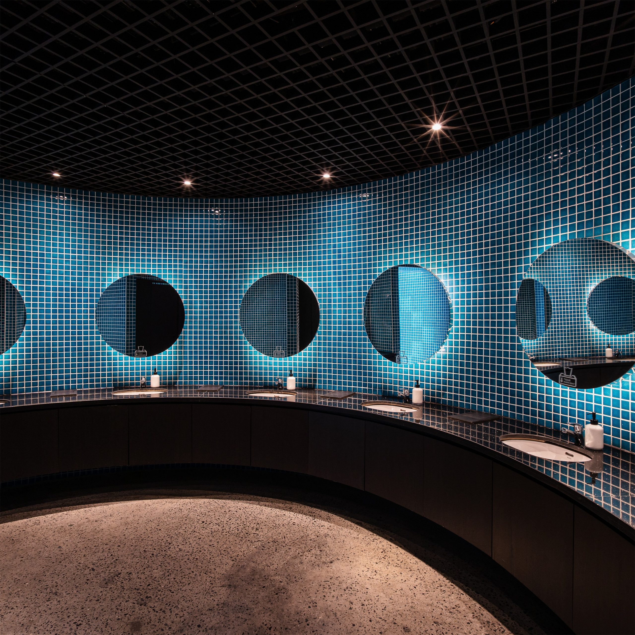
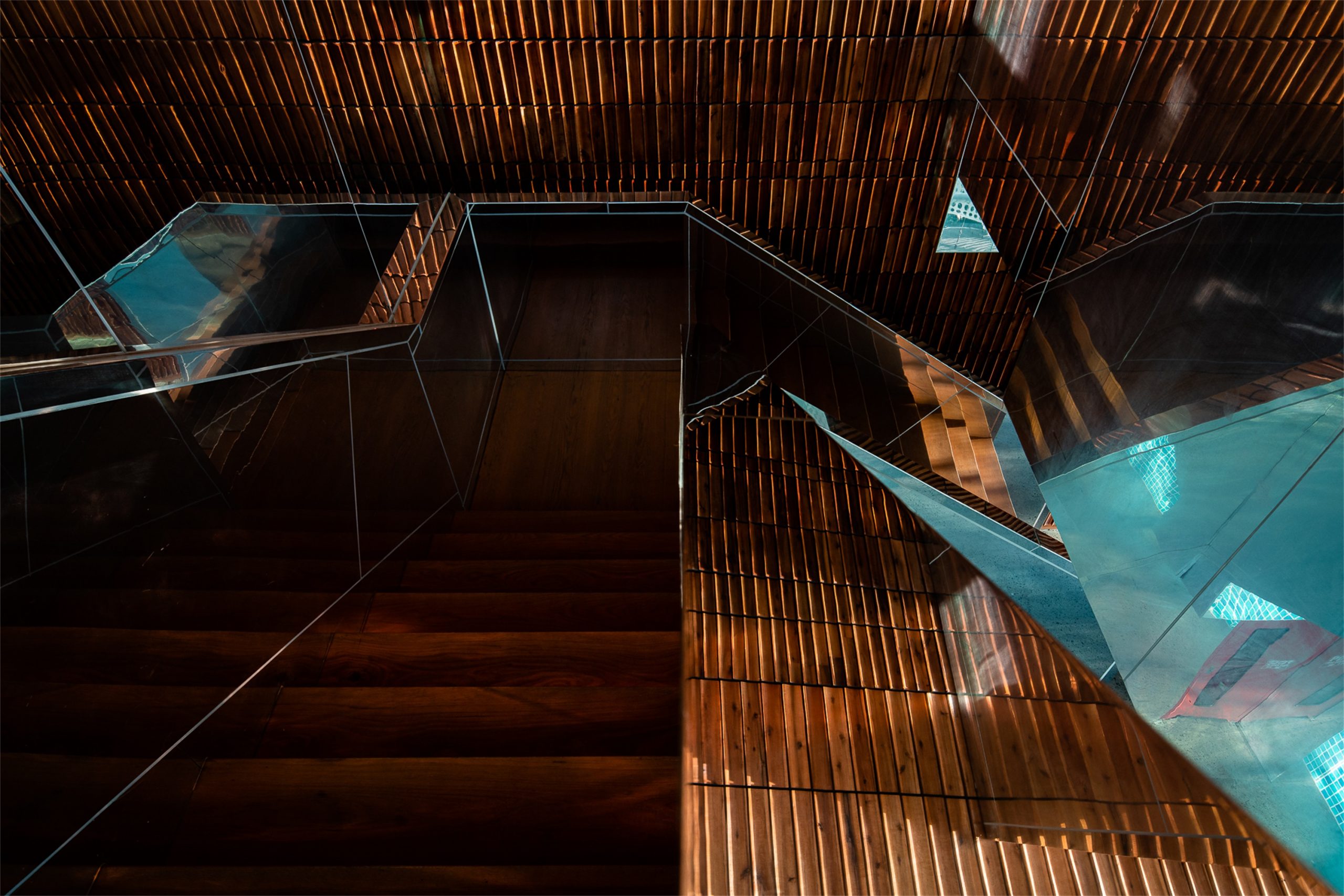
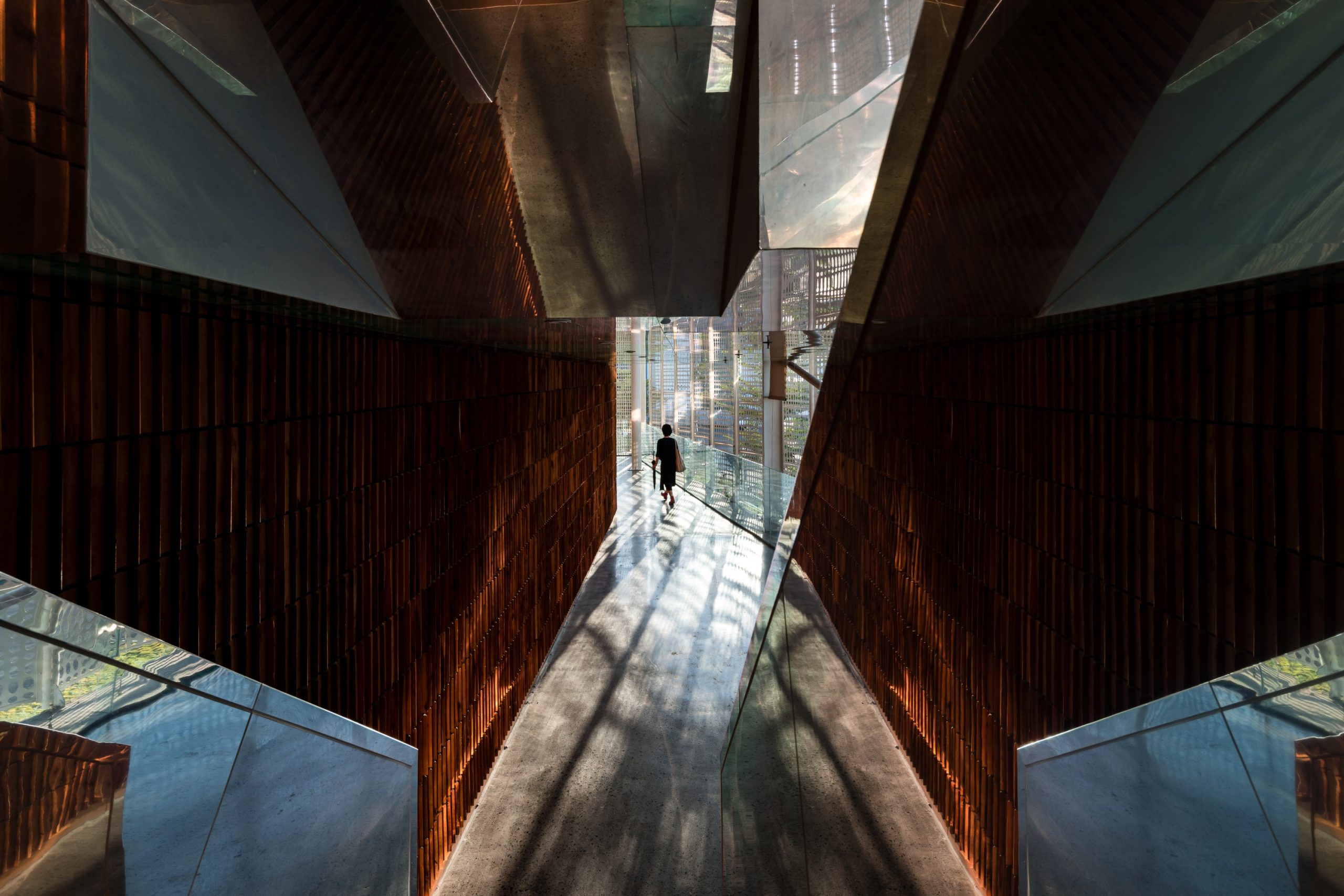
First, we expanded the space vertically. The building has two reception halls, each measuring 10 by 10 meters in width and height, spaced along the length of two blocks. The challenge was to design a warm, airy, and visually stimulating area that would encourage guests to stay longer and enjoy the meet-and-greet experience. We chose to experiment with materials that can distort perceptions of space, since it is inherently impossible to expand the available space, we decided to experiment with materials that can deceive the perception of space. The drop ceiling is made of polished aluminum panels that capture and reflect the entire space and activities underneath. Thus, the space is twice as high, and guests can discreetly “observe” not only other activities but also themselves through this reflection. In order to further convey a sense of space, the wall in front of the banquet hall is wavy. The harsh industrial architecture now contrasts with the waved finely made wood paneling.
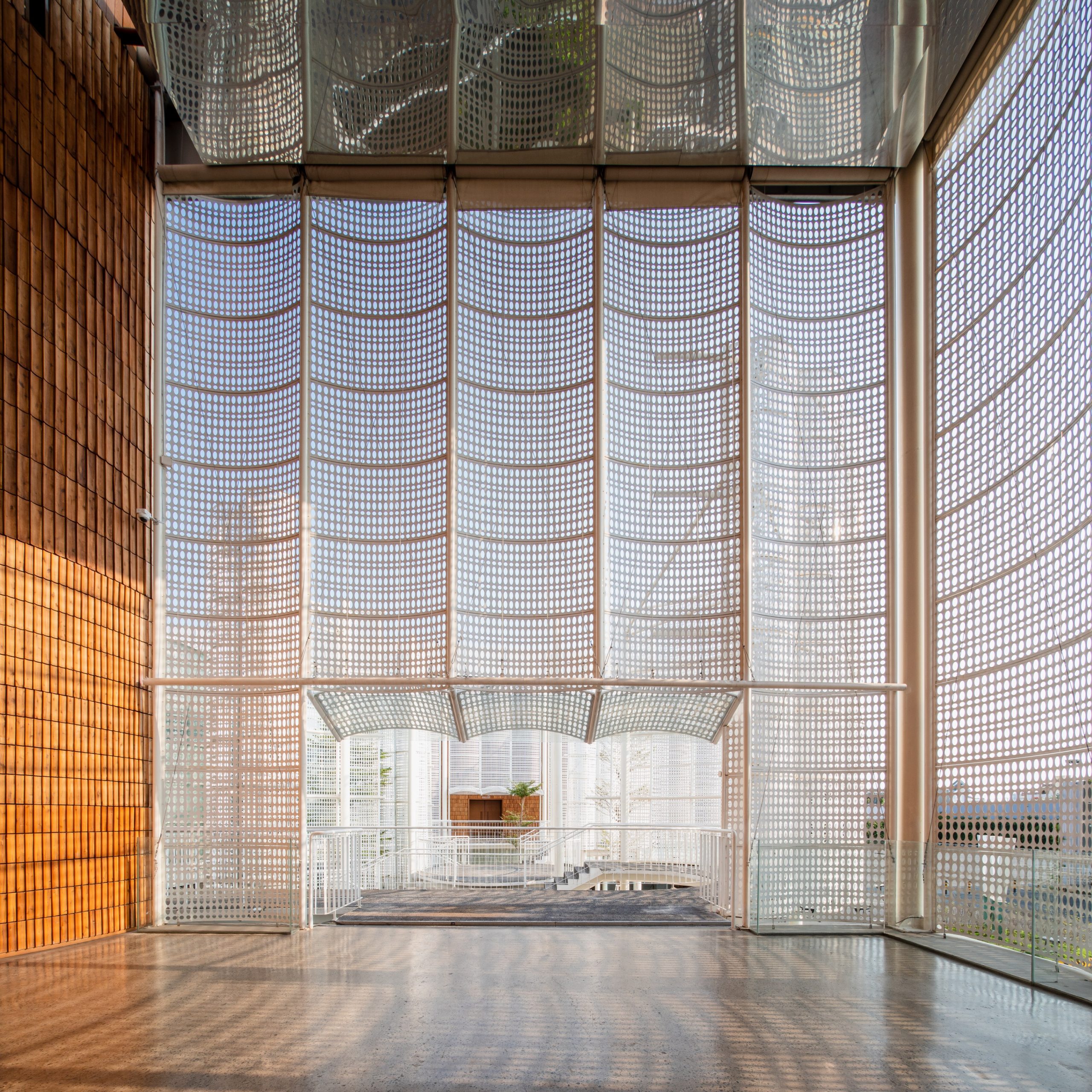

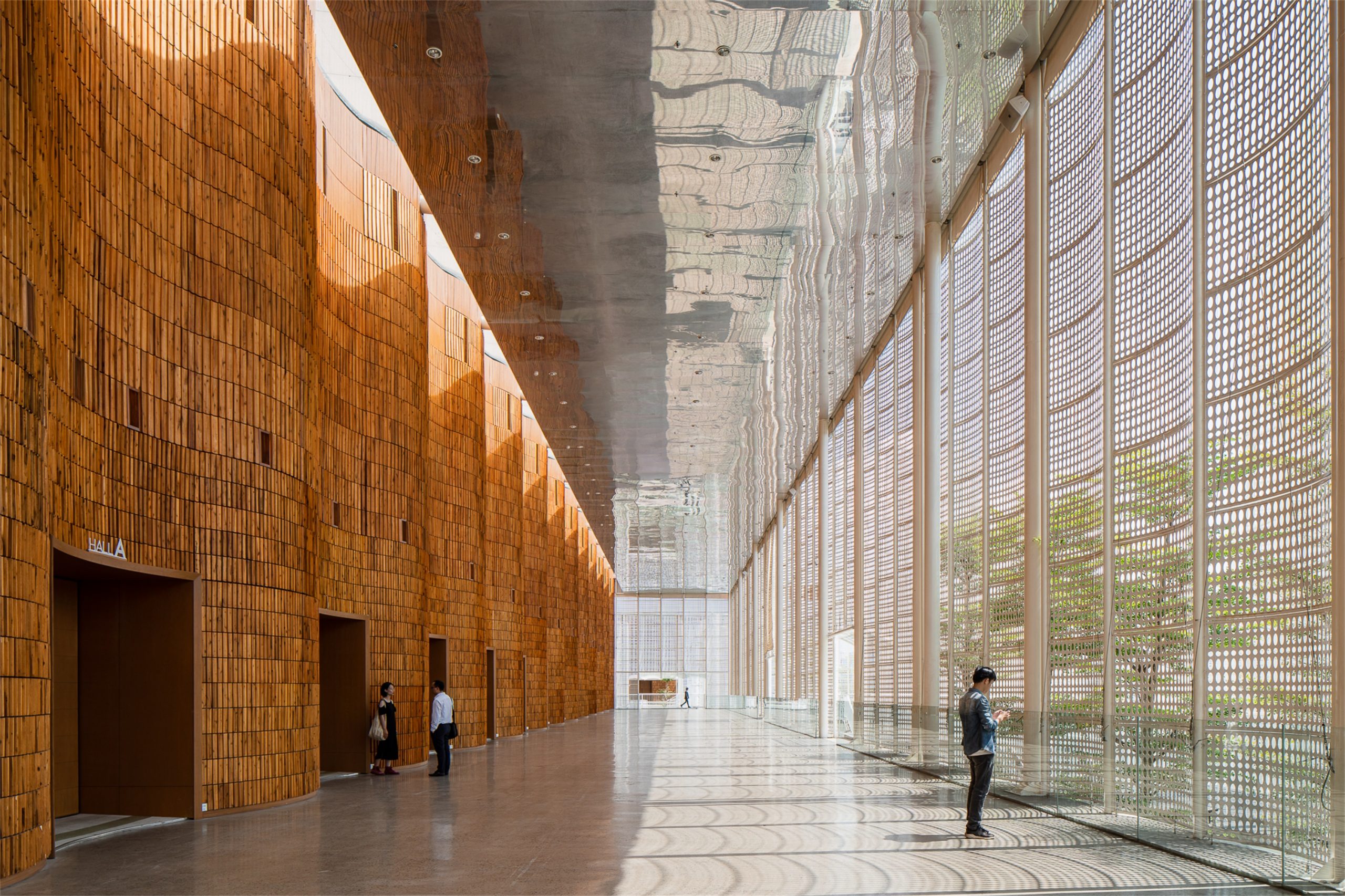
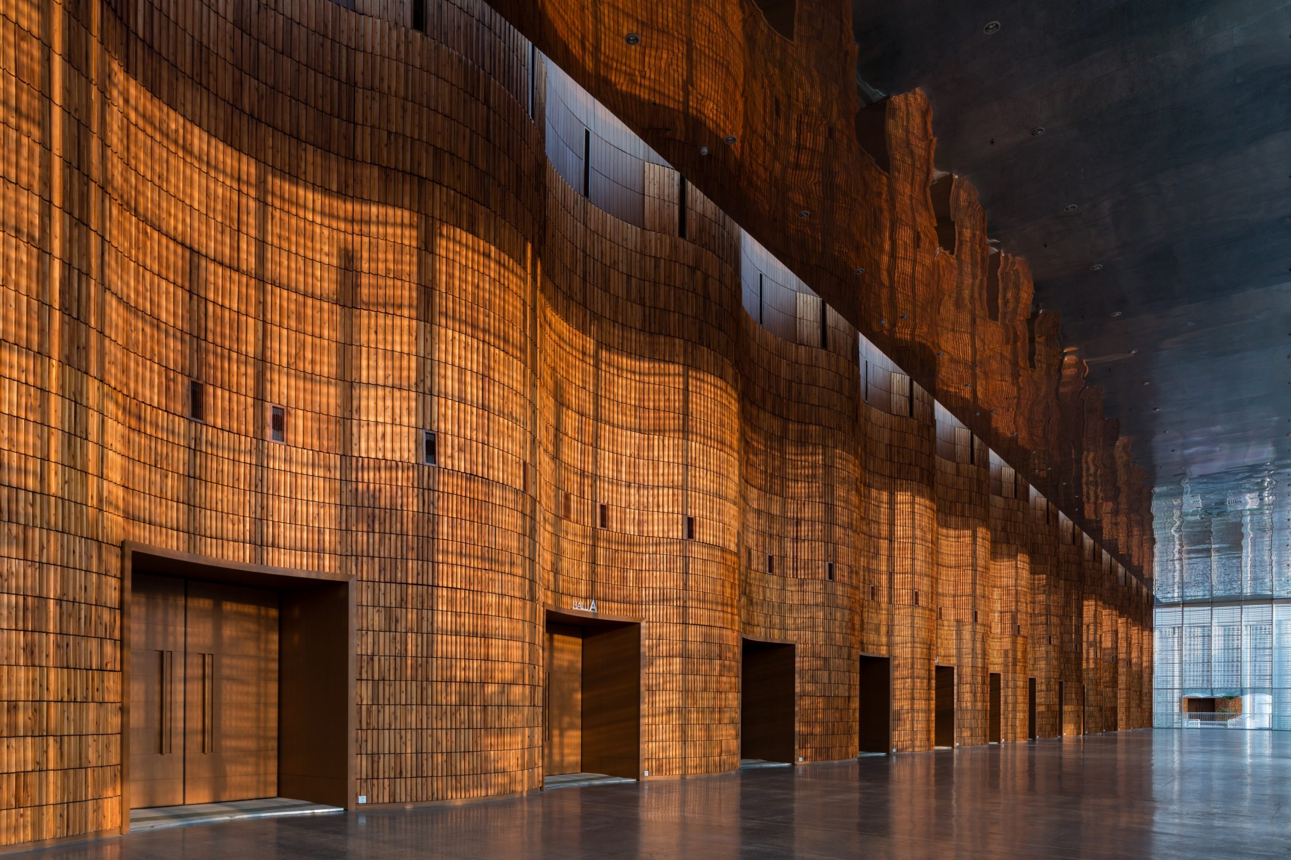
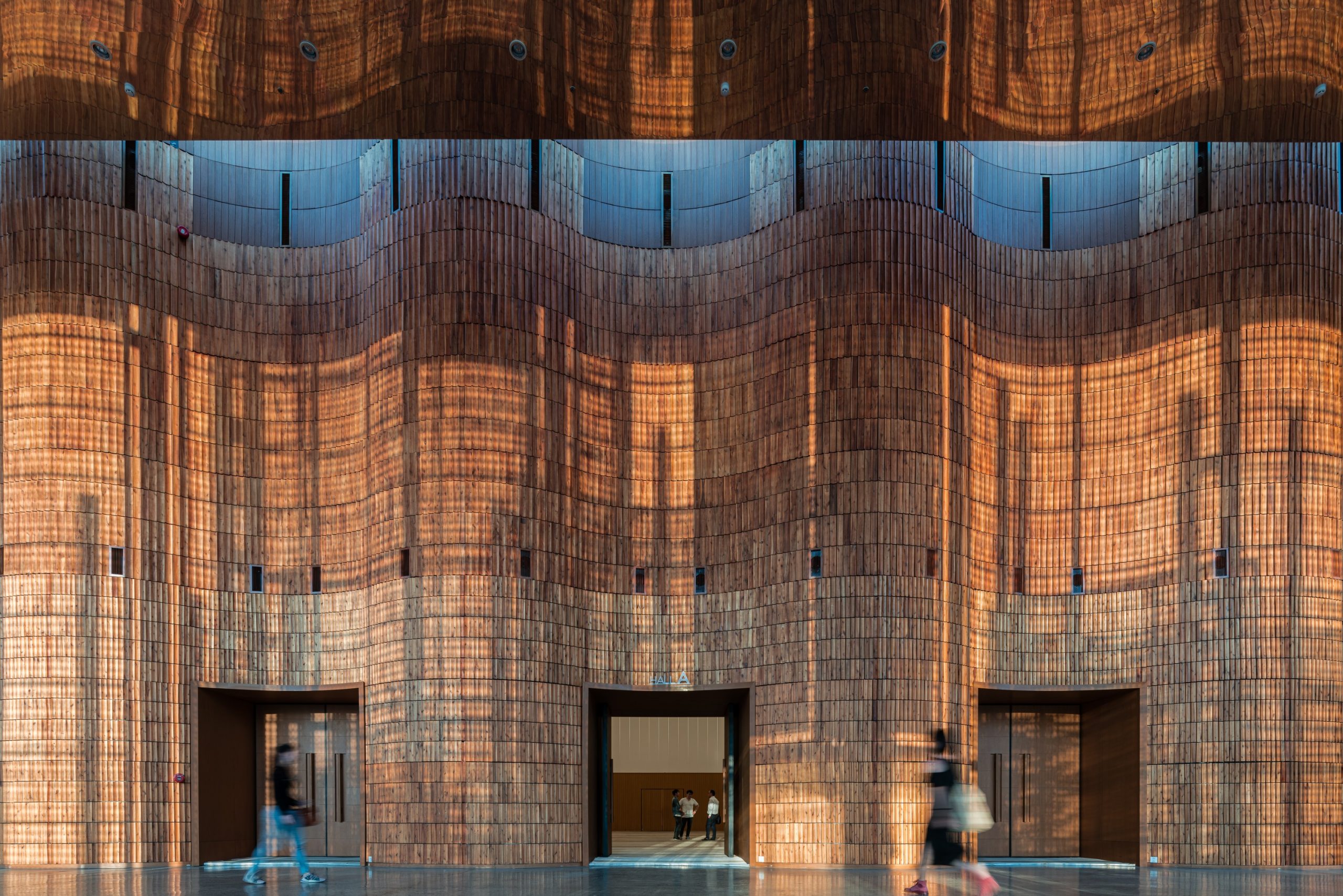
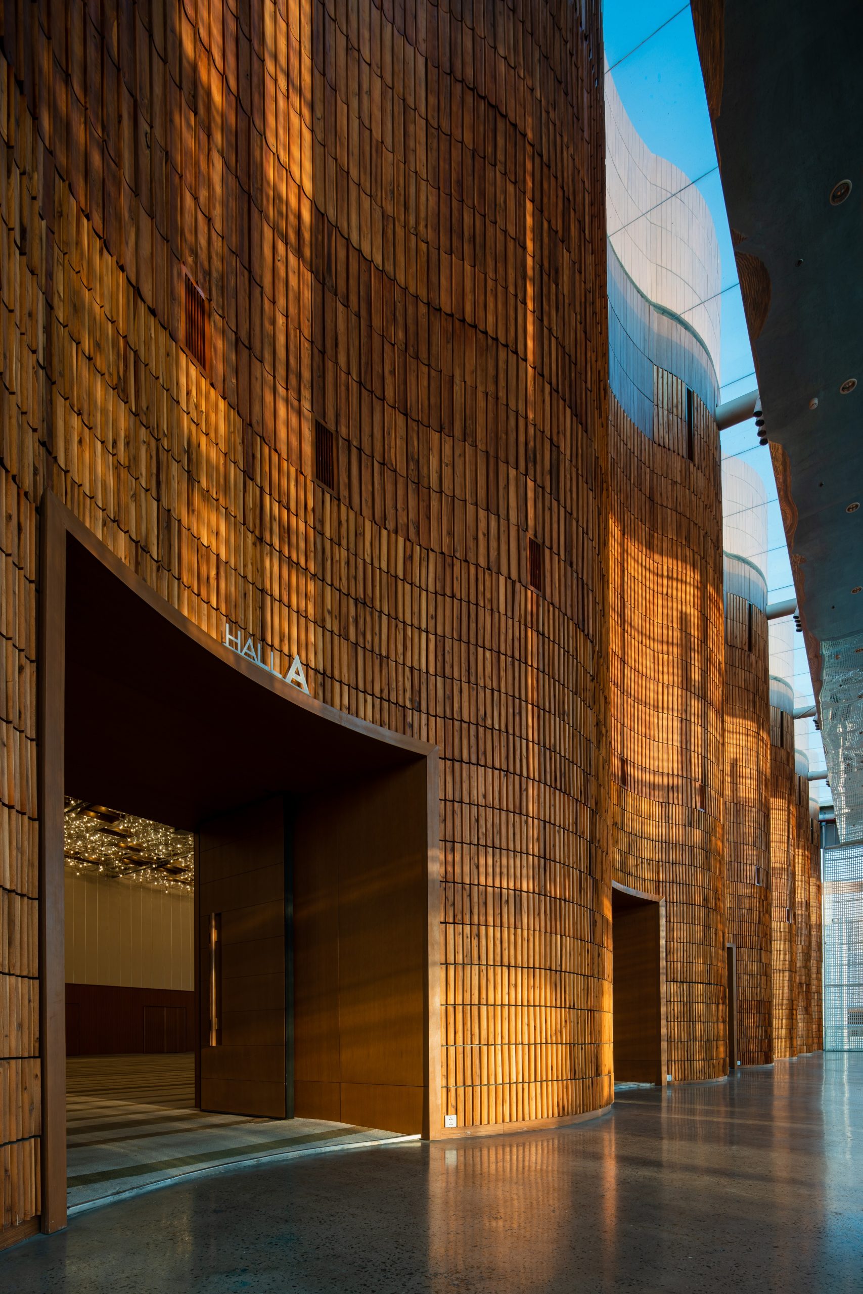
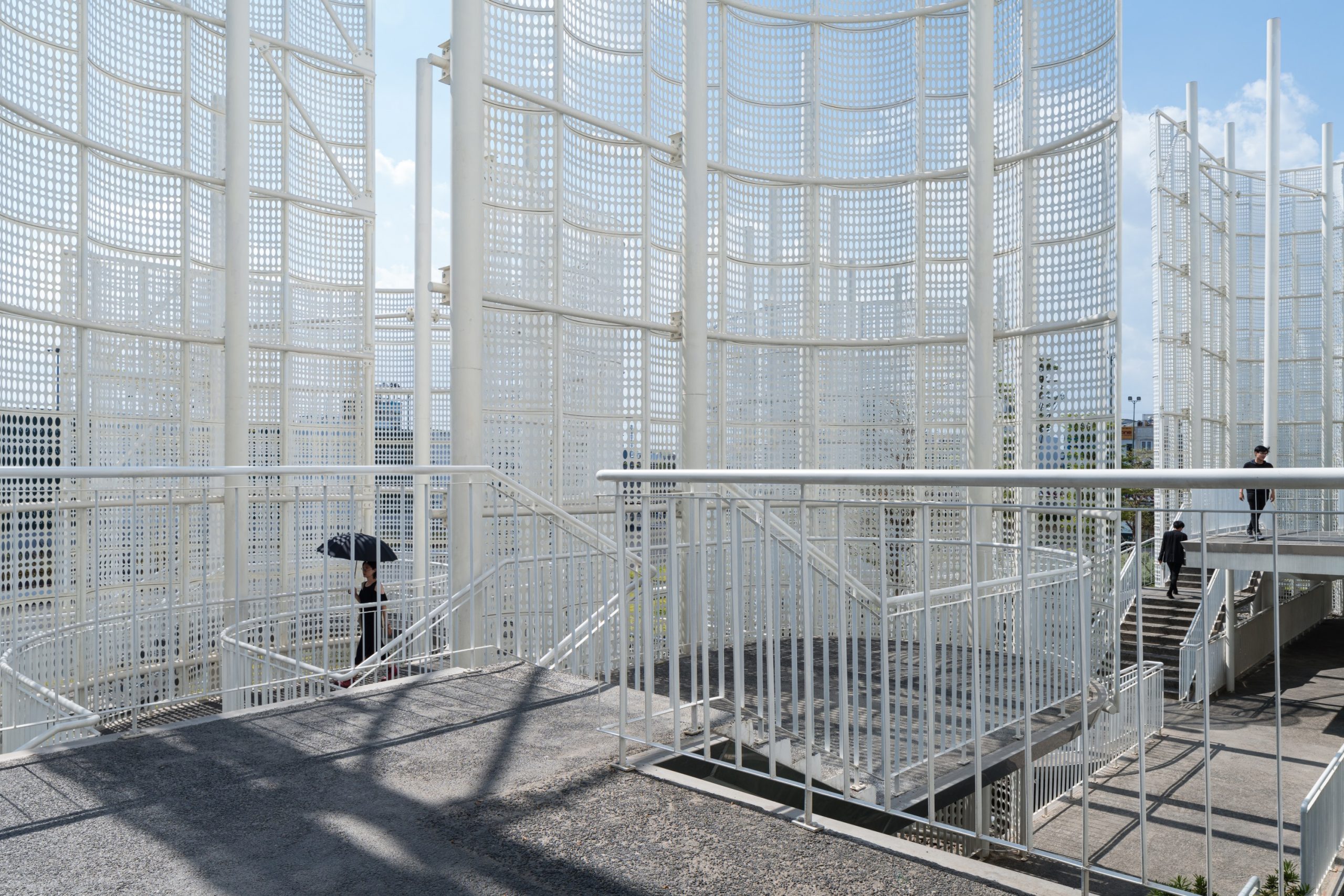
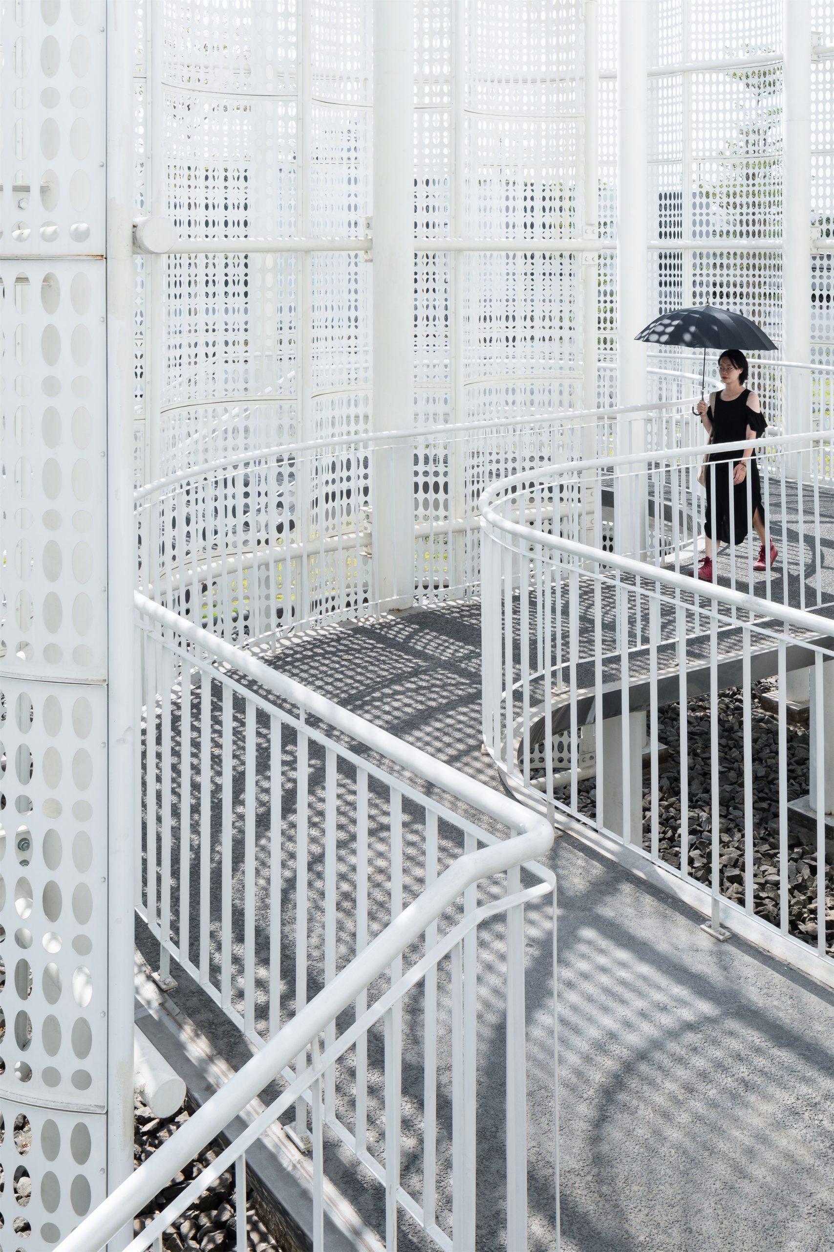
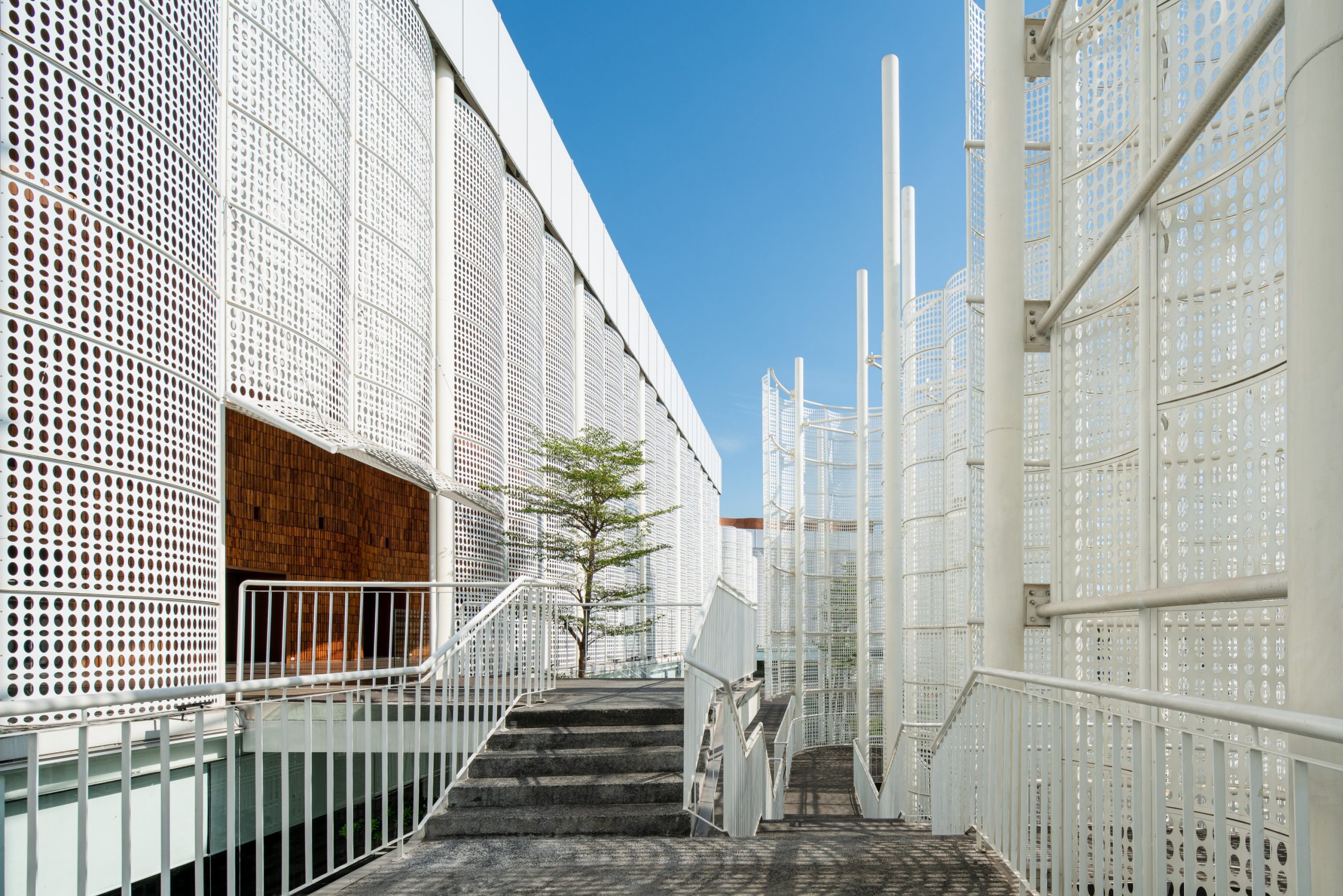
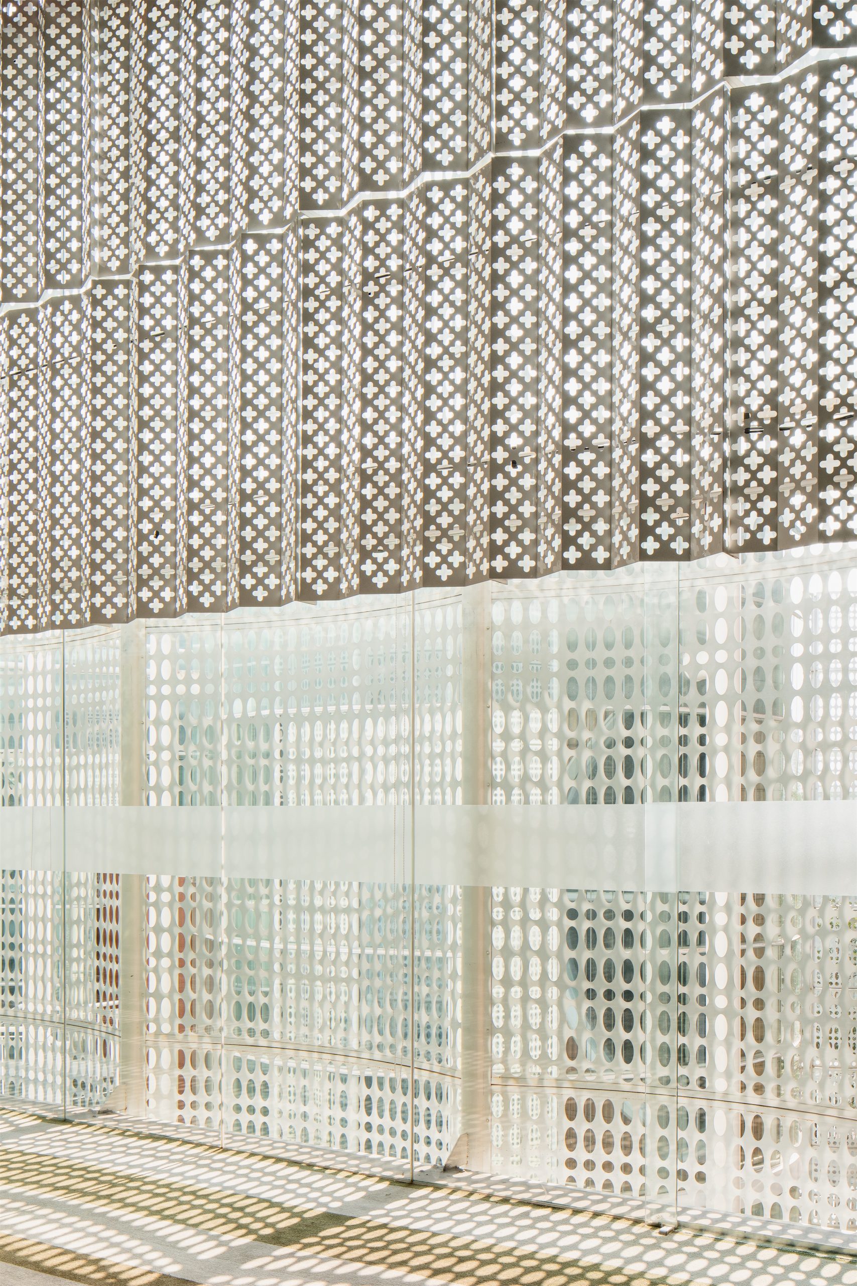
在水平方向的另一侧,涂有白色油漆的穿孔钢卷呈现出“半透明”的外观,再次“欺骗”了人们对实际空间大小的感知。空间不再受物理尺寸的限制,而是受材料给人的刺激印象所影响。会议不仅可以在大厅举行,也可以在室外的庭院举行。“面纱”的雪纺面料塑造了一个私密空间,将活动与喧闹的林荫大道隔开,与此同时它也足够模糊,足以引起外面之人的兴趣。这样的设计意图让通往大厅的旅程变得更加迷人和精致。
On the opposite side, horizontally, the white painted perforated steel rolls give off a “semi-translucent” look on the outside, once again “deceiving” the actual size. Space is no longer restricted by its physical dimensions, but by the stimulating impression of the material. Meetings are accepted not just in the halls, but also outside in the courtyard. The chiffon fabric, of the veil, provides a privacy space and separates the event activities from the noisy background of the boulevard, but it is also blurry enough to pique the interest of those on the exterior. This intention makes the journey to the lobby much more attractive and delicate.
项目名称:面纱
竣工年份:2019年
总建筑面积:20000 m2
项目地点:胡志明市 范文东街
项目/用途/建筑功能:会议中心
工作室名称:
网站:
脸谱网:https://o.waspeak.com/uploads/2024/07/19/meplusarchitect/
联系邮箱:
公司地址:越南胡 志明市 Tan Binh区
2区 宋顺16号
首席建筑师:
首席建筑师邮件:
图片来源:
摄影师网站:http://quangdam.com/vi/