UC Naturel Aroma Lab / Leaping Creative

Brand Spirit — “Circle” as the Core
By taking “translator of natural energy” as the core concept, Leaping Creative helped establish a differential brand image for aromatherapy skincare brand UC Naturel from brand visual identity, product packaging to brand culture were all centered on this concept, to interpret the brand’s spirit from different dimensions.

UC Naturel offers an extensive line of products of the finest quality utilizing plant-based and laboratory-made ingredients proven to provide outstanding results. In addition to visual identity system and aromatherapy products, another key consideration of this project was to figure out how to create a space that people’s mood can be lifted by aroma experience.

Project Video
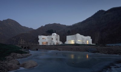
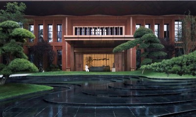
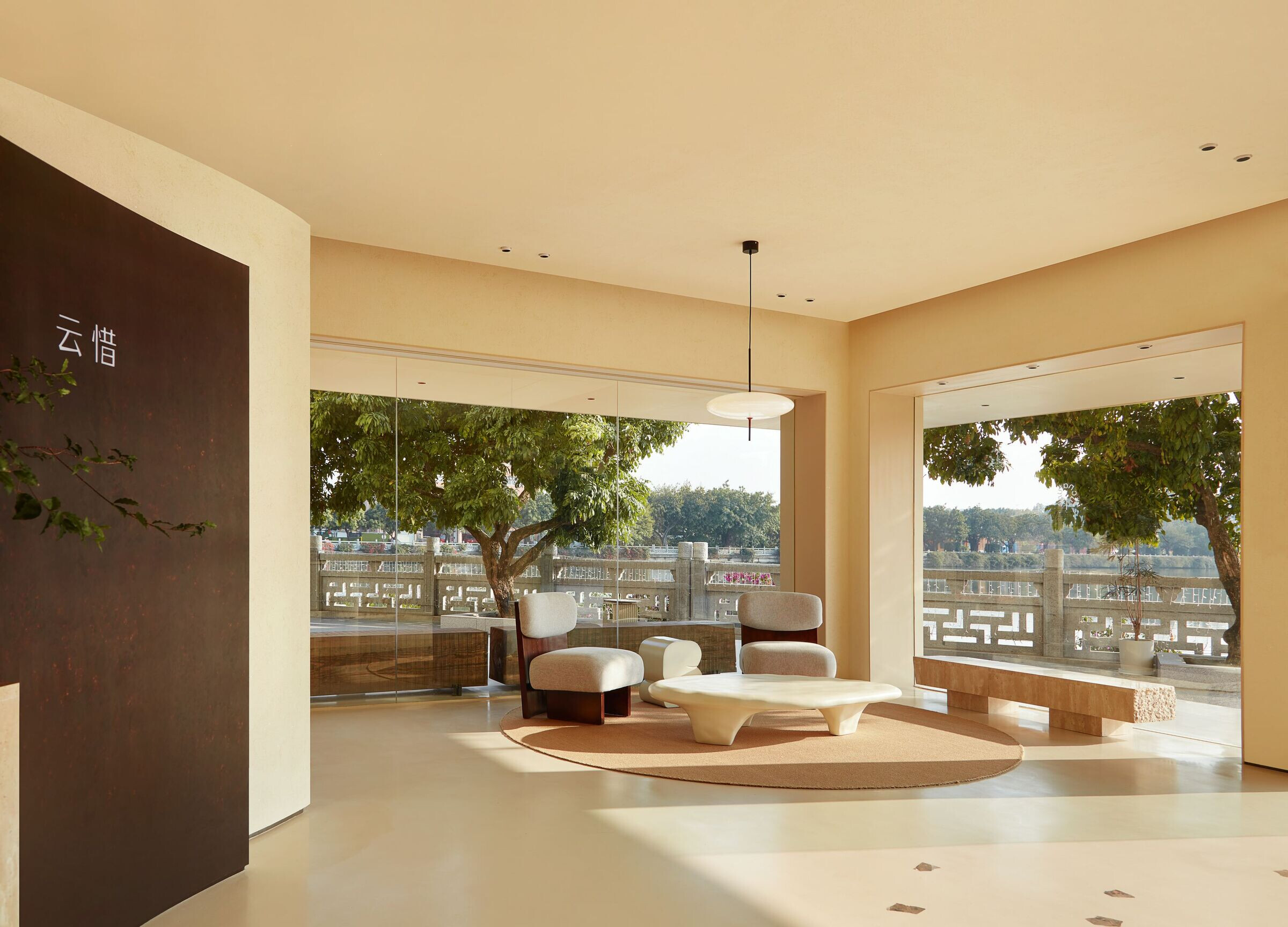
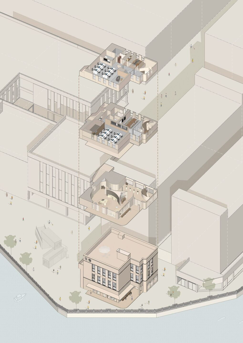
Sitting by the river, the first brick-and-mortar art space of UC Naturel is sited in Times Ark Creative Park in Guangzhou. The project’s site is right at the tip of a peninsula. The brand’s founder hoped to create a quiet, spiritual place that dialogues with nature. The project faces the broad river and a wetland park on the opposite bank. Leaping Creative transformed the original facade of the building into a sandy-toned one. Combined with a light-permeable window, it shows a rustic and serene atmosphere on the riverbank.
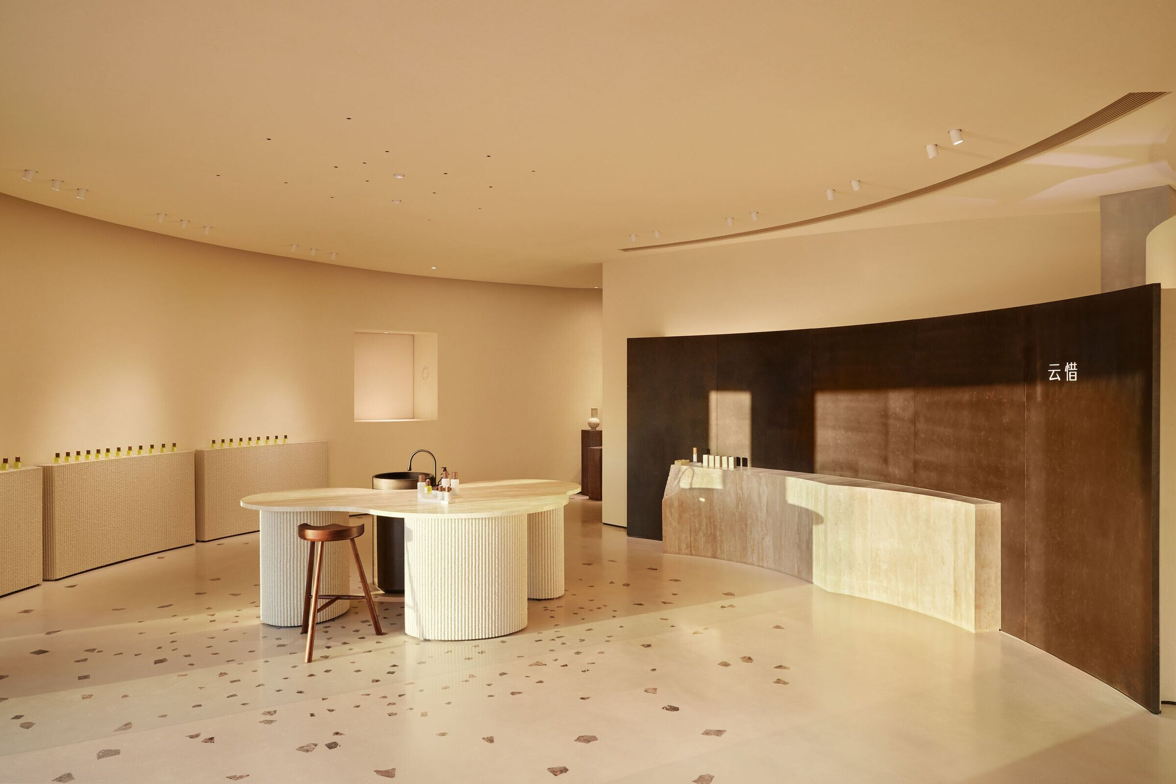
The architecture is divided into three floors. The first floor is a showroom, while the second and third floors are office areas. In this relatively limited space, the showroom not only satisfies basic functions, but also highlights people’s emotional experience.
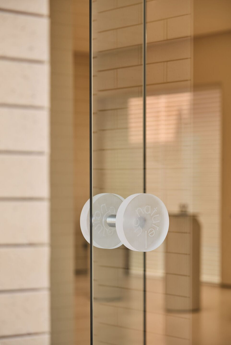
Circle, the core of UC Nature’s brand spirit proposed by Leaping Creative translated from the forms of trees rings, planets, ripples and more, representing the law of the endless cycle of nature. Thus, its constant energy becomes the core spirit of the brand. Circle is incorporated into the brand’s visual identity system as a key element, corresponding to four aspects — ingredients, process, aroma and experience.
The core concept of “circle” is also applied to spatial organization. The layout of space is shaped by a combination of several “circles” of varied sizes. The lightweight curved walls of different heights in the middle create partitions, which enclose the space but not isolate it. Thus, the aroma flows more freely in the space, and visitors can enjoy an
uninterrupted flow of experience.
Spatial layout generation
Brand Space — A “Light-permeable Container”
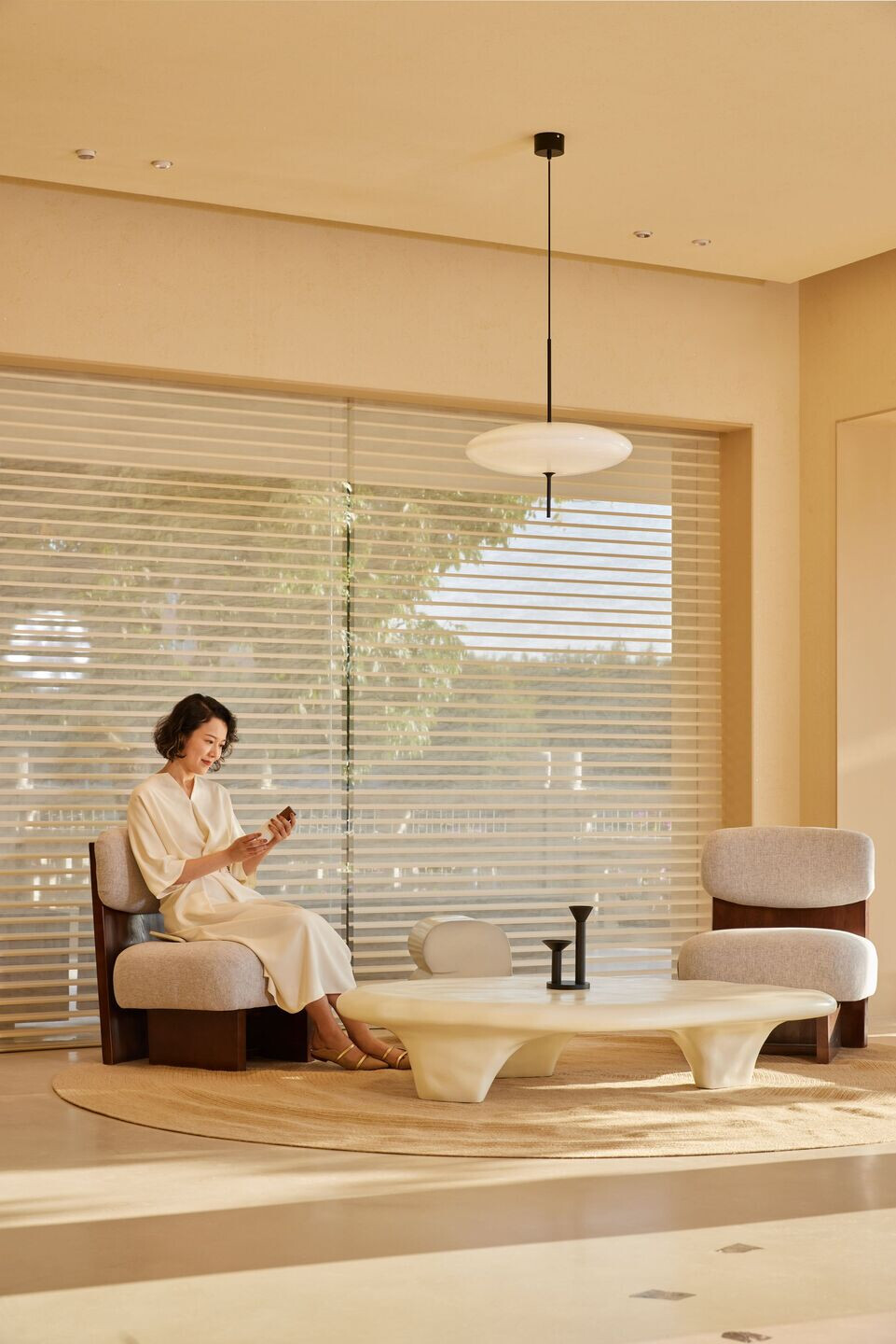
The concept is adopted to create a light-permeable space. The introduction of light enriches the delicate atmosphere in the interior. As the angle, intensity and hue of the sunlight vary during the day, the space is filled with rich changes of light and shadows. At dusk, when the showroom on 1F is lit by the golden sunset, the sparkling river and the dappled tree shadows outdoors are also brought into the space. Nature is therefore “collected” in the space in such a sensual way. When the sun eventually sets and the building facade gradually lights up, the subtle dialogue between daylight, shadow and space is consummated. Like a natural perfumer, the design team interpreted light, water, wood, stone, wind and other elements with different textures, thereby turning the space into a light-permeable container of nature.
Simple and serene Wabi-sabi aesthetics is combined with sustainable materials to create a soft atmosphere in the space. Through creating a concise style space, Leaping Creative intended to encourage visitors to absorb natural energy in a peaceful atmosphere.
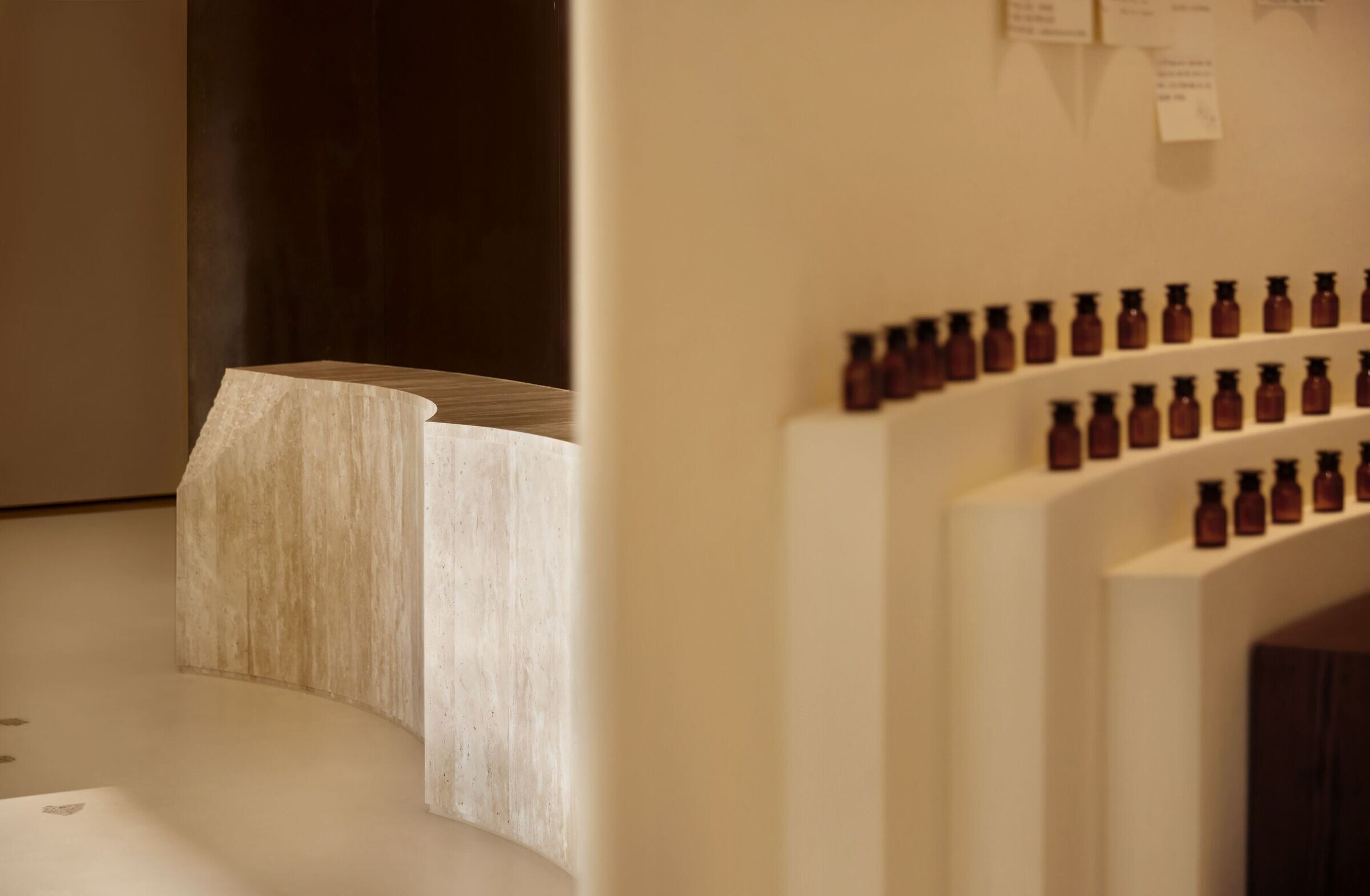
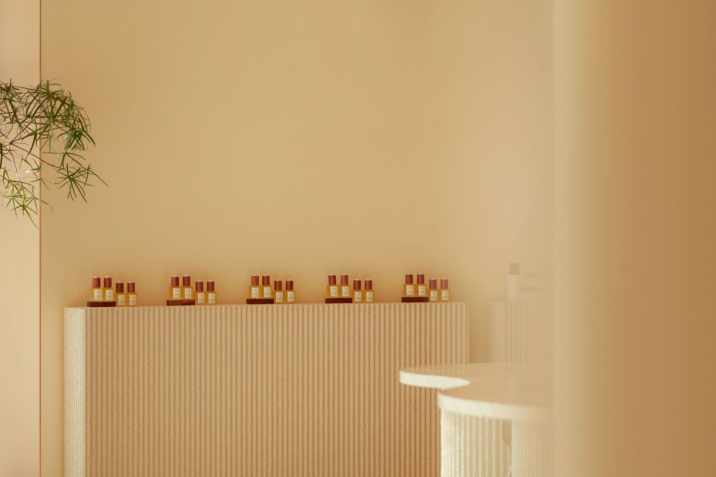
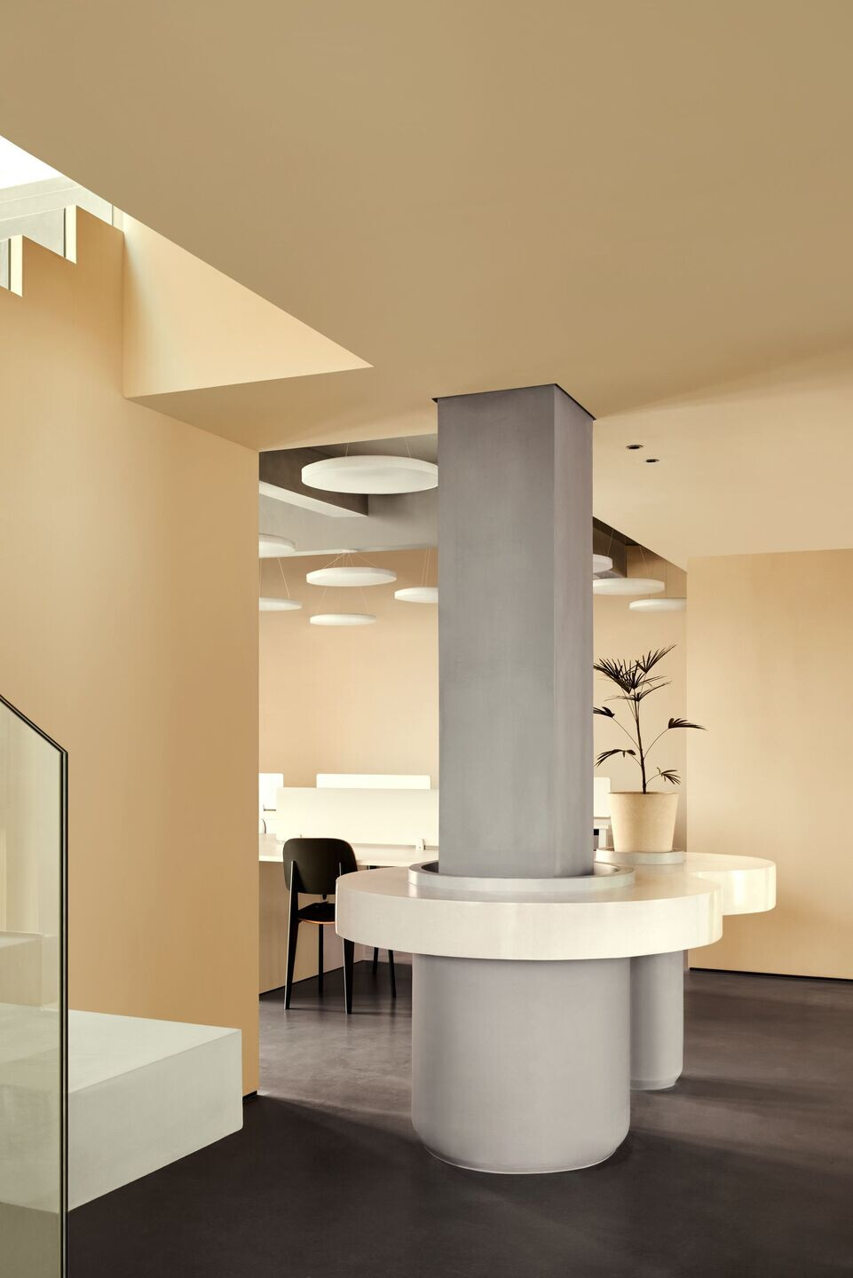
The central island is a core functional area for offering product experience, with a bronze metal logo wall with leaves ornament(by a corrosion way)forming its background. Terrazzo pieces are scattered around the island, which symbolizes the diffusion of aroma and transfer of energy.
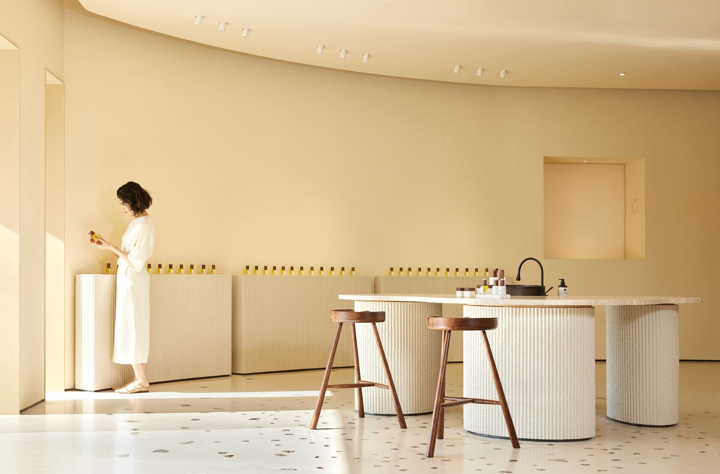
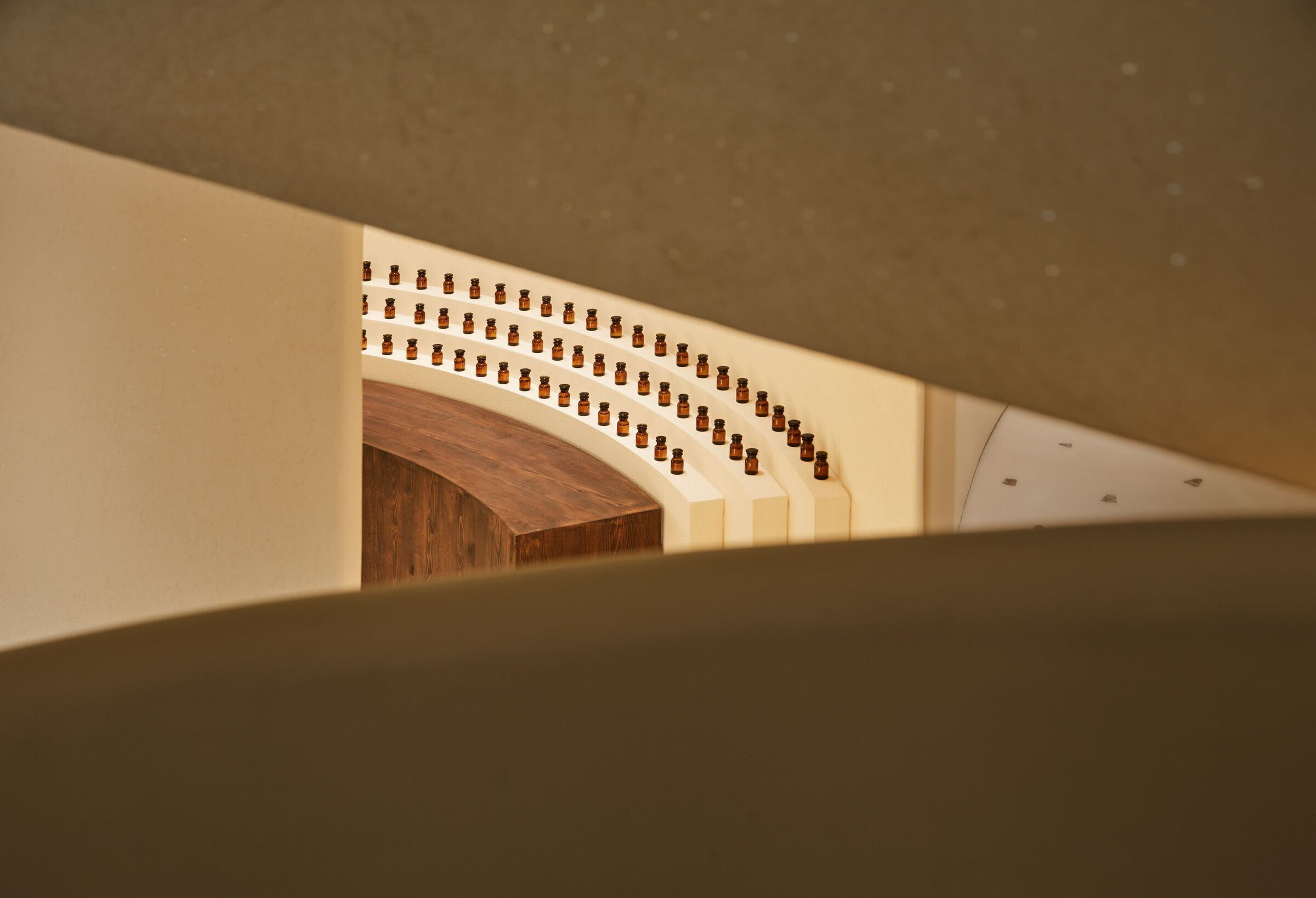
On the other side of the space is the aroma blending area. Formulation manuscripts written by UC Naturel founder are displayed on the background wall, recording the brand’s course of product development and carrying the spirit of the space. The stacked bottles of ingredients and the wooden operating counter recreate a scene of the brand’s product making process, encouraging visitors to experience the floristic aroma and energy.
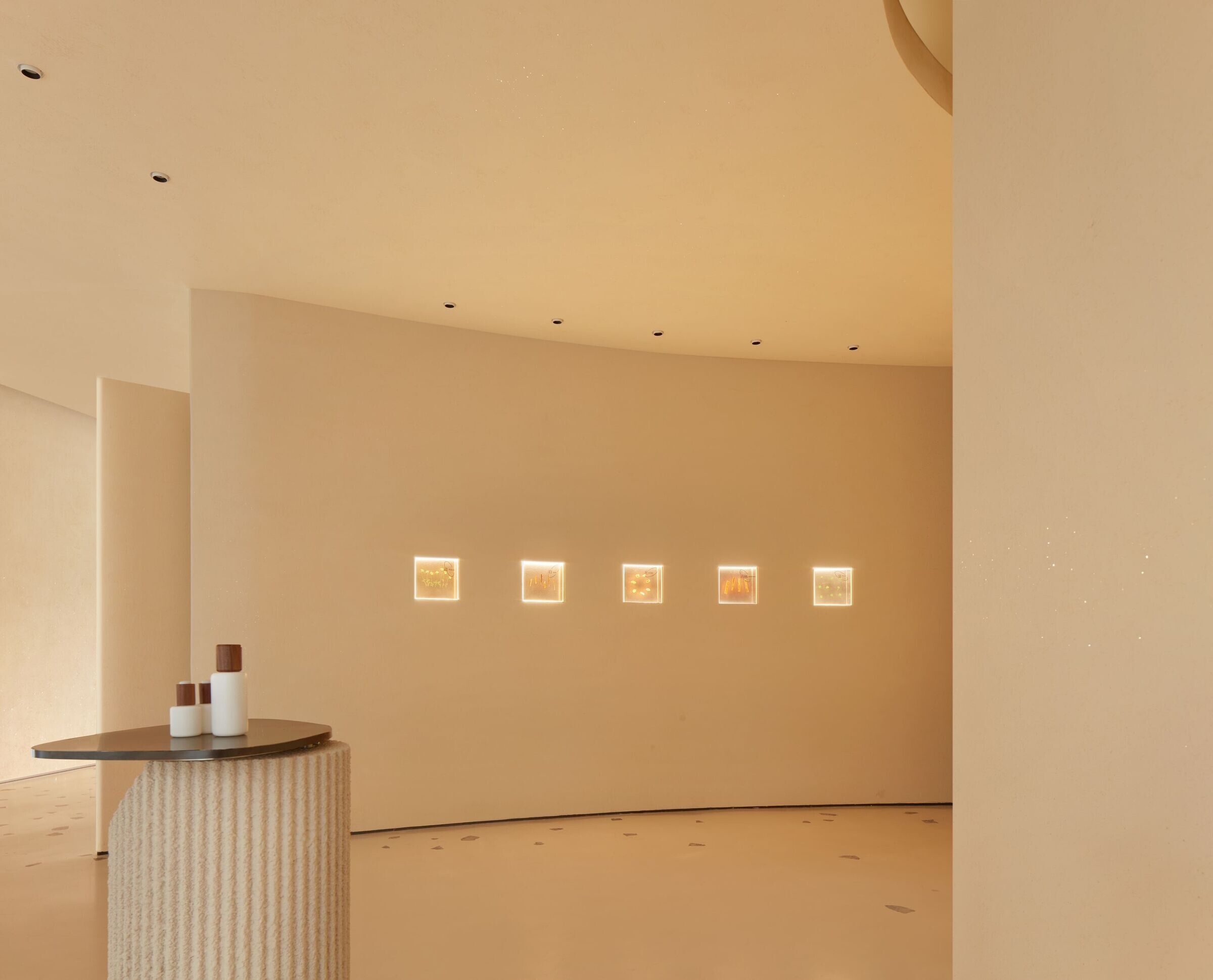
In the early morning, the sunshine also introduced in the back end of the space, with dappled tree shadows flicking on the terrazzo flooring. This shared area can be used for brand-related events or aroma experience activities. Together with other functional areas, it forms a complete experiential circulation and spatial realm.
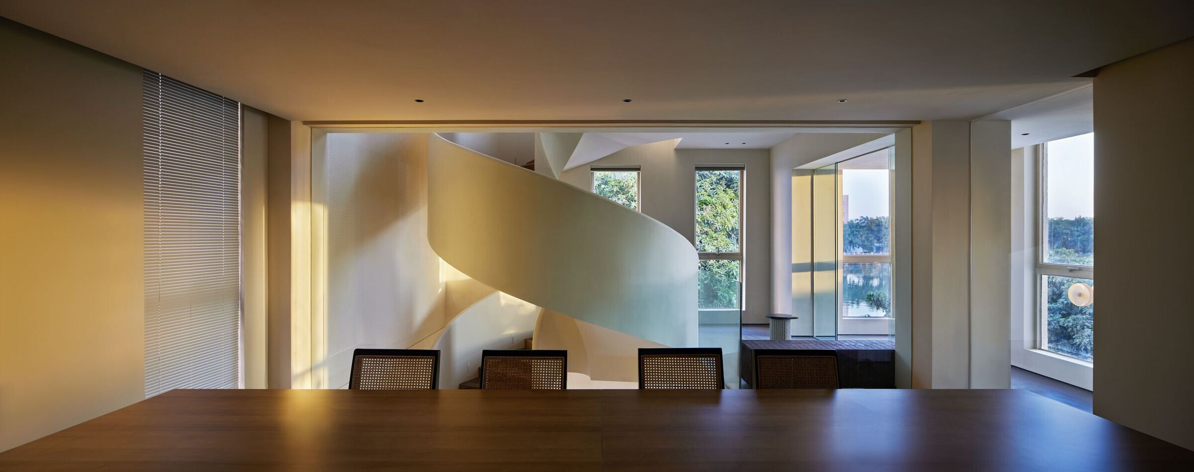
The spiral staircase connecting the three floors is a metaphor of “circle” in the vertical dimension. In response to the brand’s philosophy of nature advocating and sustainability, the staircase is made of wooden beam and ridge components recycled from local renovated old houses. Spiraling up from the first floor, the powerful blocks and elegant curves, combined with dappled lights and the view of the outdoor river, add a romantic ambience to the space.
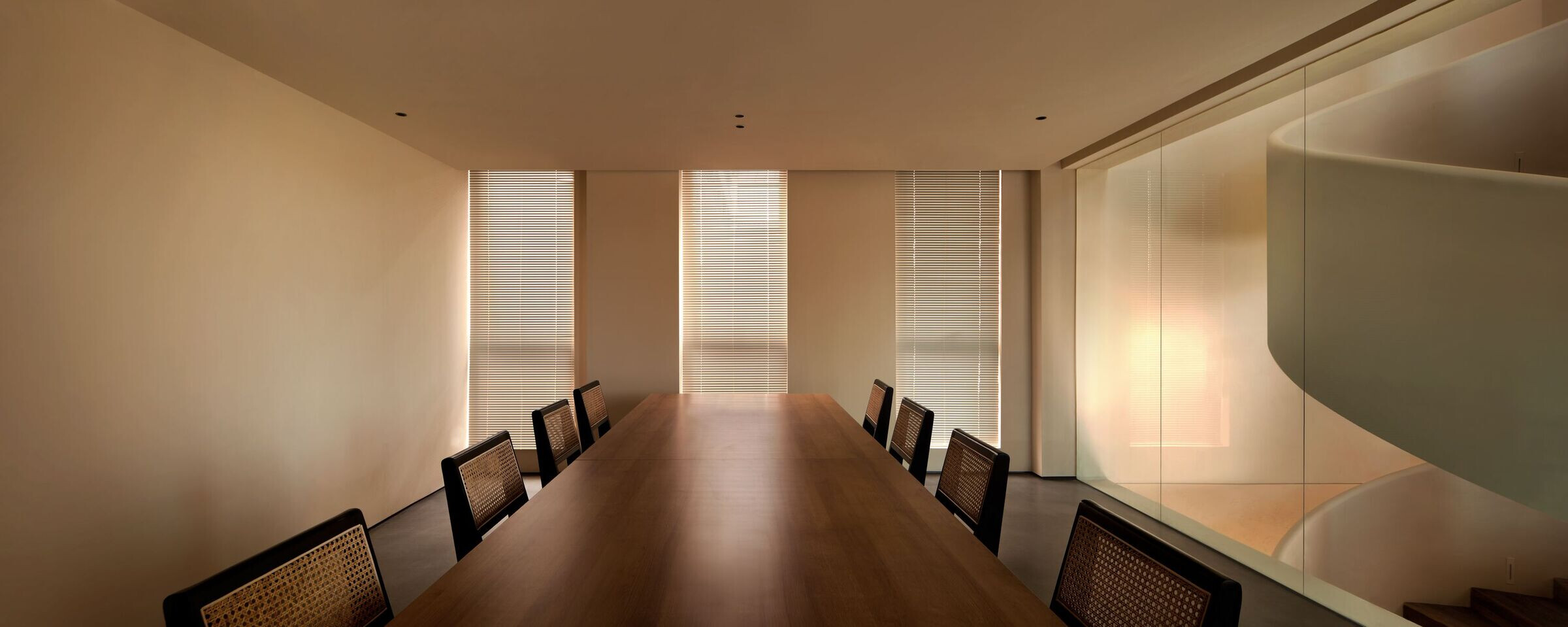
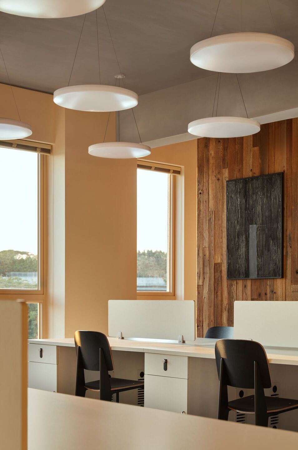
The second and third floors are the brand’s office designed in a rational spatial order, indicating the brand’s rigorous attitude towards product development, material selection and techniques. Daylight and outdoor waterscape are brought into the space, endowing the space with a soft aesthetic. The entire space enjoys the tranquility and dynamism of the peninsula. Leaping Creative also designed a leisure area to encourage visitors to stay outdoor. By enjoying gentle breeze and the interplay of light and shadows, they get their mind healed by nature.
Brand Visual Identity — Emotionally Healing Symbols
As an aromatherapy skincare brand, UC Naturel emphasizes the healing effect of aroma extracted from nature. Based on extensive market research and investigation, Leaping Creative proposed three brand keywords — “connection, nature, growth” for UC Naturel, as well as the core concept of “circle”, which represents the power and vitality of nature. By incorporating those ideas and translating plant forms, the design team expressed products’ ingredients, making process, aroma and experience through visual symbols, to highlight their healing, calming, relaxing and balancing effects.
Leaping Creative visualized the emotionally healing symbols in a two-dimensional vision, representing the healing, calming, relaxing and balancing effects of the products. These symbols were used on the product packages, which were also categorized according to this rule.
Starting from nature and environmental protection, product packaging and gift boxes are designed with the adoption of sustainable materials and techniques. The brand’s values and positioning as a “translator of natural energy” is conveyed from multiple dimensions, triggering deep contemplation about the relationship between human and nature.

Team:
Design director: Zen Zheng
Experience strategy: CC Chen
Spatial designers: Wilson Liu, Penghui Yang
Brand VI and package design: Jiachun Wu, Yinjie Li, Shuling Guan, Zheming Ji, Jiarong Feng, Jiayi Huang
Construction supervisor: Penghui Yang, Liwei Chen, Haoming Li
Project Manager: Yingying Jing
Copyright © 2022 WaSpeak.com, Shanghai & Melbourne, All Rights Reserved.
Privacy. Terms of Use.ICP 2022000905
 编辑推荐
编辑推荐 新锐设计
新锐设计