
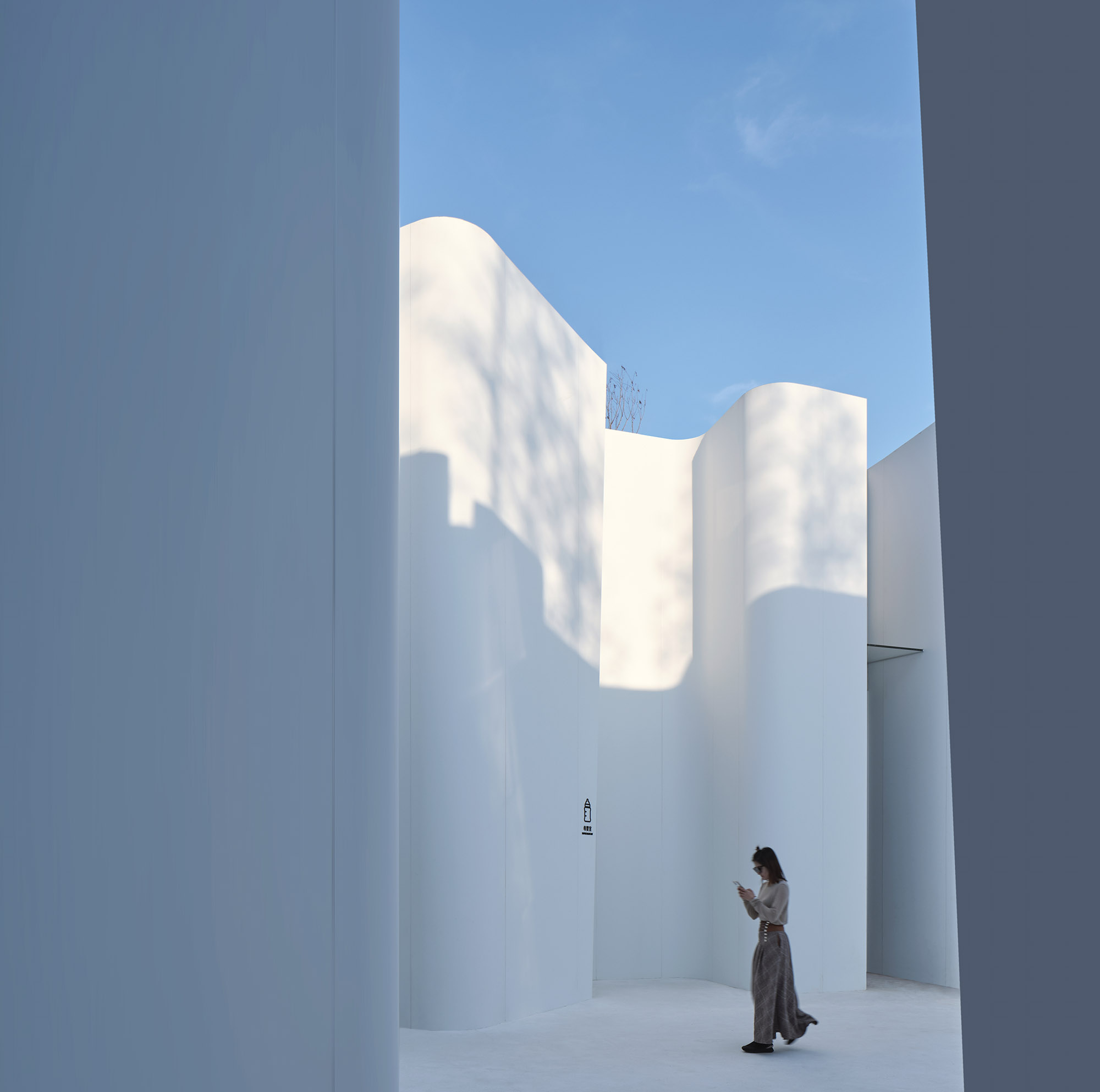
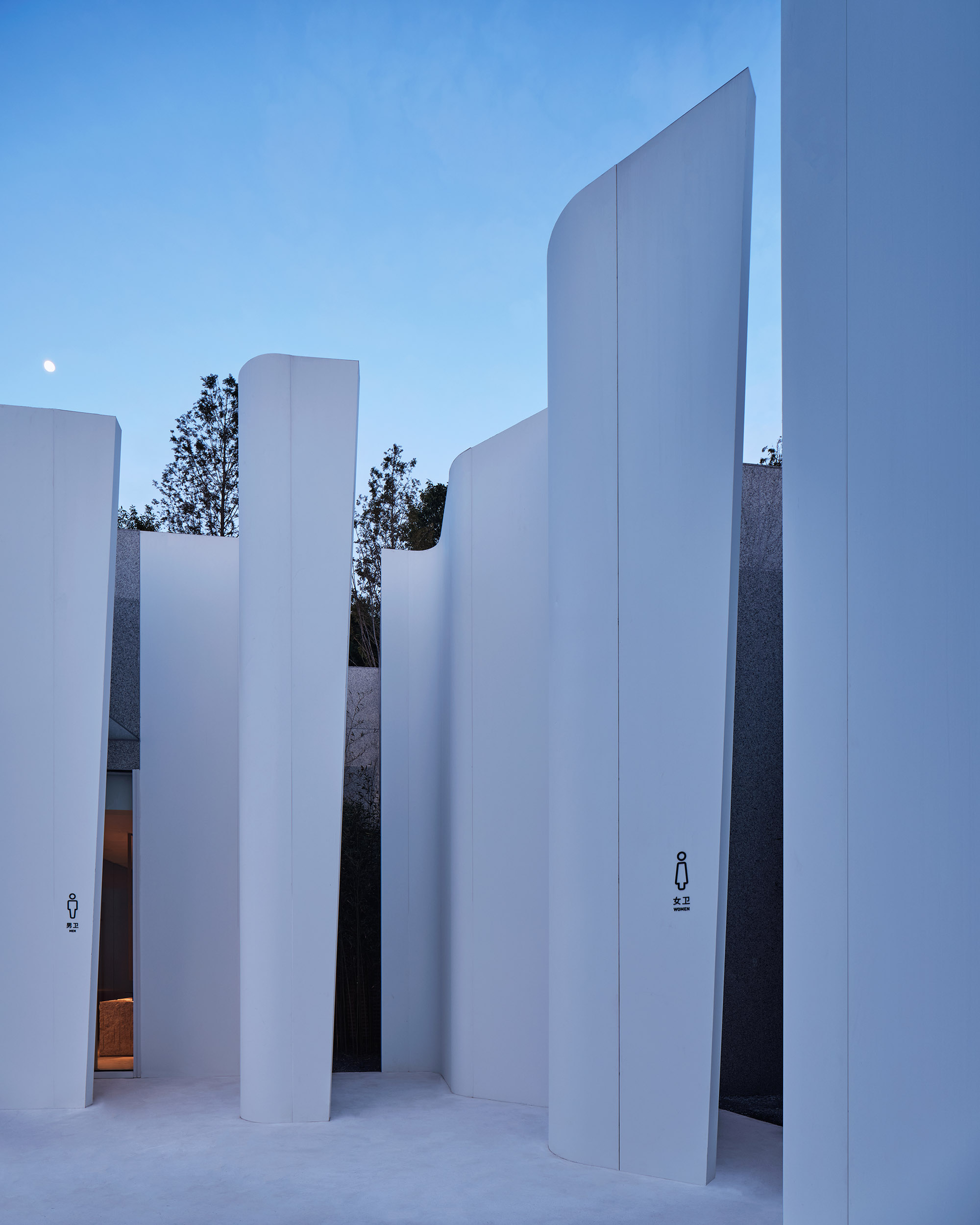
▲明快干净的白色切面While cut-surfaces which are bright and clean
阿朵小镇这个广场片区的目光被三个主题建筑占据,没有给公共卫生间留下一个"独立"空间。业主最初只是需要这个功能,它可以出现在任何一个建筑内部,或者与车库架空层合并在一起。
In Atour Village town square, the sight is captured by three themed buildings, leaving no independent space for the public restroom. Initially the owner just wanted this feature, and it could appear inside any building, or be incorporated with the garage overhead.
多数建设的出发点是效率,分清楚重要和次要、主角和配景,然后来分配成本和设计精力,这也是我们担心的问题。因为维护成本和选址隐蔽,多数景区卫生间缺少明快干净的体验,我们在一些景区调查数据中发现,游客对于卫生间的投诉仅次于门票性价比,公共卫生间的建设、管理是城市和文旅景区的一个被忽略的BUG,建筑师希望在这里能解决这一问题。
The starting point of most constructions is efficiency, to distinguish the majority and minority, the protagonist and the background, and then allocate the cost and design work force , which was also a problem we were worried about. Because of the maintenance cost and site itself, most of the scenic bathrooms lack a bright and clean experience. However, we found in the survey data of some scenic spots that tourists' complaints about restrooms are second only to the cost-effectiveness of tickets. The construction and management of public restrooms is a neglected bug in cities and cultural tourism scenic spots. We hope to solve this problem here.
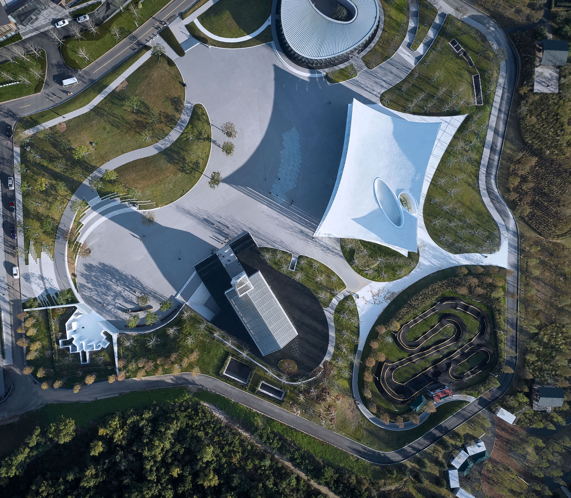
▲卫生间正对广场,辨识度好The public restroom is facing the square, which is very recognizable
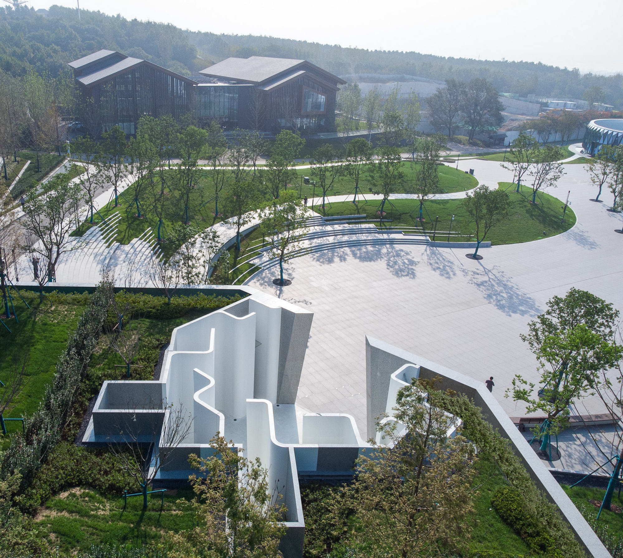
▲崖下的卫生间消隐在树林中The restroom on the foot of the cliff is hidden in the woods
选址Location Selection
步行街和广场之间有个7米高断崖,建筑师最后将项目选址在崖下,让卫生间院子开口直面向广场,这样拥有显著的辨识性。从上部的步行街看过来,树林中有一个白色面的深坑,这是建筑的顶部,顶部的覆土和植物起到了很好的过度。同时,避免街和广场之间直接大台阶的降落。
There is a 7-meter-high cliff between the pedestrian street and the square. The architect eventually chose the site at the foot of the cliff, so that the opening of the bathroom yard faces the square, which is remarkably recognizable. From the upper pedestrian street to see, there is a white deep pit in the woods, which is the top of the building. The earth-covered top and plants together play a good transition, and at the same time avoid the direct landing of large steps between the street and the square.
院子The Courtyard
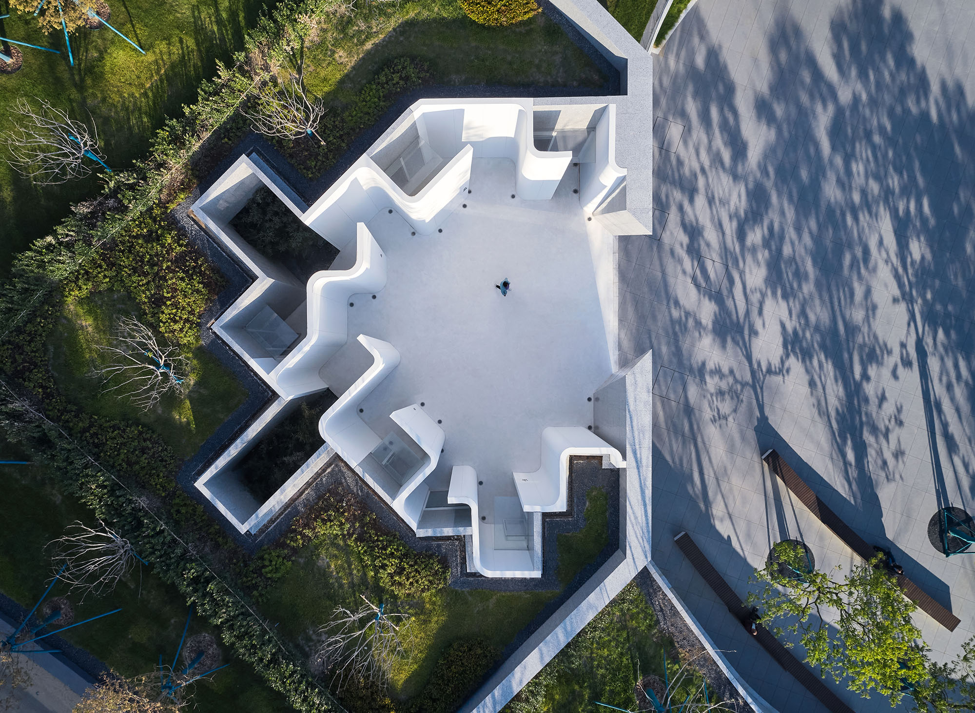
建筑师用一个院子完成与大广场的连接,让卫生间的隐私性和辨识性得到平衡。这个封闭的院子像一个山坡上的深坑,游客在进入到这里才能看到这个建筑的样子。建筑之间还嵌有两个方形的小院,让使用者视觉和空间采光通风保持良好。
The architect used a courtyard to complete the connection with the main square, so that the privacy and identification of the bathroom can be balanced. This enclosed yard is like a deep pit on the hillside, and visitors can only see the building after entering here. There are also two square courtyards embedded between the buildings to keep users' vision and space well-lighted and ventilated.
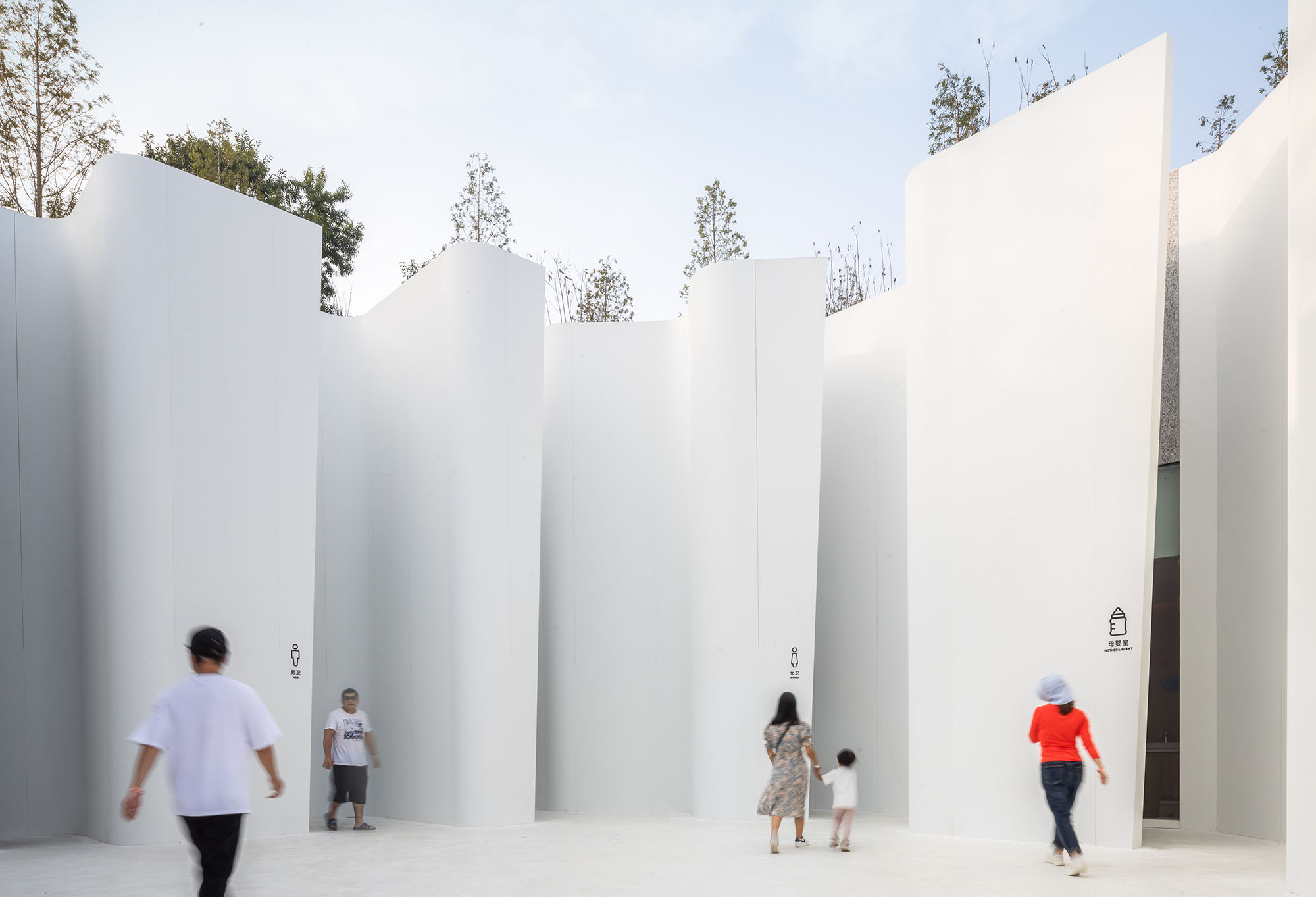
▲入口被隐藏在白色片墙后The entrance is hidden behind the white wall slices
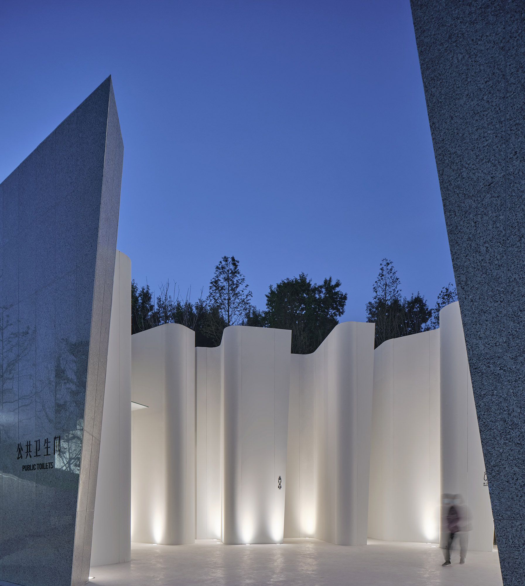
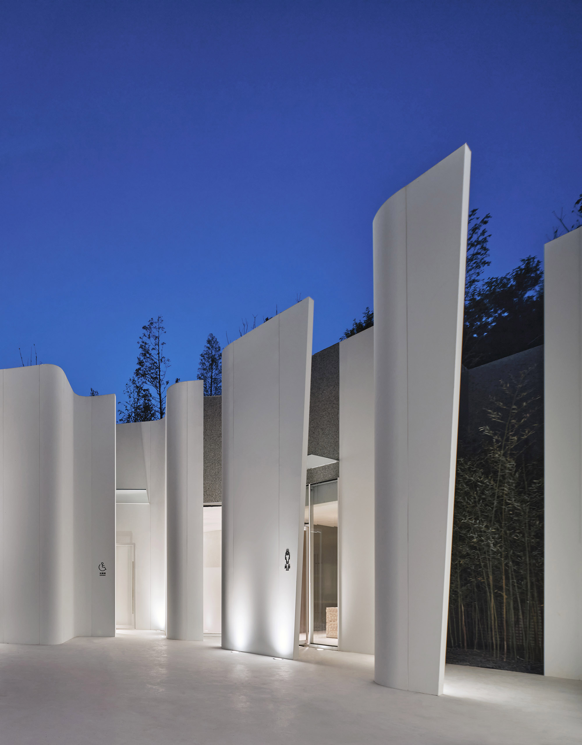
▲光滑曲面与粗野的自然Smooth curved-surfaces and rough nature
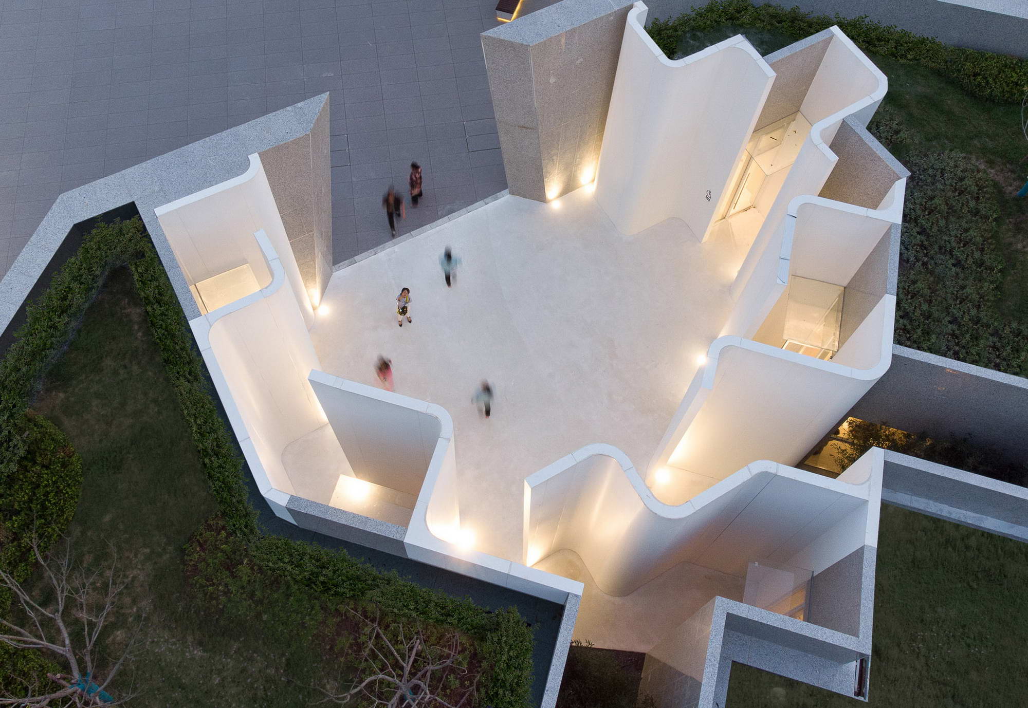
▲夜幕之下的光从“洞口”溢出The light overflows from the “cave” when the dark night falls
立面Façade
建筑师将所有门和窗都隐在弧墙后,四个功能入口用标识导航,立面采用弧形的白色复合铝板竖向密拼,7米高的整体板,非常适用这个单曲面。事实上这是我们最重要的出发点,在粗野的外壁和丛林覆盖之下,游客进入到一个削切打磨出来的采石坑中,阳光洒下来,明媚而洁净,表面的无缝材质加深了这种体验。
The architect hides all doors and windows behind the arc wall, the four functional entrances are navigated with signs, and the façade uses arc-shaped white composite aluminum panels, which are vertically stitched together, and the 7-meter-high integral panel is very suitable for this single surface. In fact, this is our most important starting point. Under the rough outer walls and jungle cover, visitors enter a quarry pit that is being cut and polished. The sunshine pours down, which is bright and clean, and the seamless texture of the surface enlarges this experience.
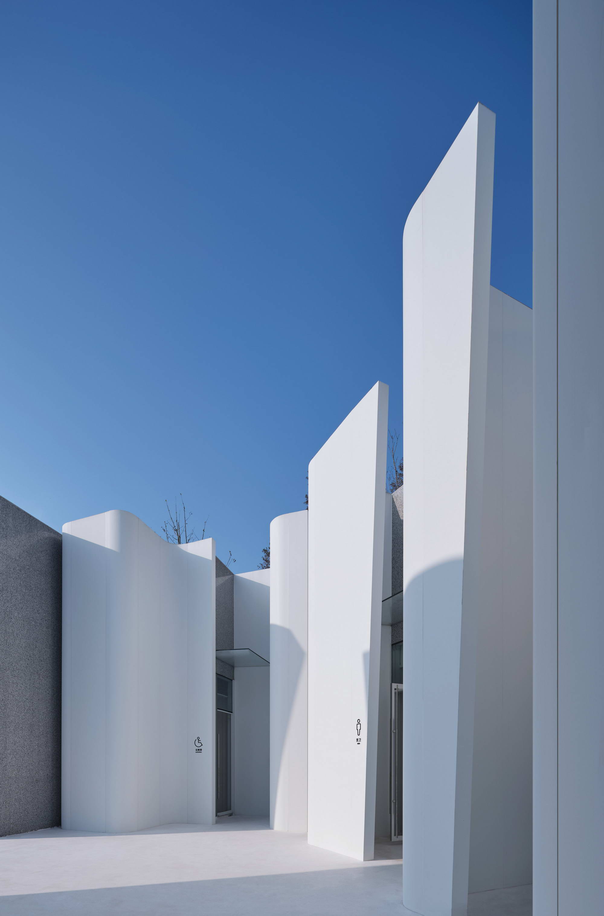
▲一块复合铝板做成弧墙A piece of clad aluminum panel being made into curved-wall
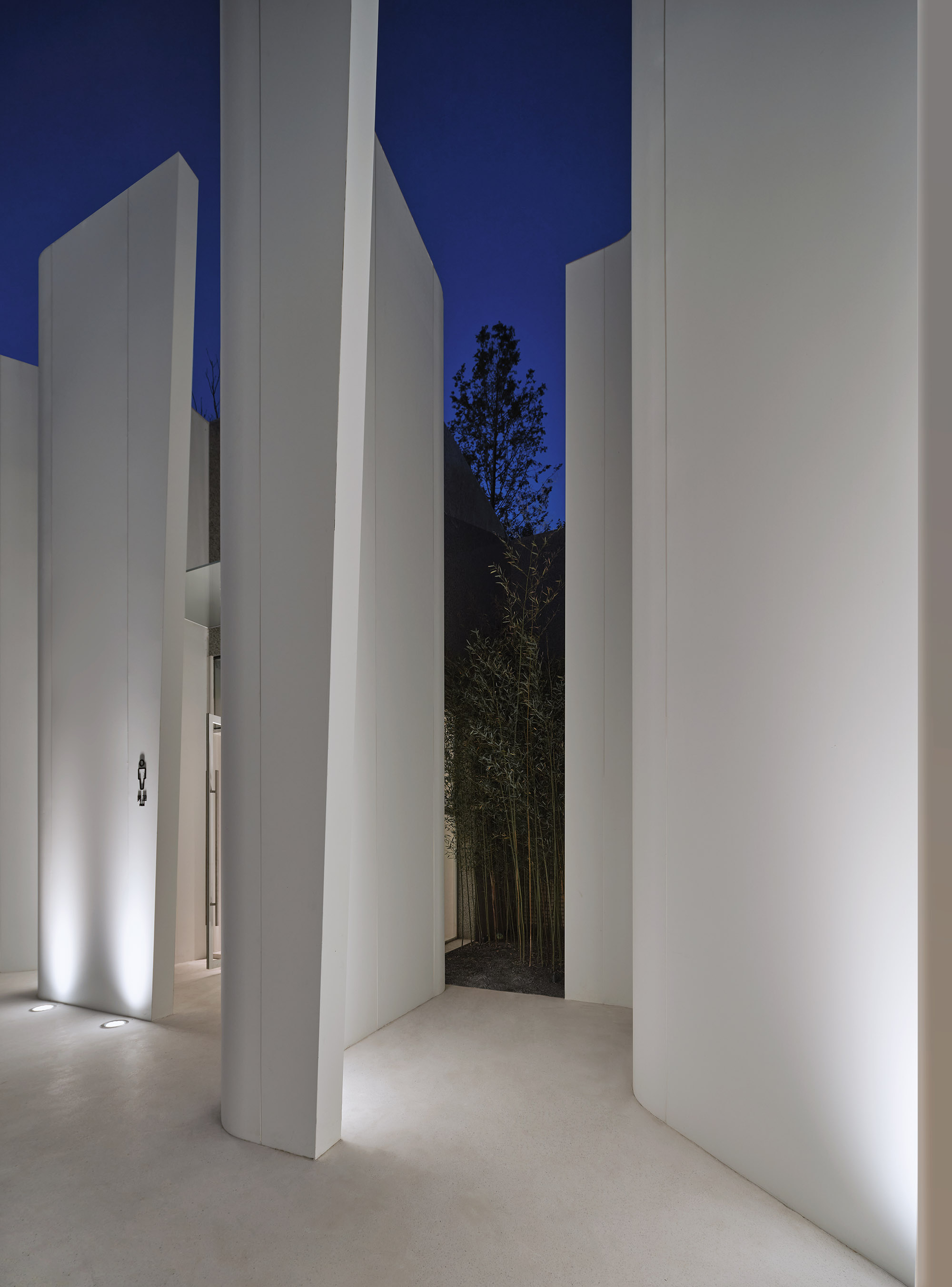
▲入口的弧面与植物相映The curved-surface at the entrance and the plants form a contrast
功能Functions
虽然业主并没有约定卫生间面积,建筑师还是保持了克制和集约,避免价值正义的一些冗余出现,设计重点加入了母婴室和第三洗手间,以及空调的隐蔽处理。由于院子正面看不到任何玻璃窗,采光都被安排在弧墙的阴面和方形小院子里。
Although there was no agreement on the area of the bathroom with the client, the architect still maintained restraint and intensiveness to avoid some redundancy of value justice. The design focused on adding the infant room and the third restroom, as well as the concealed treatment of air conditioners. Since no glass windows can be seen in the front of the courtyard, the lighting is arranged on the shady side of the arc wall and in the small square courtyards.
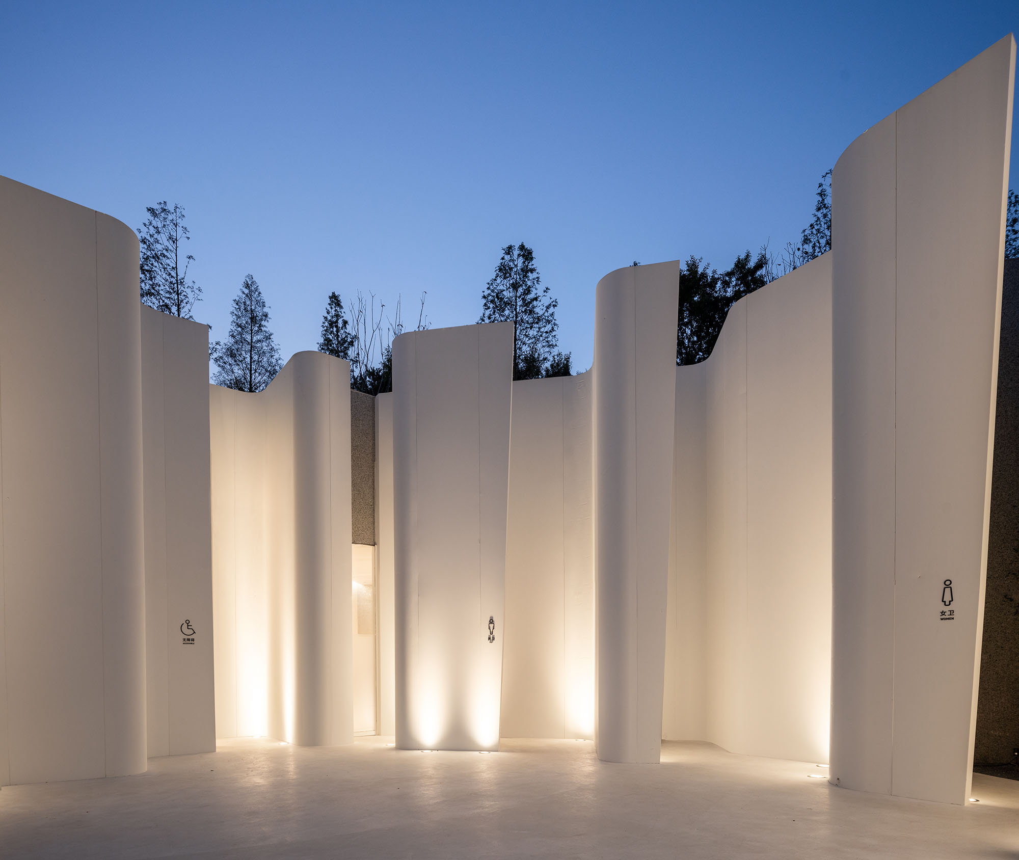
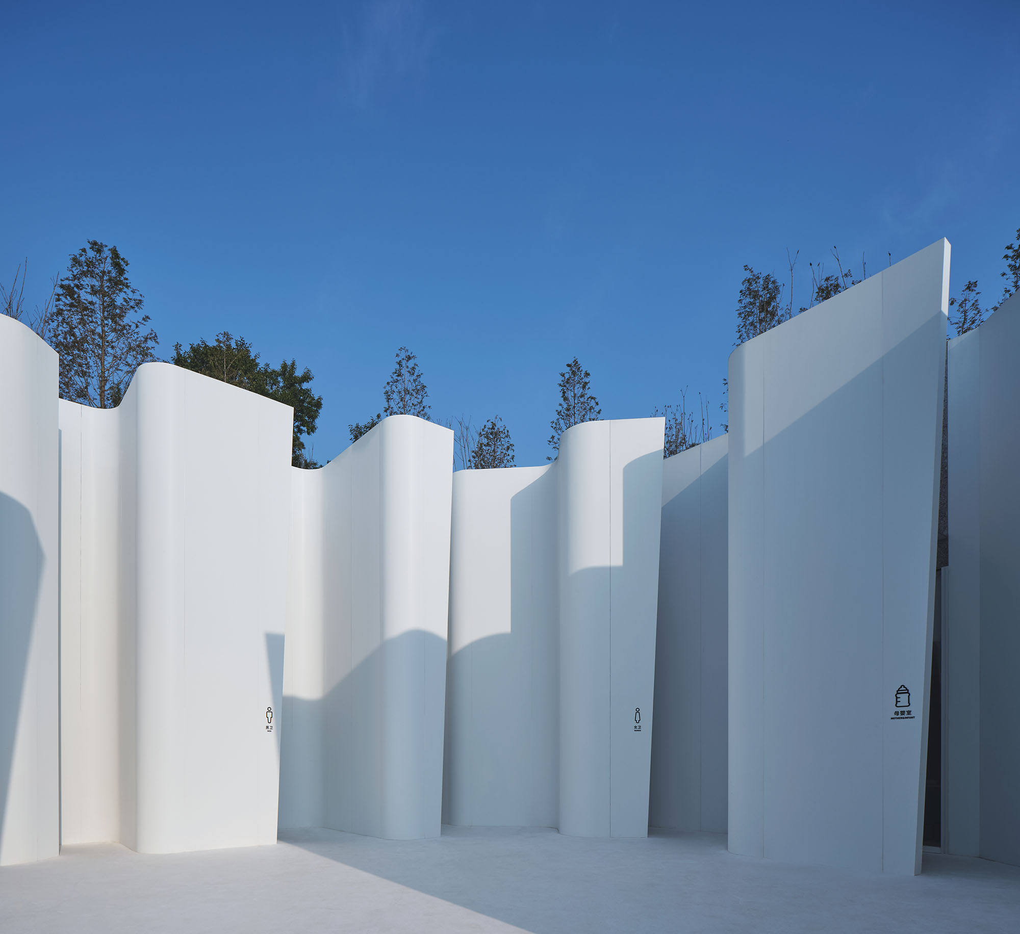
▲不同时间和光线下,卫生间的呈现状态The appearance of the restroom in different time and light
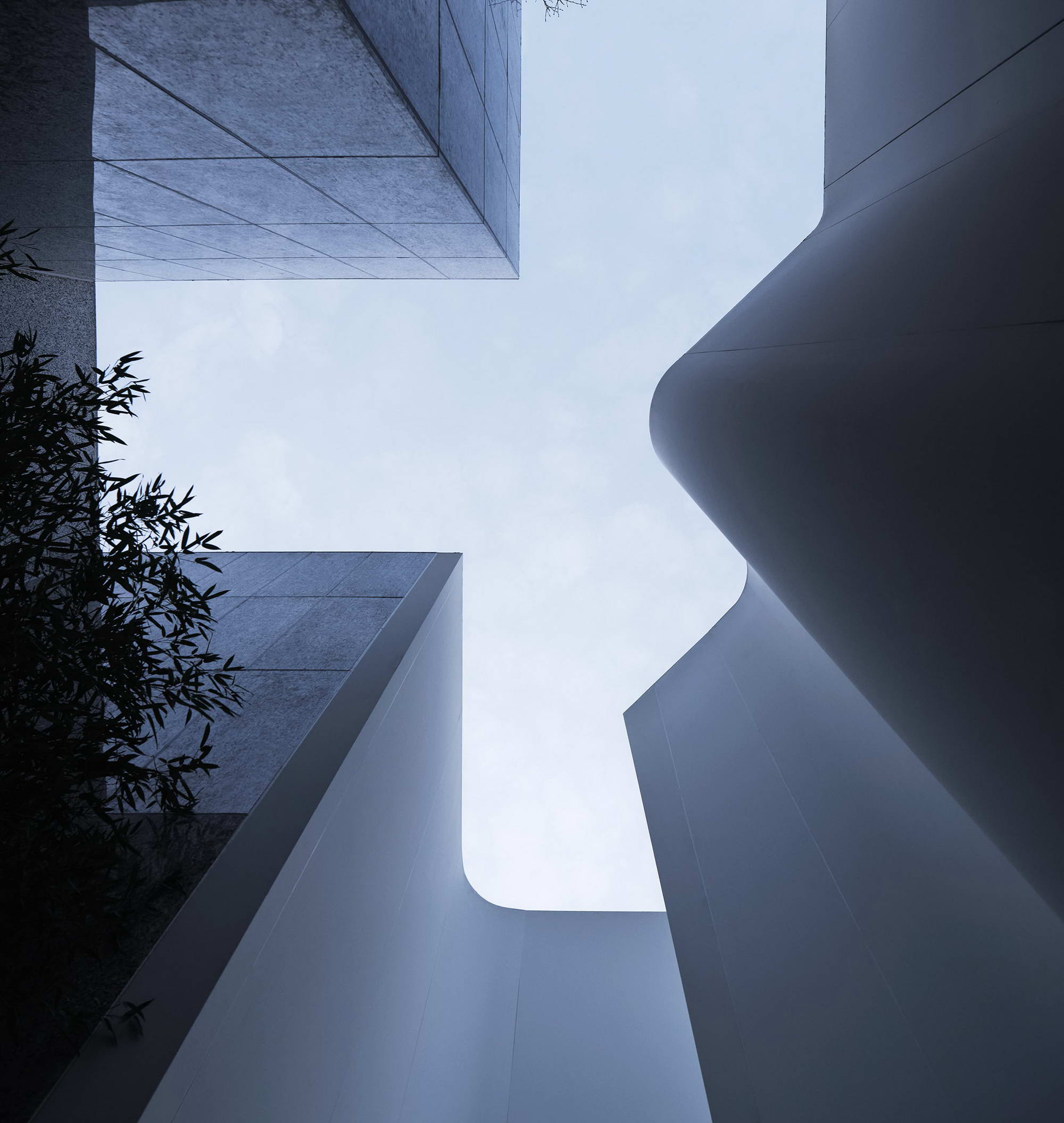
▲墙面与天空形成的图底关系The figure-ground relationship between the wall and sky
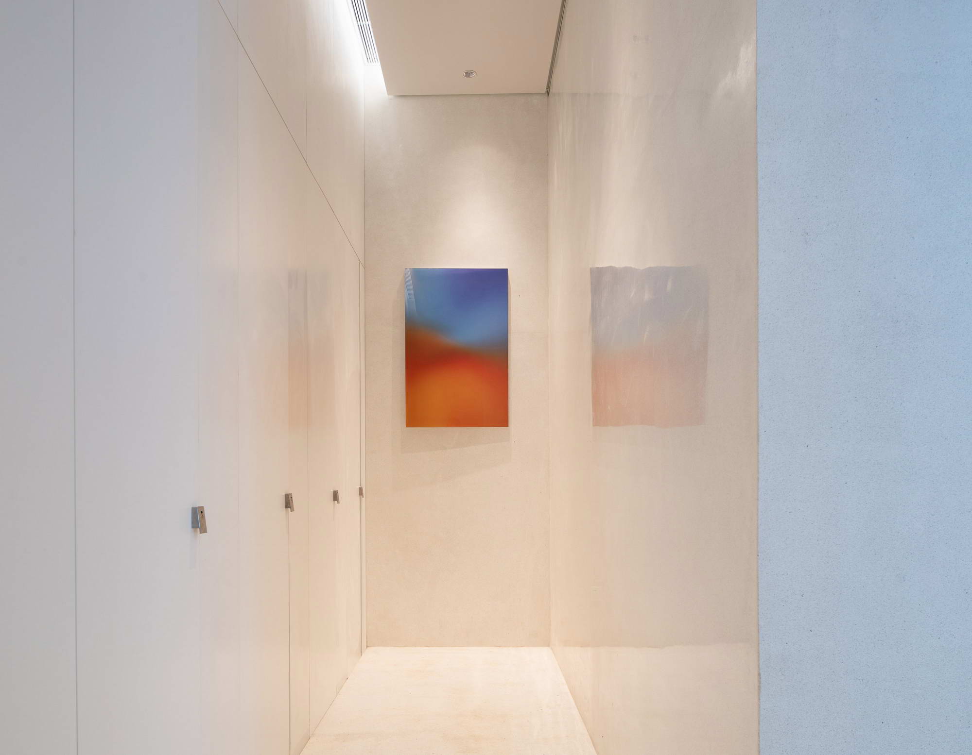
▲温和的室内The gentle feeling from the interior
过程The Process
建筑场景设计的早期想法来自民间赌石的场景。就像风化表皮的毛石被切出平滑的切口,游客从粗野的自然环境突然进入到一个精致工业感的坑洞里,瞬间“哇”的这种反差的惊喜感是我们想在这里创造的。在整体理性克制之下,有一点浪漫的小意外,这些构成了我们生活的美好感。
The early idea of the architectural scene design came from the stone gambling game, like the rough cut out of the weathered stone skin, the tourists suddenly enter into a pothole with a delicate industrial sense from the rough natural environment, with this moment of the "wow", this contrast is what we want to create here. Under the overall rational restraint, there is a little romantic surprise, which constitute the beauty of our life.
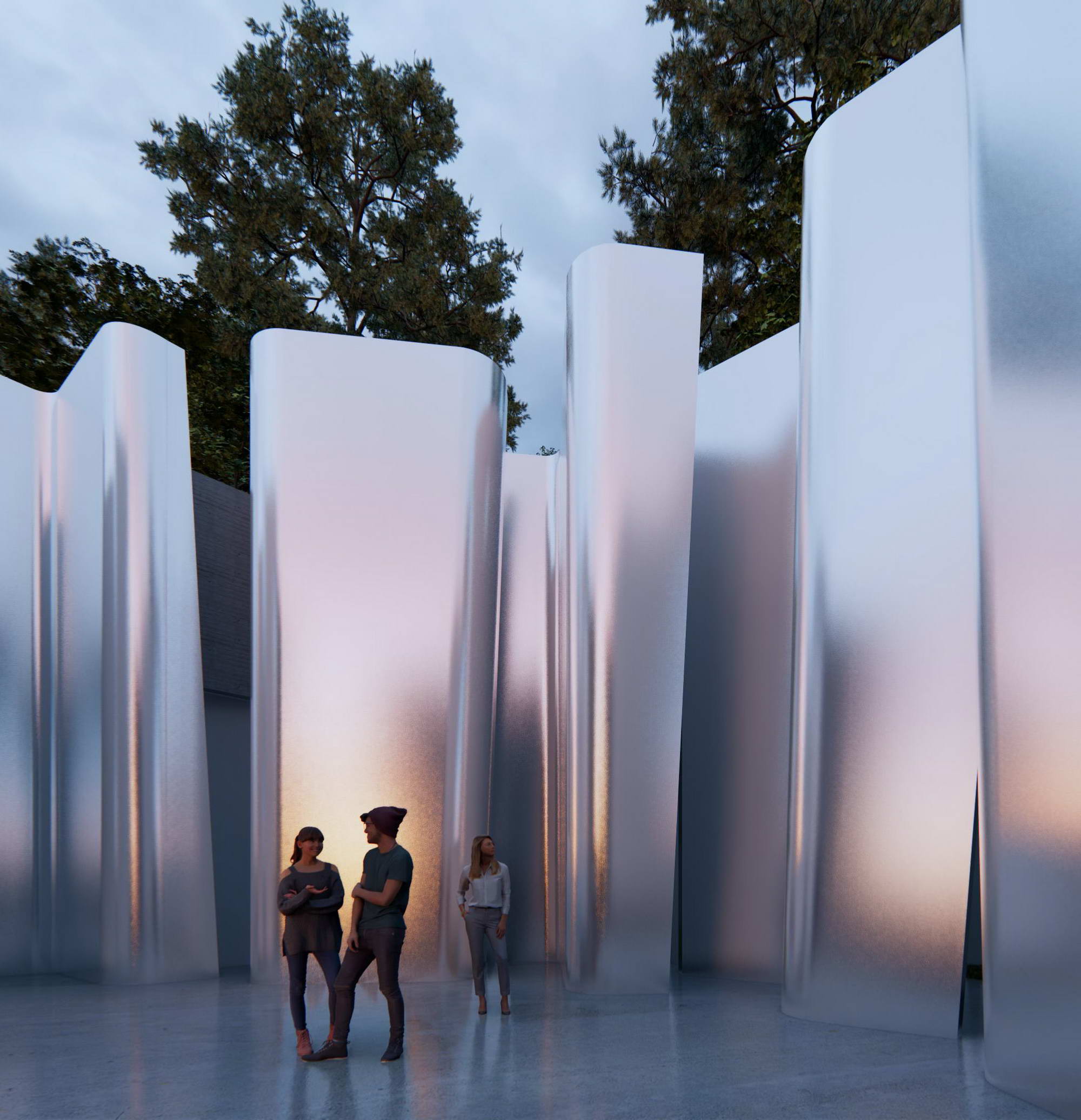
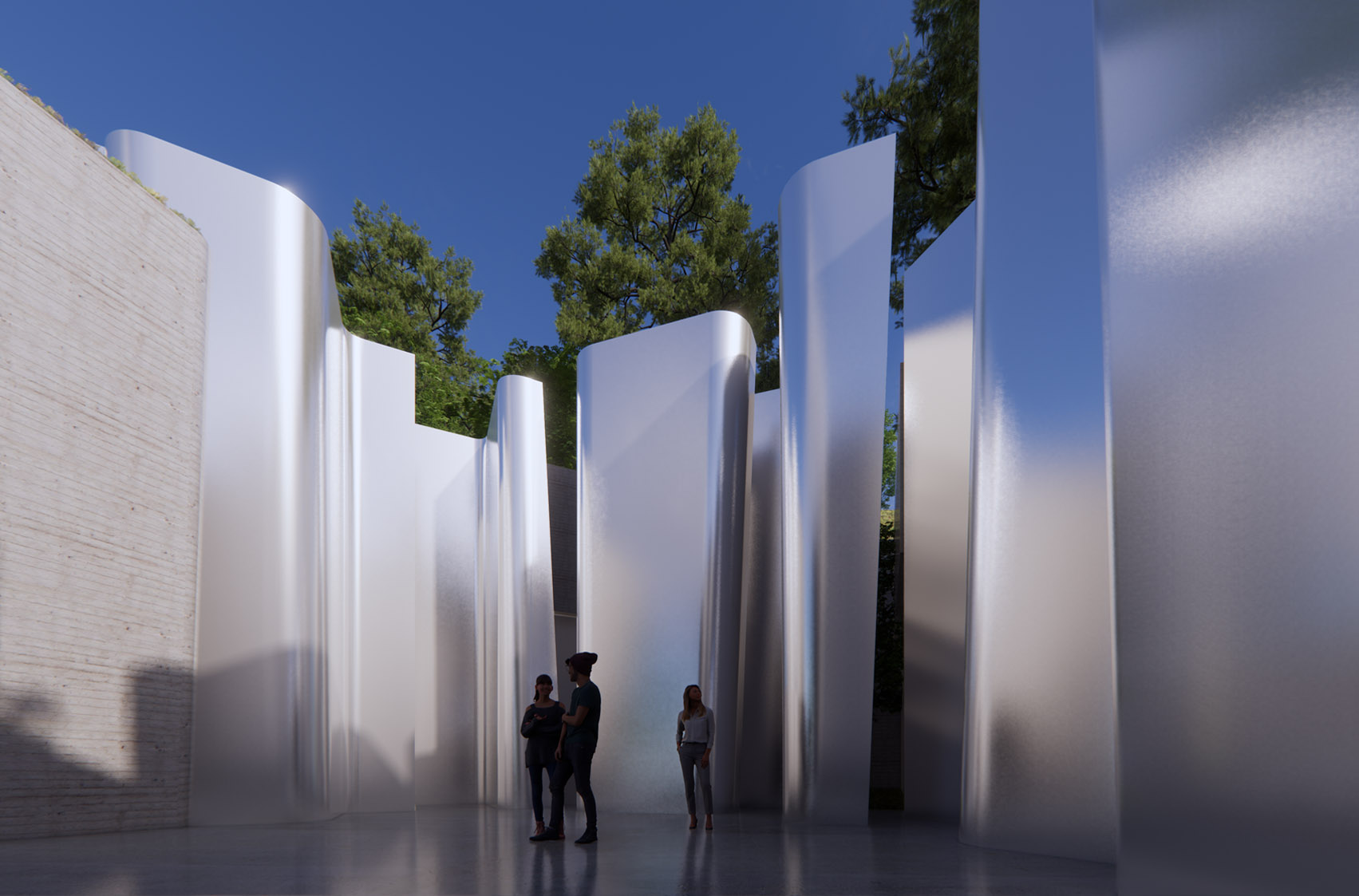
▲设计方案初期采用了哑光金属面做出的切割肌理We used matte metal color to make cutting texture in the initial phase of the schematic design
我们方案设计的材料一直是哑光亮面,在现场做了打板,用钢板拼接焊缝、打磨,再做光面处理。当时还没完成,业主决策人来看后投了否决票。在工期和成本下,我们也对这材料产生了动摇,后来换成白色复合铝板,这是另外一种效果了。意外的是,建成后不少人认为这比亮面的效果好。这是因为建筑师视角和受众的天然不同?
The material of our schematic design has always been a matte finish. We made a sample board on the site, spliced the weld with steel plate, polished it, and then made a smooth surface. The client did not agree with the effect when it was not yet completed. Due to the cost and time limit, we also hesitated with this material, and later replaced it with a white composite aluminum plate. This has brought another effect. Surprisingly, after the completion, many people think that this is better than the glossy surface effect.Is this because the architect's perspective is naturally different from that of other general audiences?
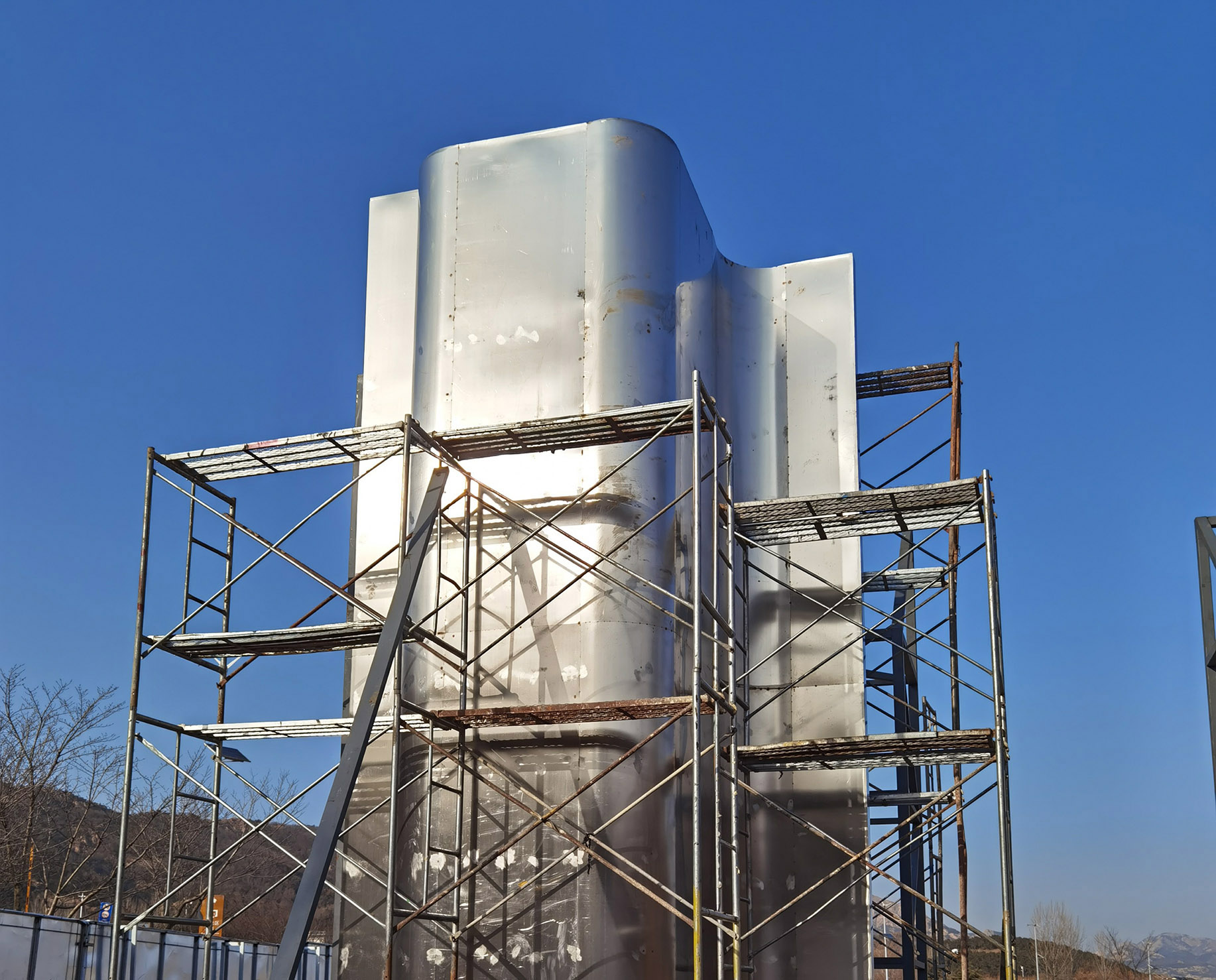
▲样板墙The sample wall
思考Thoughts
最近有个思考多次的问题:在建筑师、业主、游客之中,我们在意谁的评价权重,建筑师更多是城市的影响者、问题解决者还是服务者?不同思考权重会把我们导向不同的设计观。在这个时代下,服务内卷和过度设计,尤其值得重新思考这一原初的问题。
There is a question that has been pondered many times by us recently: among architects, clients, and tourists, whose evaluation weight do we care about? Are architects more urban influencers, problem solvers, or service providers? Different thinking weights will lead us to different perspectives. In this era, service involution and overdesign are especially worth rethinking this initial problem.
我们做了阿朵小镇这个片区的整体规划和亲子中心(飞毯),这个卫生间也是规划时的一个额外设计。相对于大型公建,小建筑的难点不在构造和功能,而是需要将自身功能连接到环境里完善整体拼图,并建立起区域场景里的角色感。这个小卫生间,我们赋予它沉默而骄傲的角色,让游客体验明快的应用场景,为行程增加愉悦,能达到这样就很好了。
We have made the overall planning and parent-child center (flying carpet) of Atour Town. This bathroom is an additional design in the planning. Compared with large-scale public buildings, the difficulty of designing small buildings is not in structure and function, but the need to integrate their own functions to the environment in order to complete the overall puzzle, and establish a sense of role in the regional scene. We have entitled a silent and proud role for this small restroom, allowing tourists to experience a bright application scene and adding pleasure to the itinerary, which is what we would love to see.
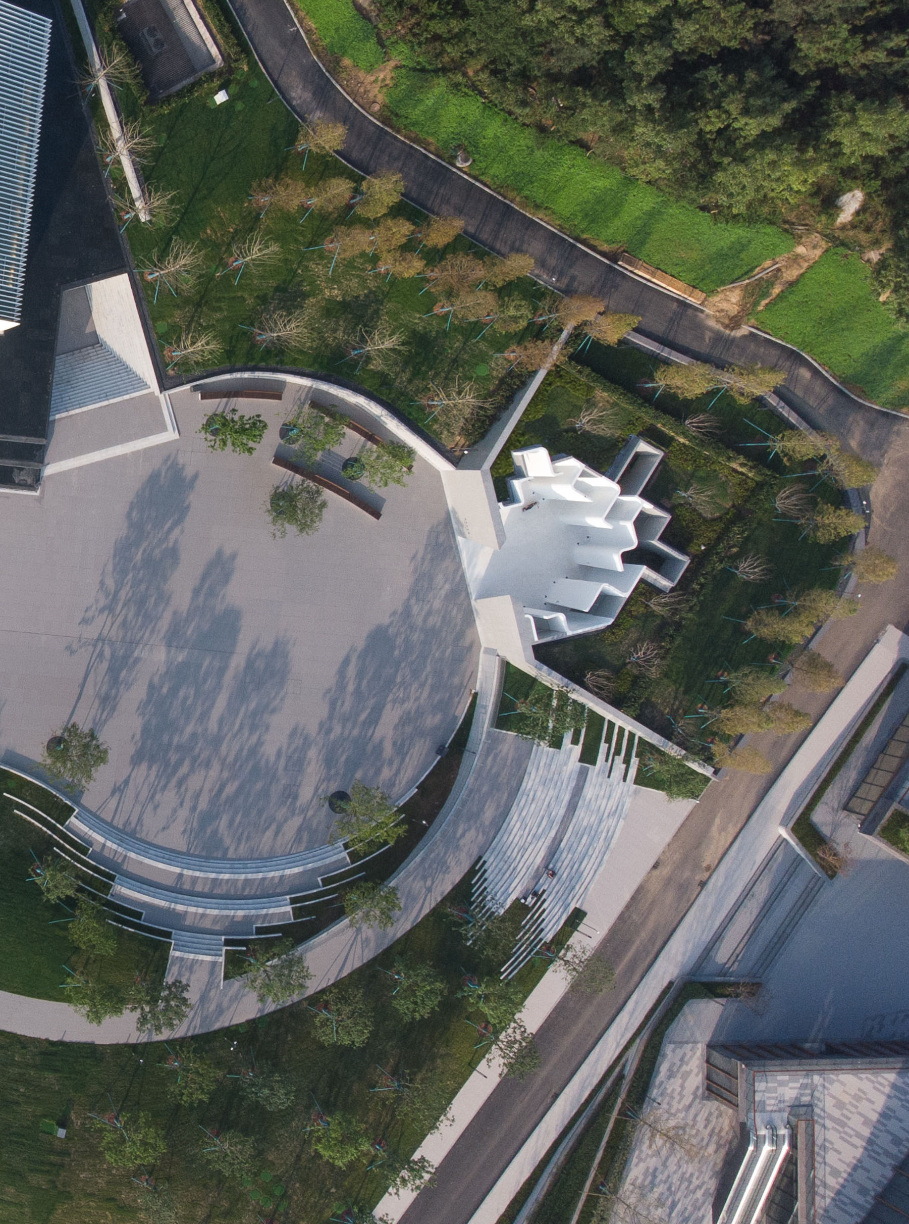
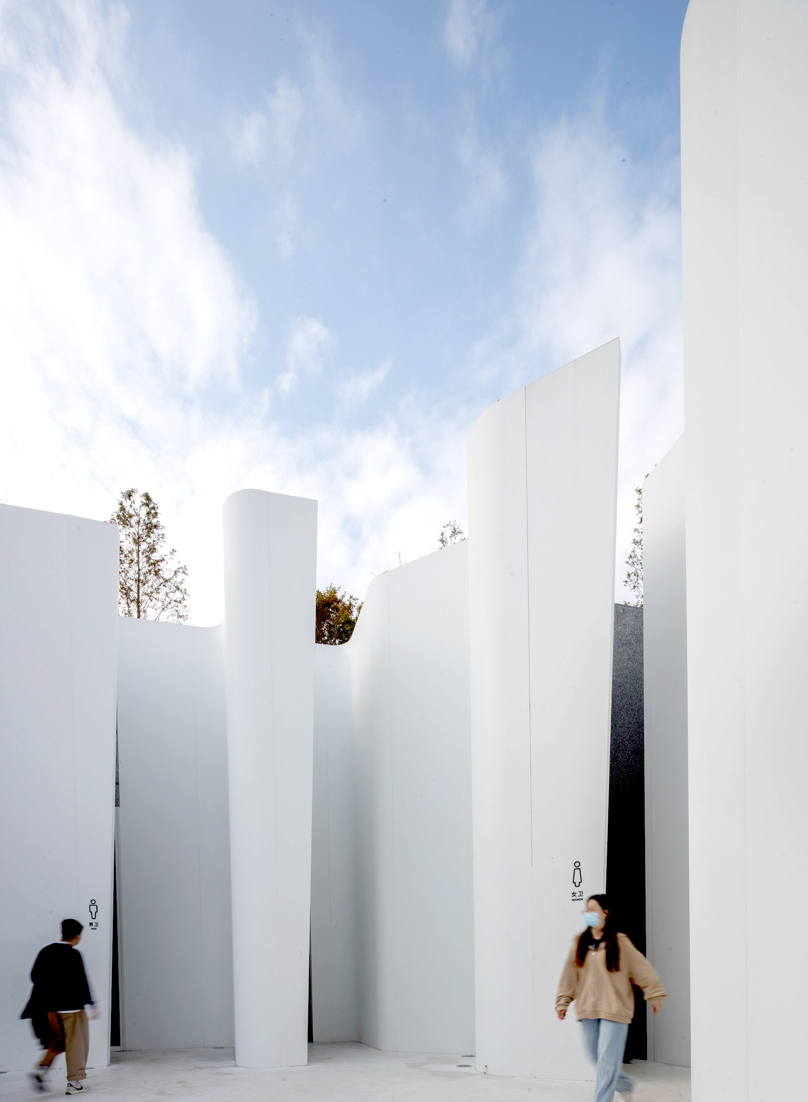
▲使用中的卫生间The Restroom in use
项目图纸Project Drawings
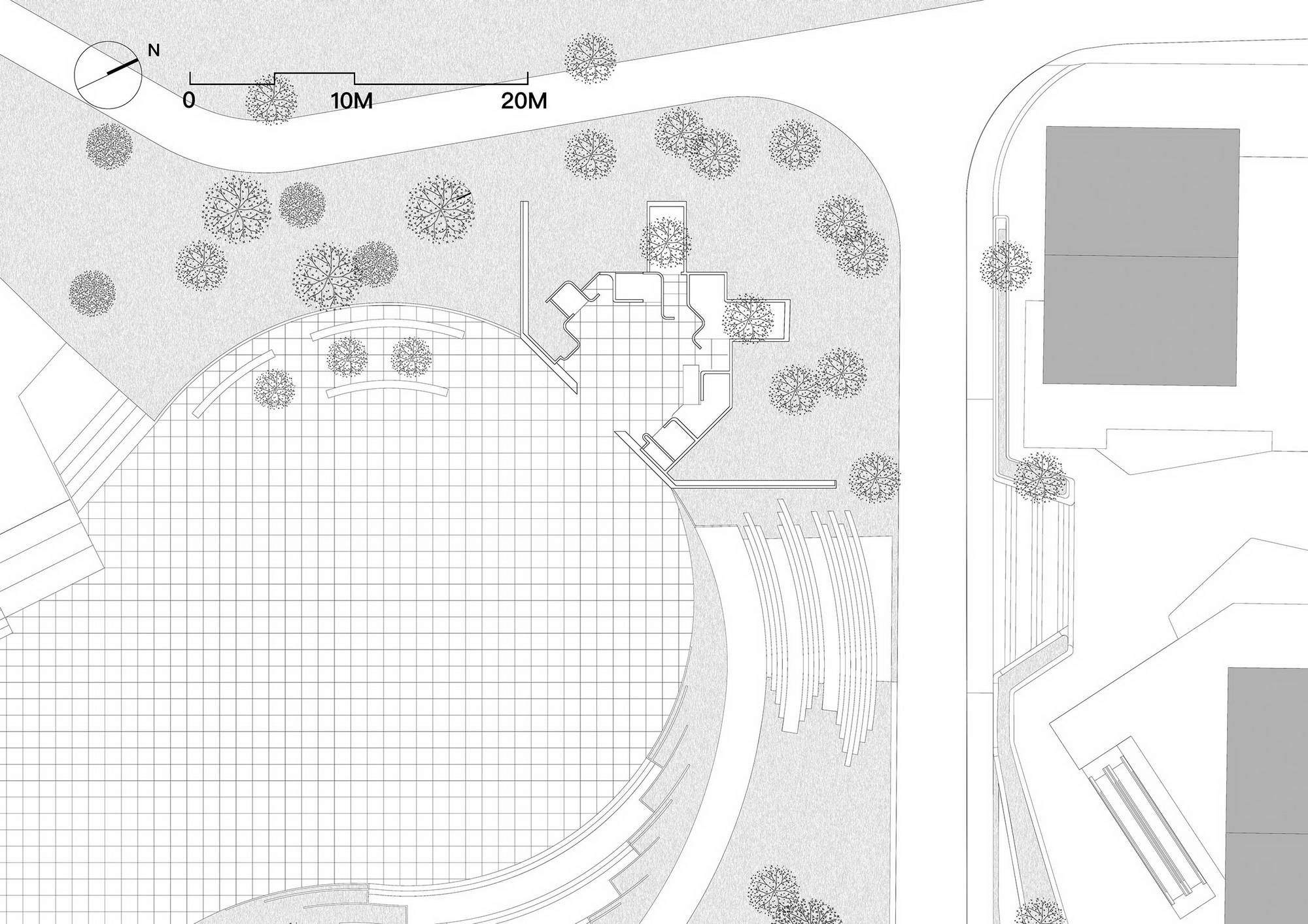
▲总平面图Masterplan
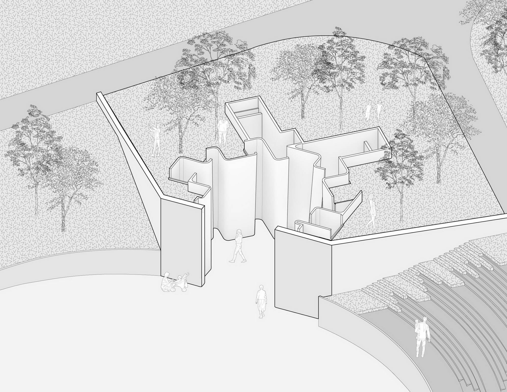
▲轴测图Axonometric Drawing
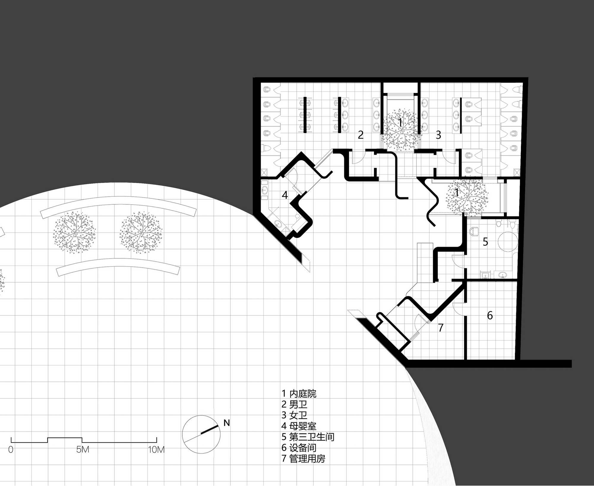
▲平面图Plan Drawing

▲立面图ElevationDrawing
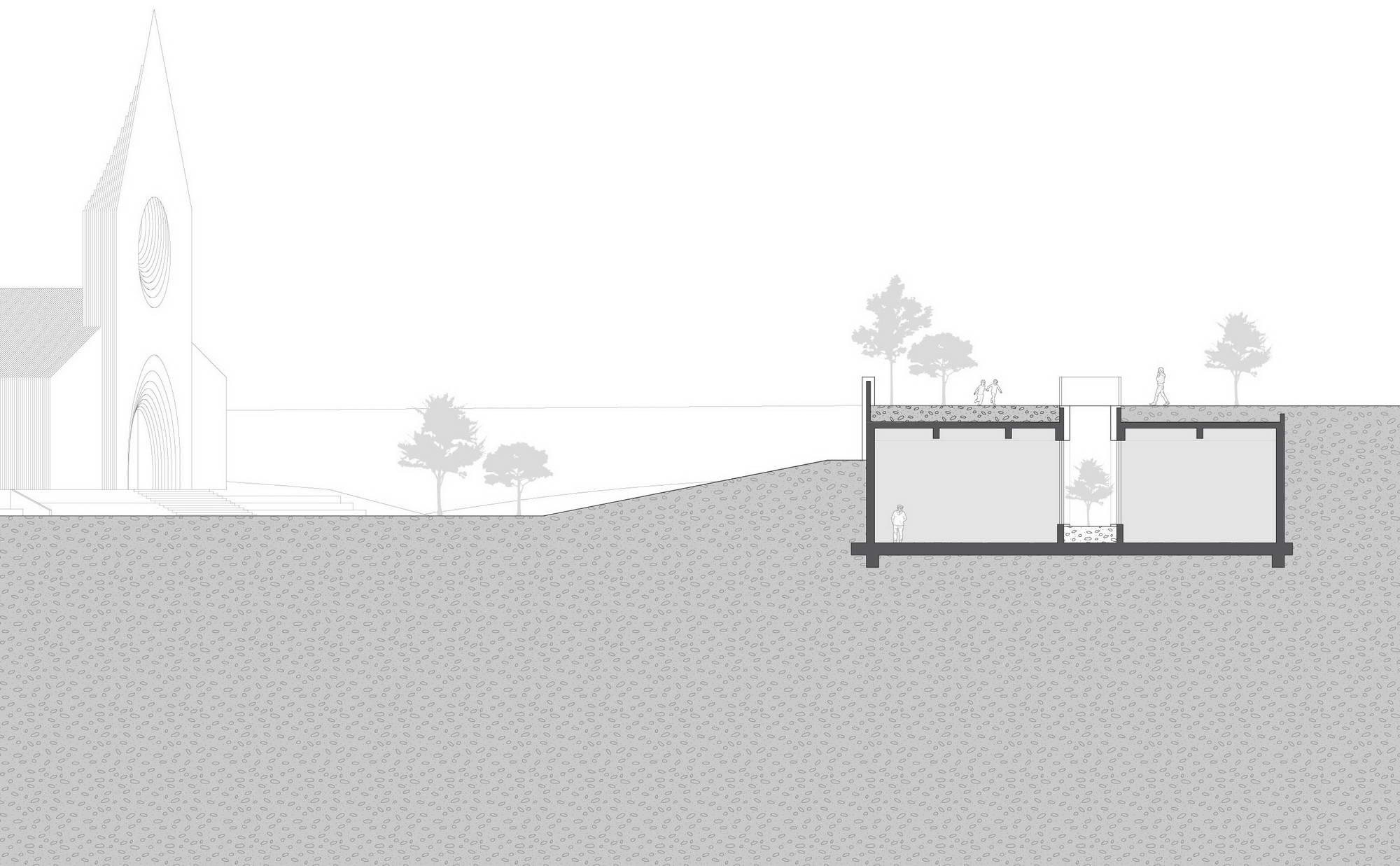
▲剖面图SectionDrawing
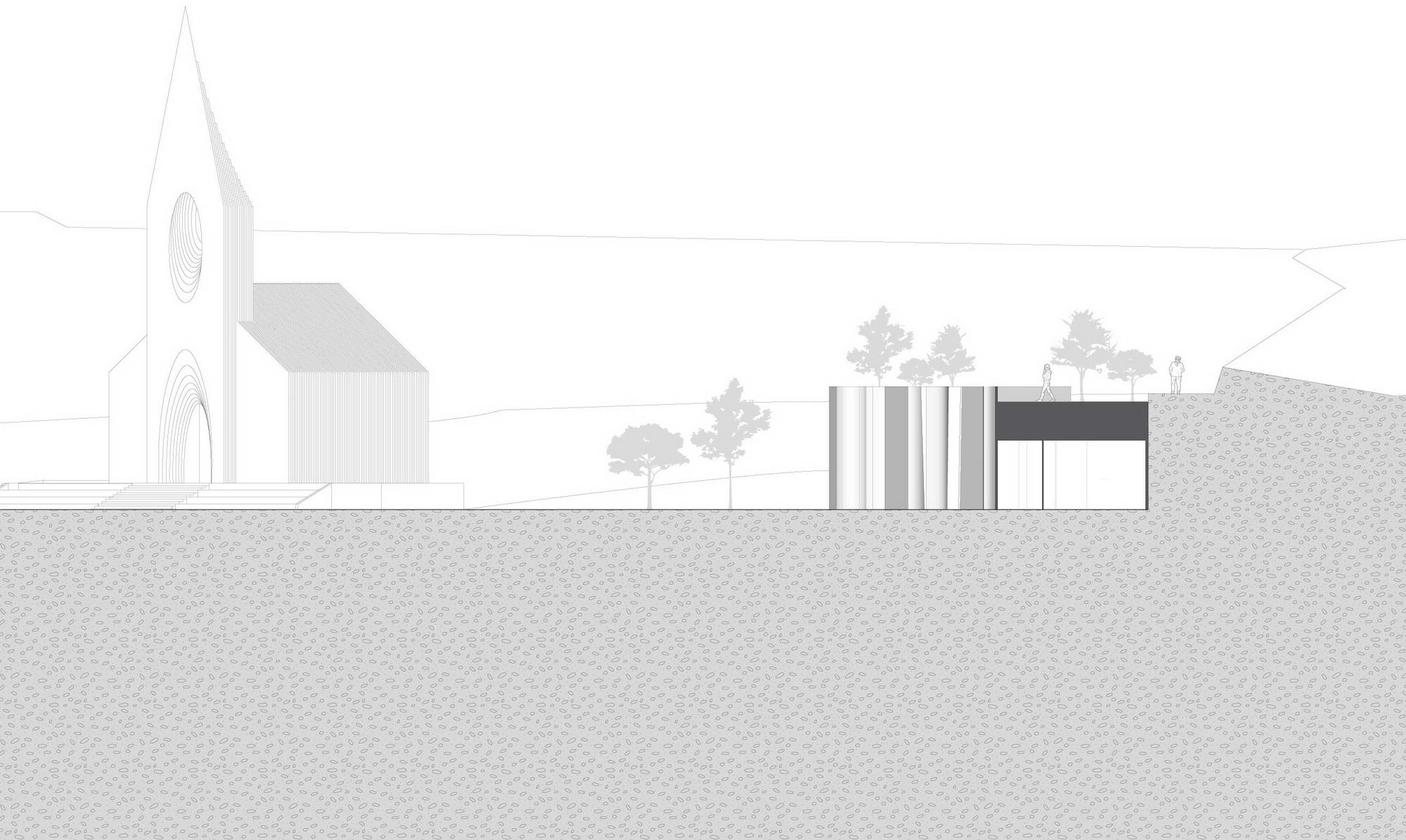
▲剖面图SectionDrawing
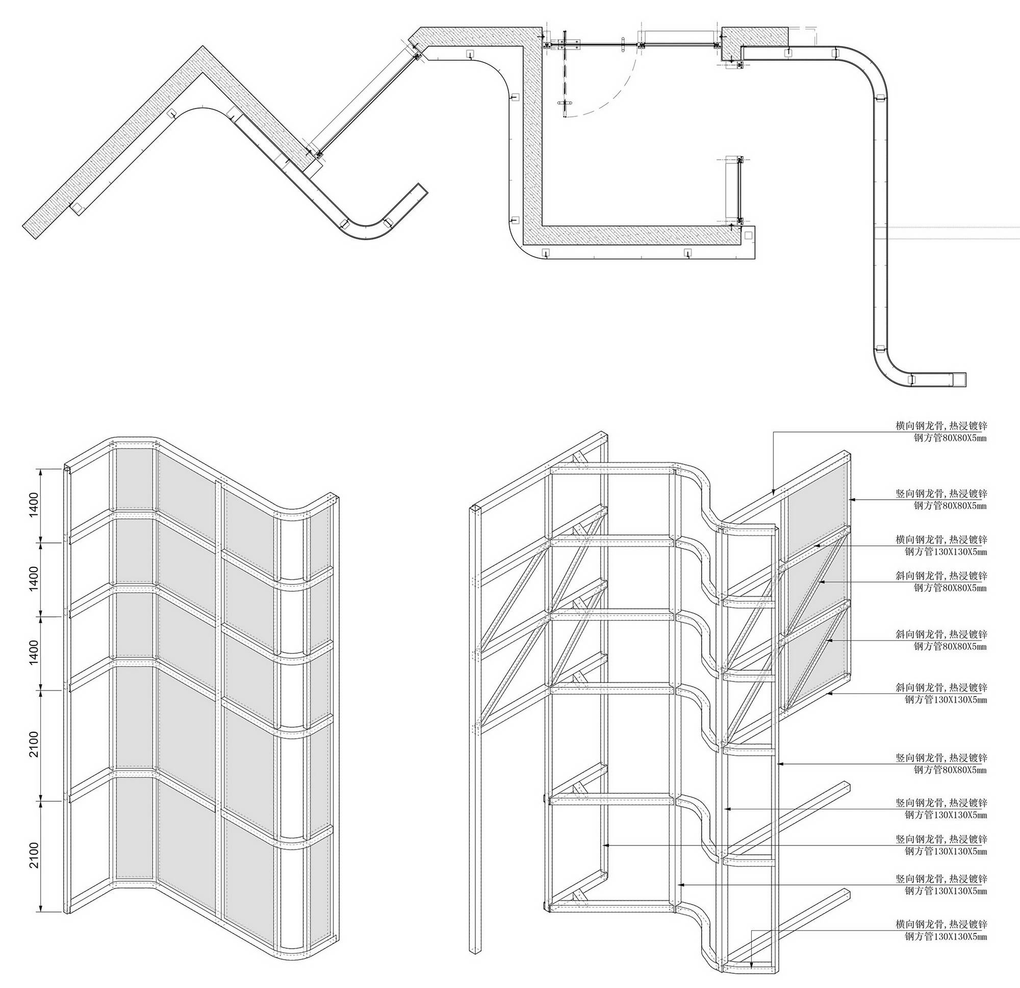
▲细部图Detail Drawing
项目信息
项目名称:阿朵小镇公共卫生间
项目位置:中国 青岛 藏马山
建筑面积:215.5㎡
业主单位:融创北京
建筑设计:栖城设计
主创建筑师:沈利江、崔恒轩
项目负责:丛燕飞
结构设计:徐政
幕墙设计:陆启跃
机电设计:范志刚,邓腾腾,周川
室内设计:栖城设计
室内设计团队:范陶翔、陈学博、王语琪、魏明、黄玮菁、邱佳家
景观设计:澳派景观设计
灯光顾问:北京光湖普瑞照明
主要材料:阿鲁克邦铝复合板,水磨石 ,陶瓷板
建成时间:2021年9月
建筑摄影:章勇,梁文军