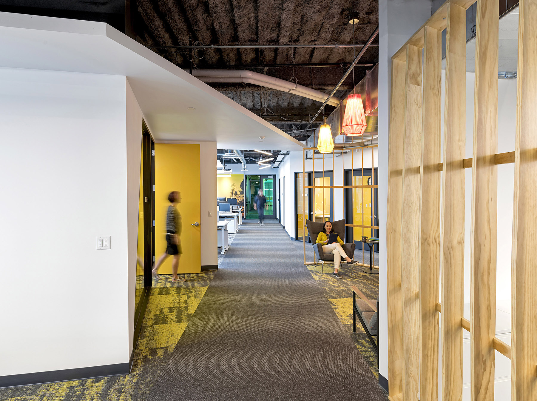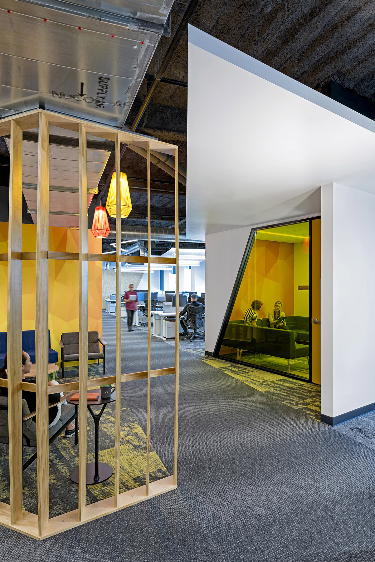
Autodesk wanted to relocate their Denver sales hub into a newer, more modern space to achieve consistency with their portfolio of offices, redefine their local culture, and increase productivity. The Denver location needed to be a unique design with a strong visual tie to the company and to the region.
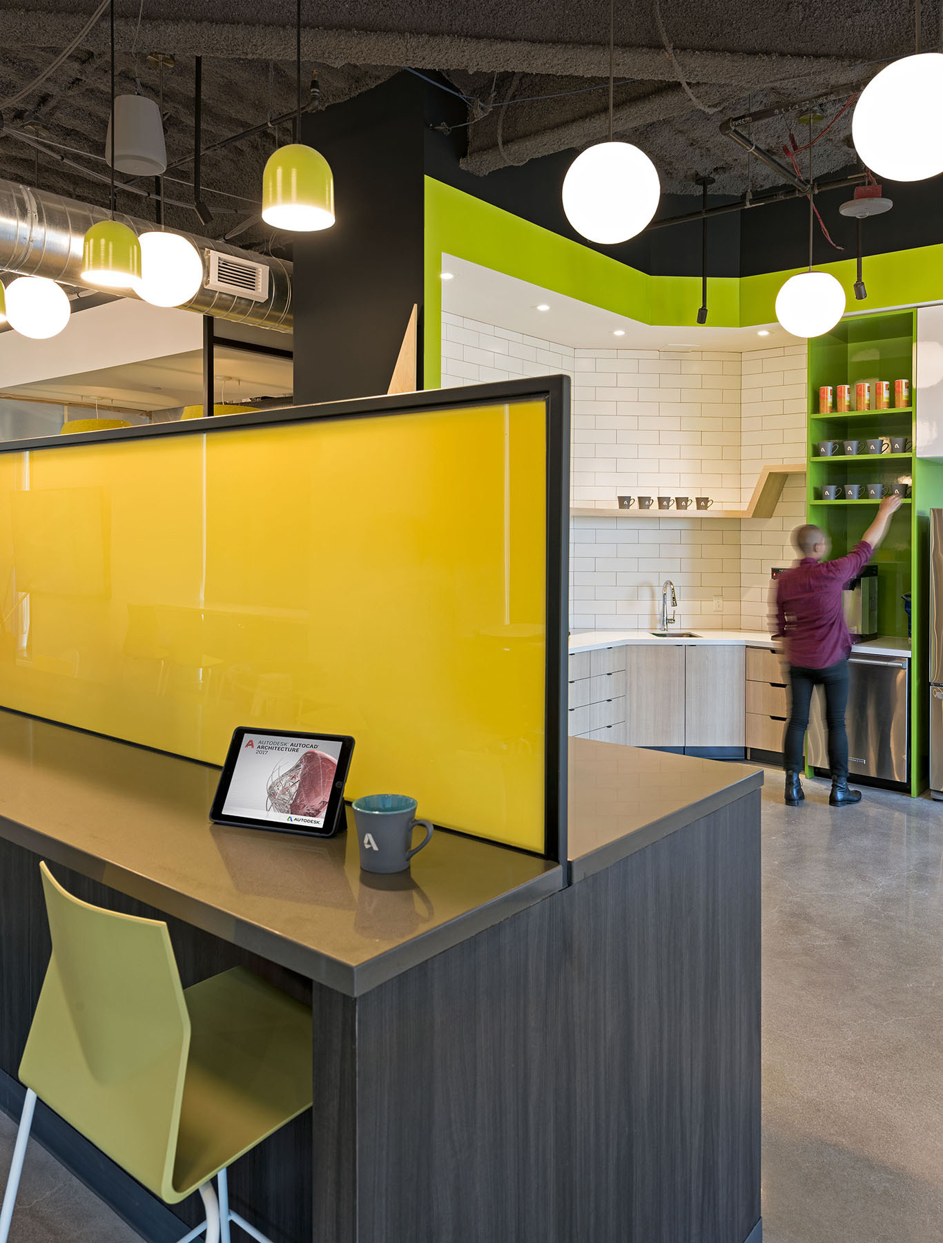
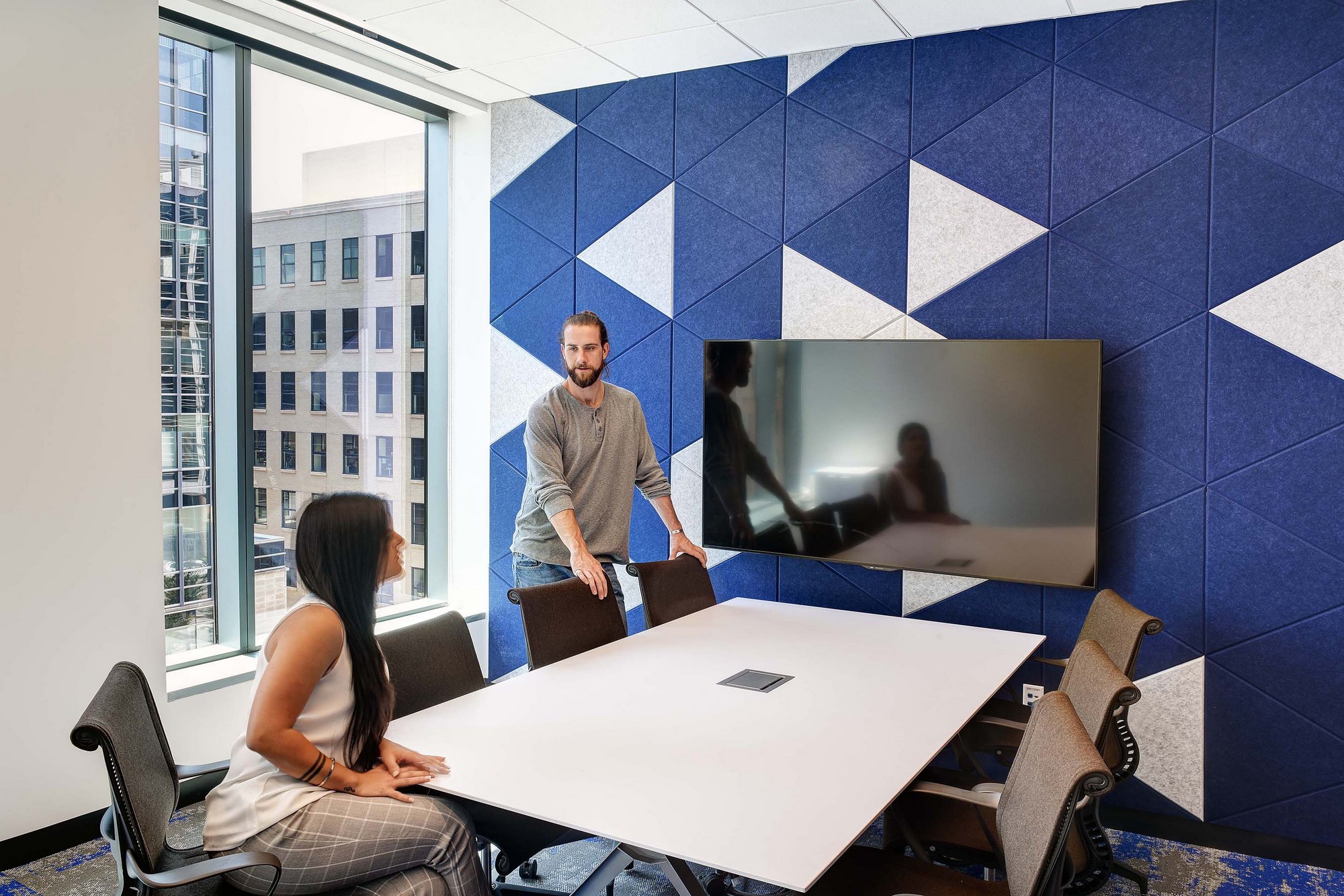
The design goal for Autodesk Denver was to provide a vibrant and energetic environment that would inspire and motivate both employees and visitors. The design firm collaborated with the client to identify key branding elements and locations, as well as create a series of unique graphics that both complement the digital nature of the brand and reference the natural surroundings of Colorado, using punches of nature-themed color.
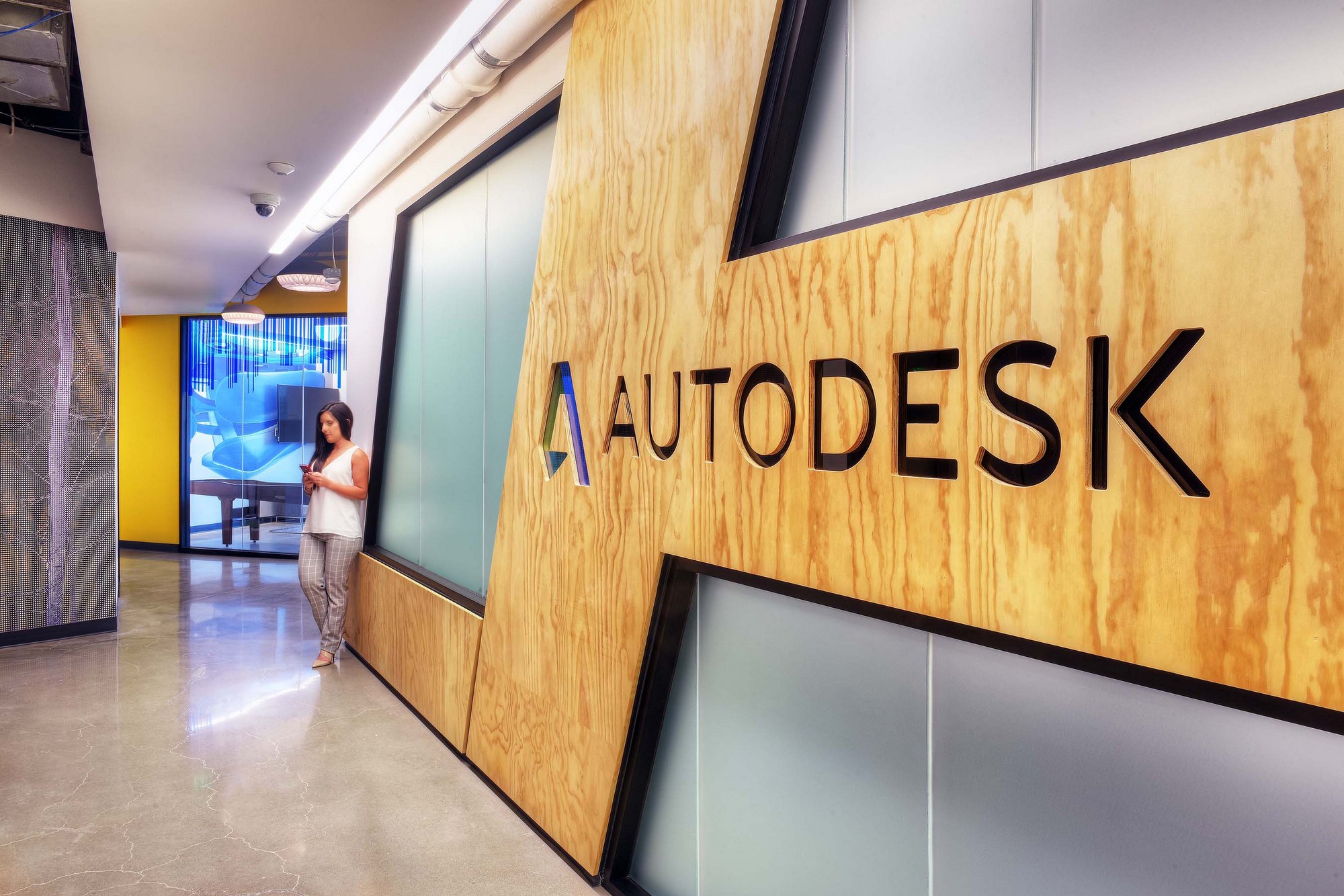
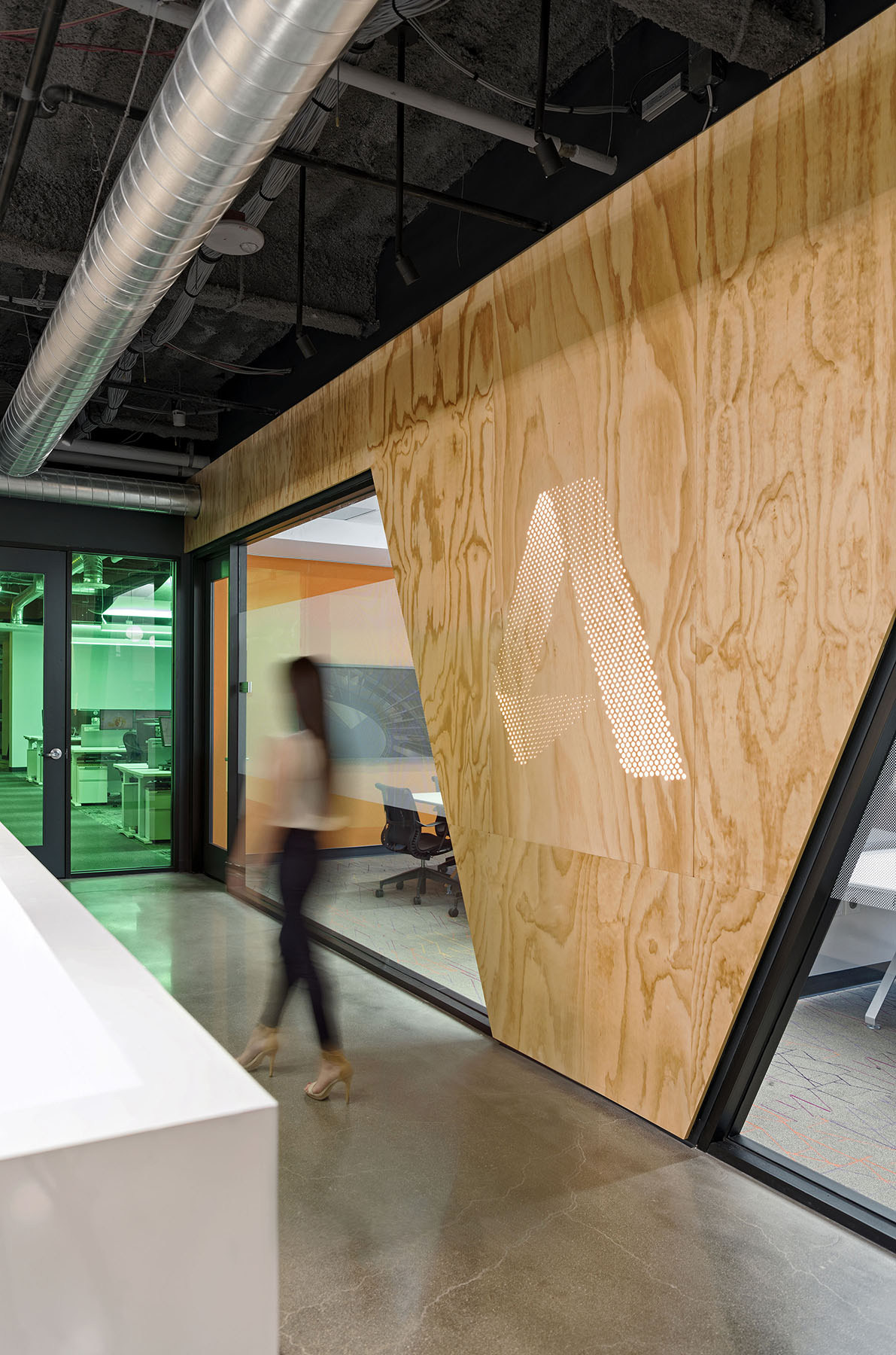
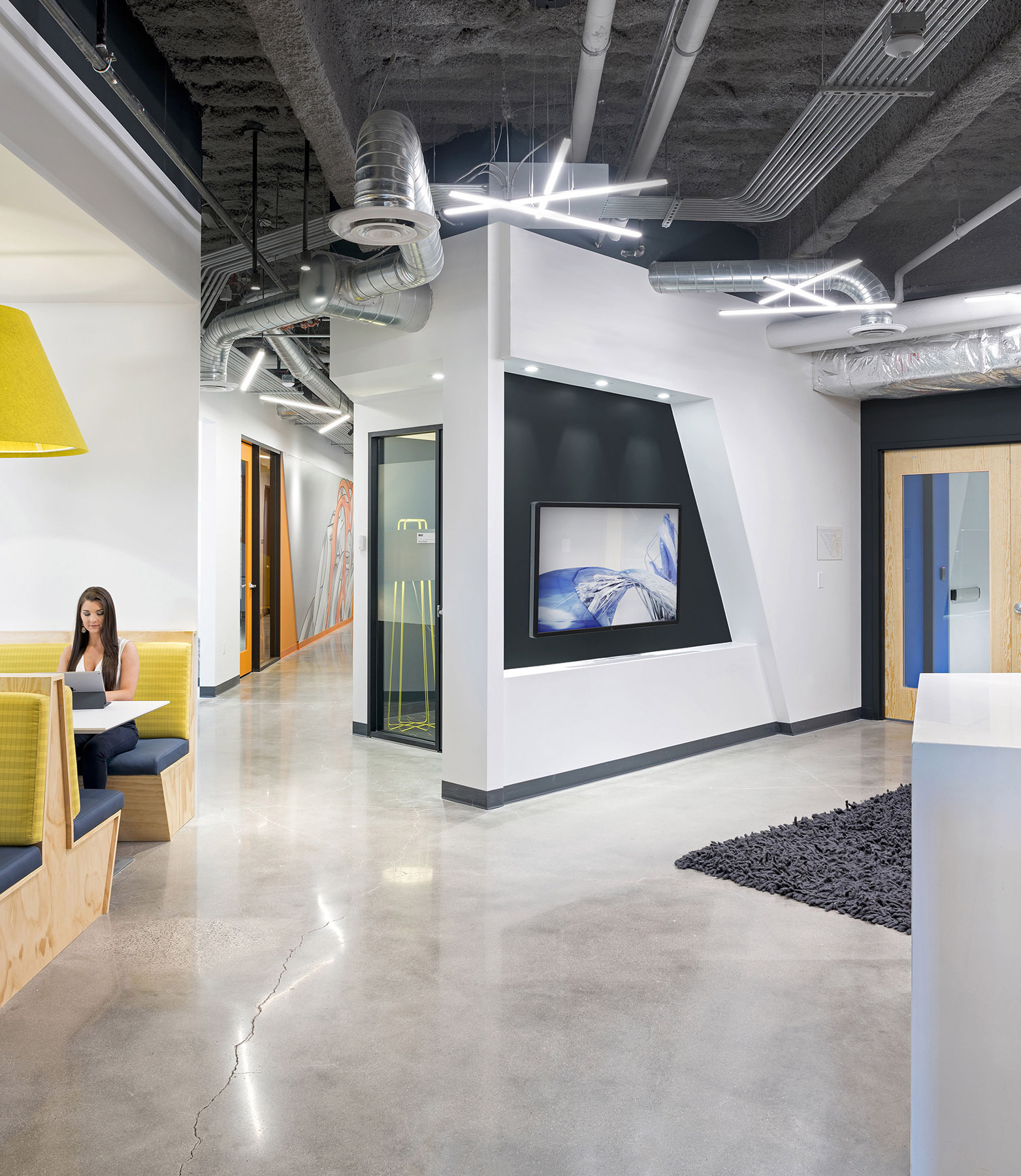
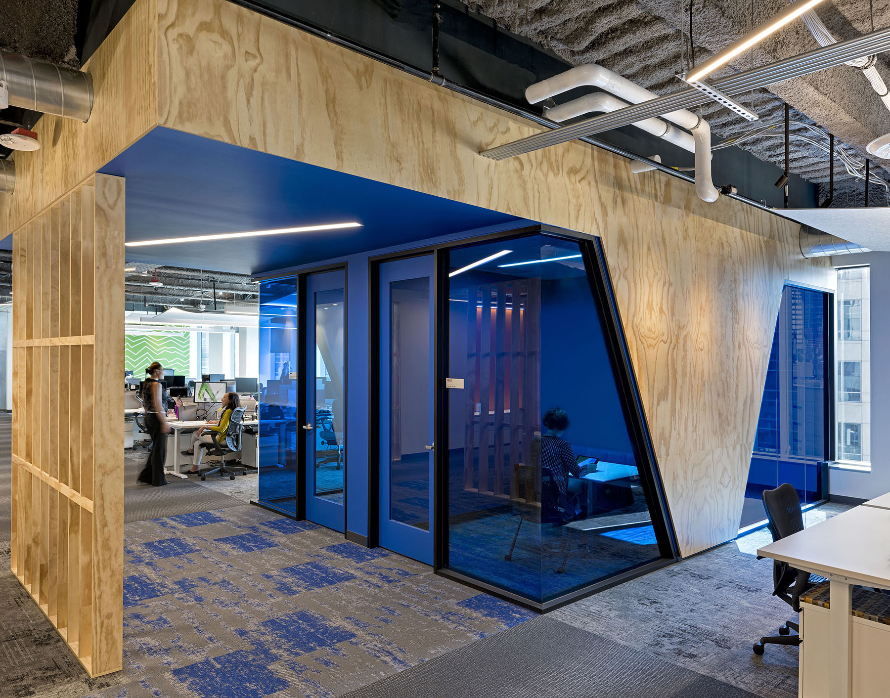
The angles of 67 and 113 degrees were borrowed from the Autodesk logo and are used prominently throughout the space, in a variety of different materials. They convey movement and activity as they trace their way around the office, providing interesting finish transitions, framing graphics, and shaping glazing. Behind the reception desk, the Autodesk logo has been reimagined using a halftone technique. In a one-of-a-kind statement, hundreds of varying-sized holes are CNC routed into exposed plywood panels, which were hand-selected for their prominent wood grain, and are backlit by a continuous LED light source.
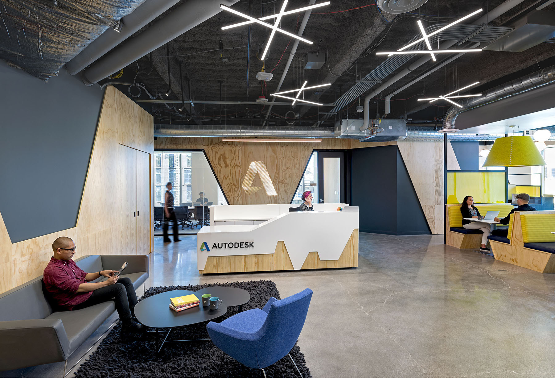
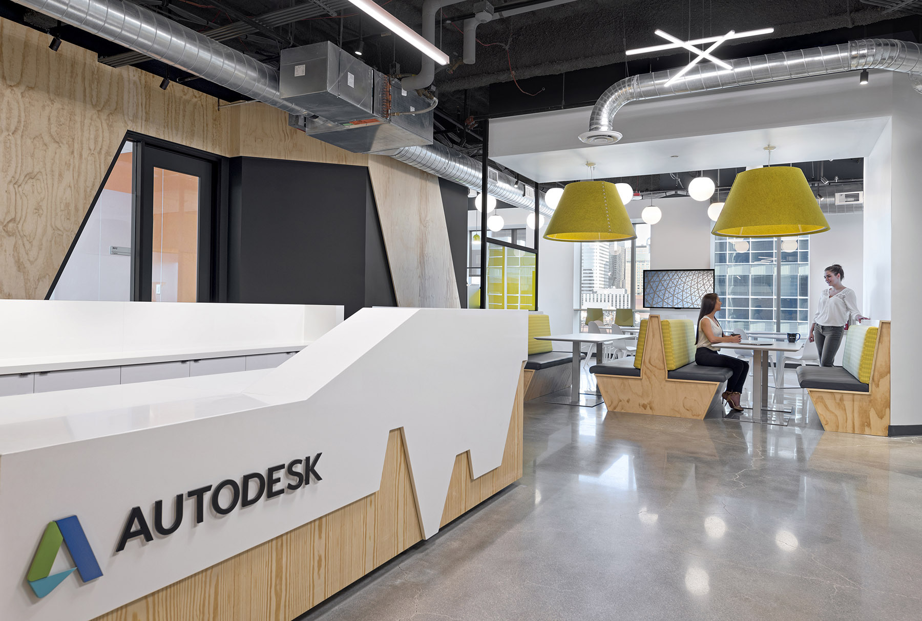
The reception and break room areas work together as the main hub of all activity in the office, providing convenient and interesting areas to greet, meet, and eat. Building materials such as plywood, concrete, blackened steel, and more provide an urban and industrial aesthetic, while exposed infrastructure and the resulting transparency of construction showcase the end result of using Autodesk products.
The design, in a very challenging triangular footprint, is highly functional, efficient, and effective, but maintains a sense of fun while reflecting the client’s identity.

