GlaxoSmithKline (GSK) is among the top ten pharmaceutical companies in the world (and one of the largest in Ecuador), focused on improving people’s quality of life through research. And although its commercial operation is located in the city of Quito, it has a large workforce presence throughout the country.
The GSK offices, entirely made by Contract Workplaces, were developed on a 518 sqm floor located in ‘Torre 6’, one of the most emblematic and modern buildings in the city.
This prominent pharmaceutical company, which has a large multinational presence, has developed its own strategy for all its workspaces and has a design guide that specifies the use of colors, the dimensions of the furniture, the types of finishes, the design chart, ergonomics guidelines, etc., for all its locations.
One of the main challenges of Contract Workplaces was to develop a proposal for a conceptual design with its own character that would also meet the parameters and requirements established by the company. With this in mind, the heart of the GSK logo was taken as a starting point to turn each of the office spaces into the beat of that heart, a place where users could feel at home.
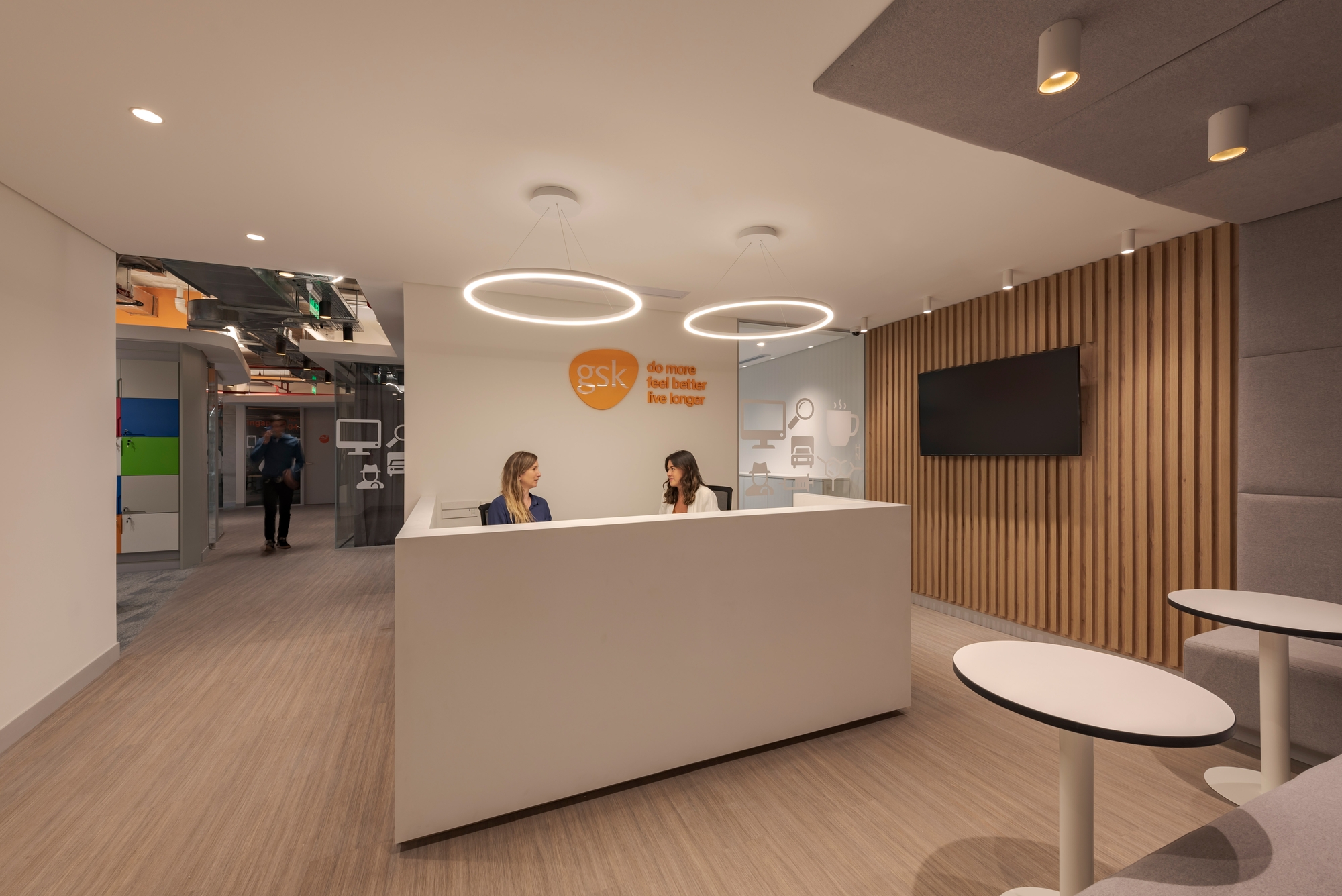
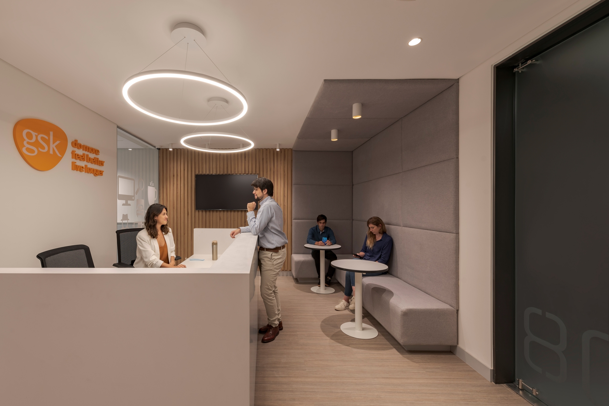
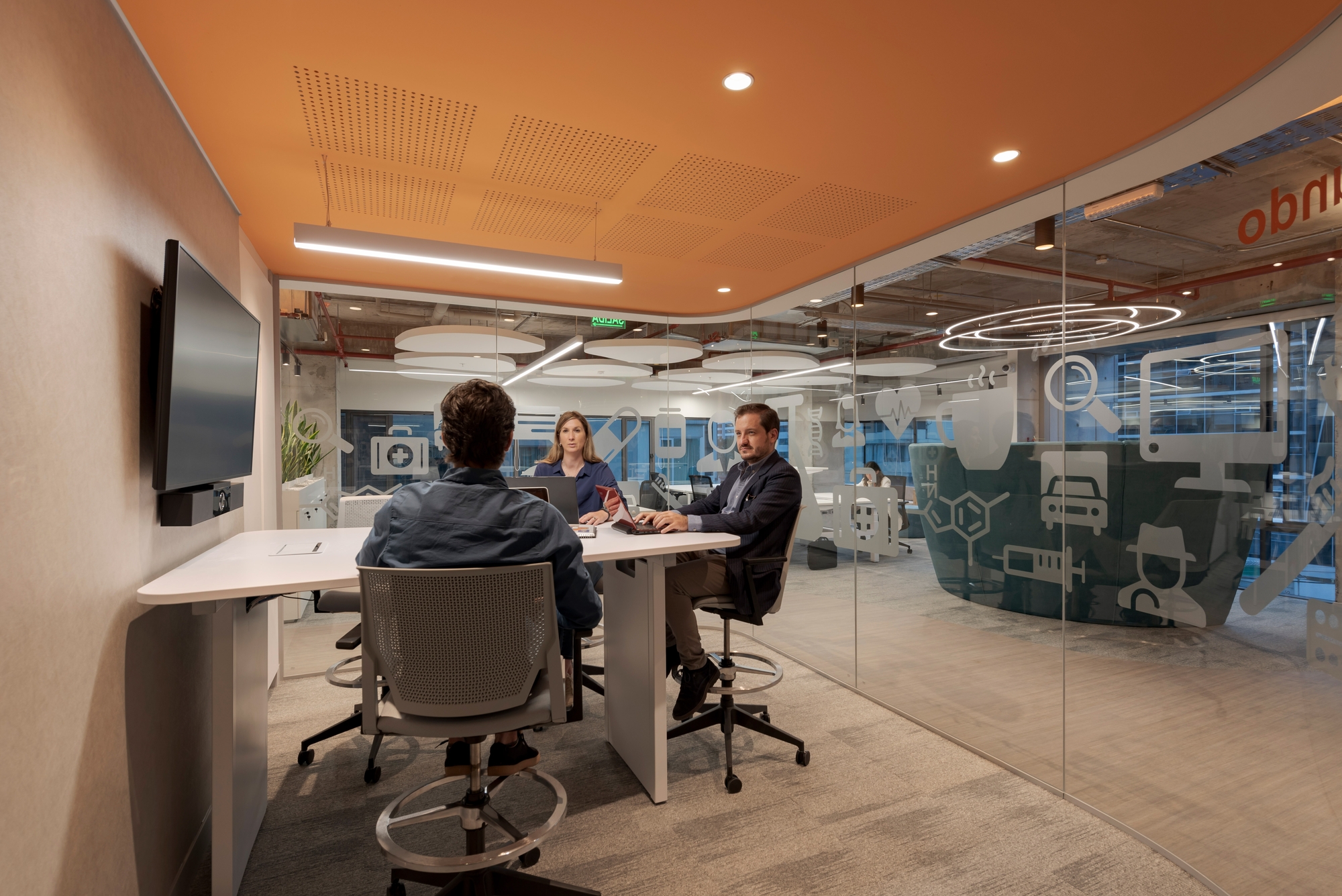
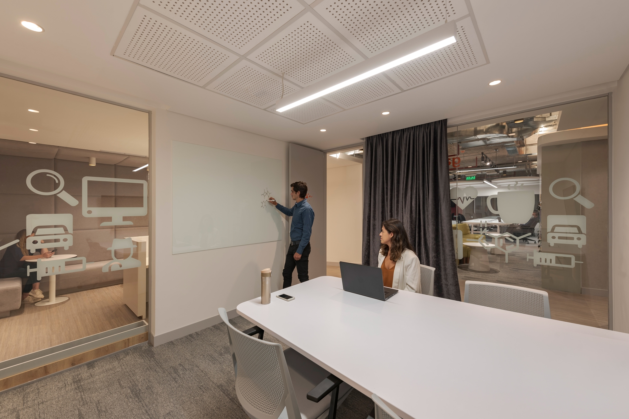
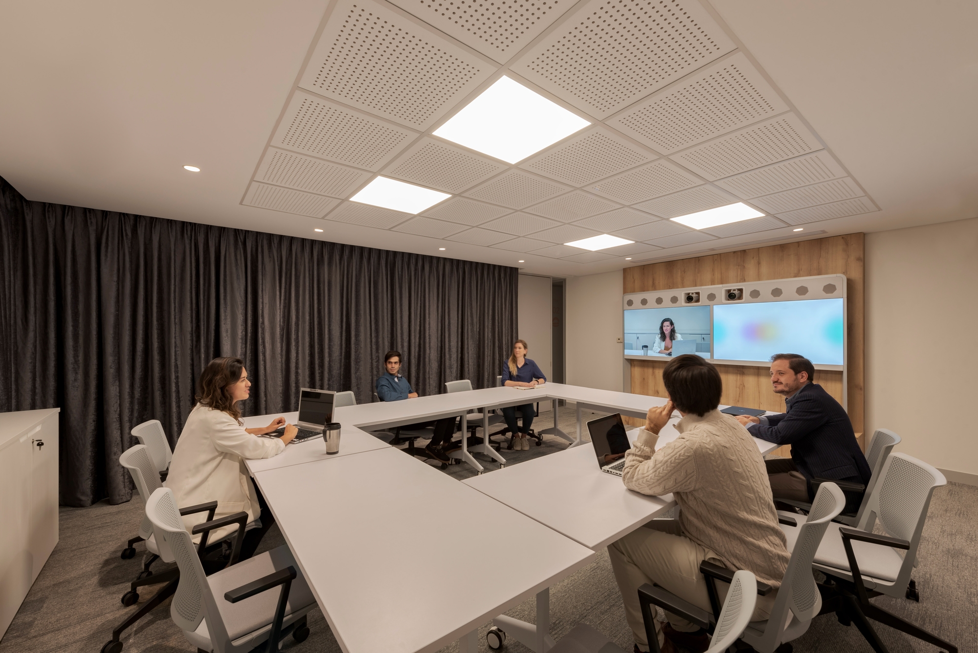
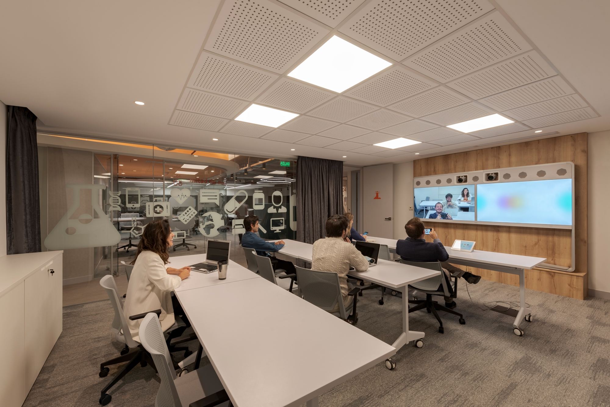
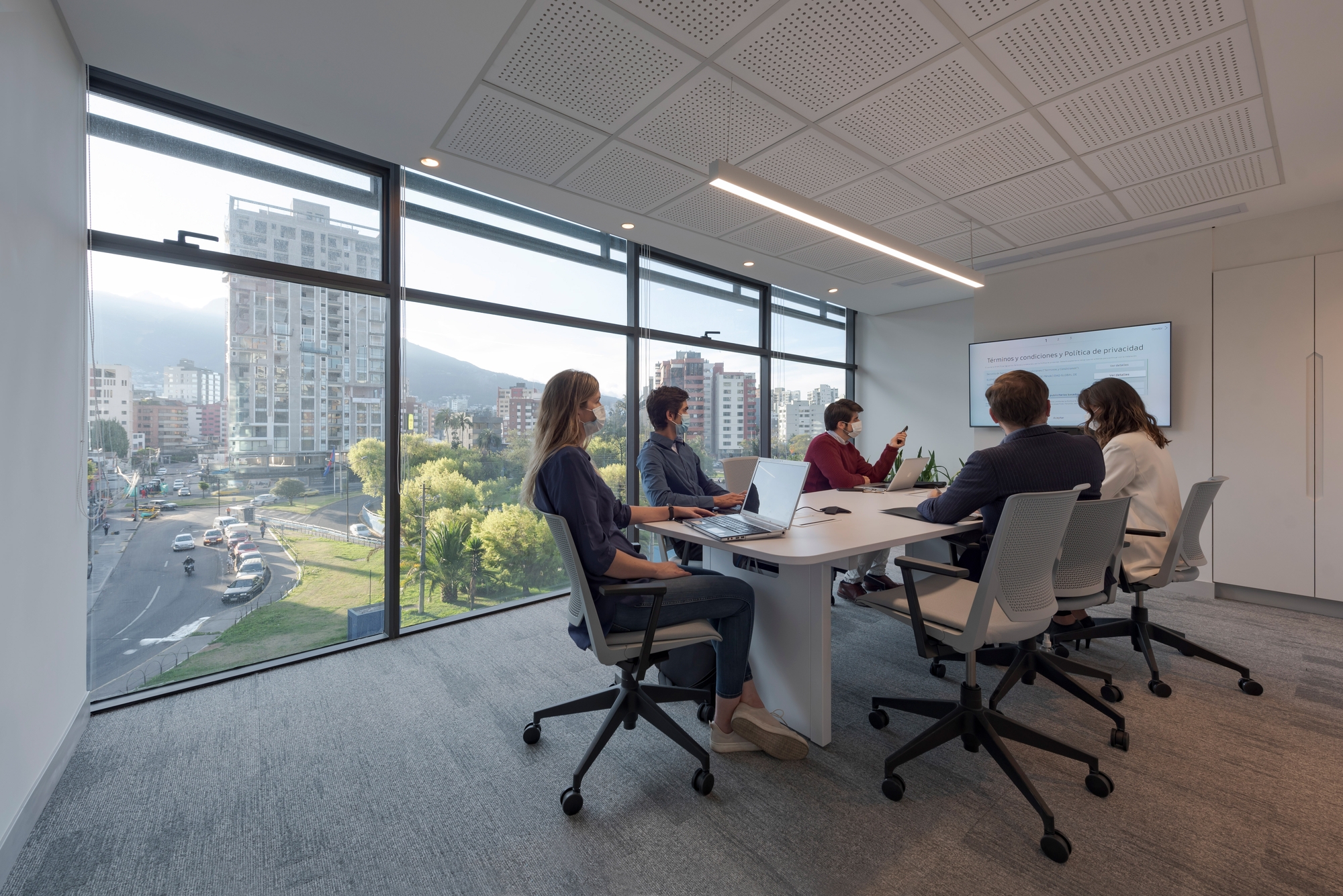
The office was distributed in three different areas: public, semi-public and private. The public area was made up of the reception, together with meeting rooms of different capacities. There we opted for a palette of neutral tones with some wooden accents in order to give the spaces a more formal character.
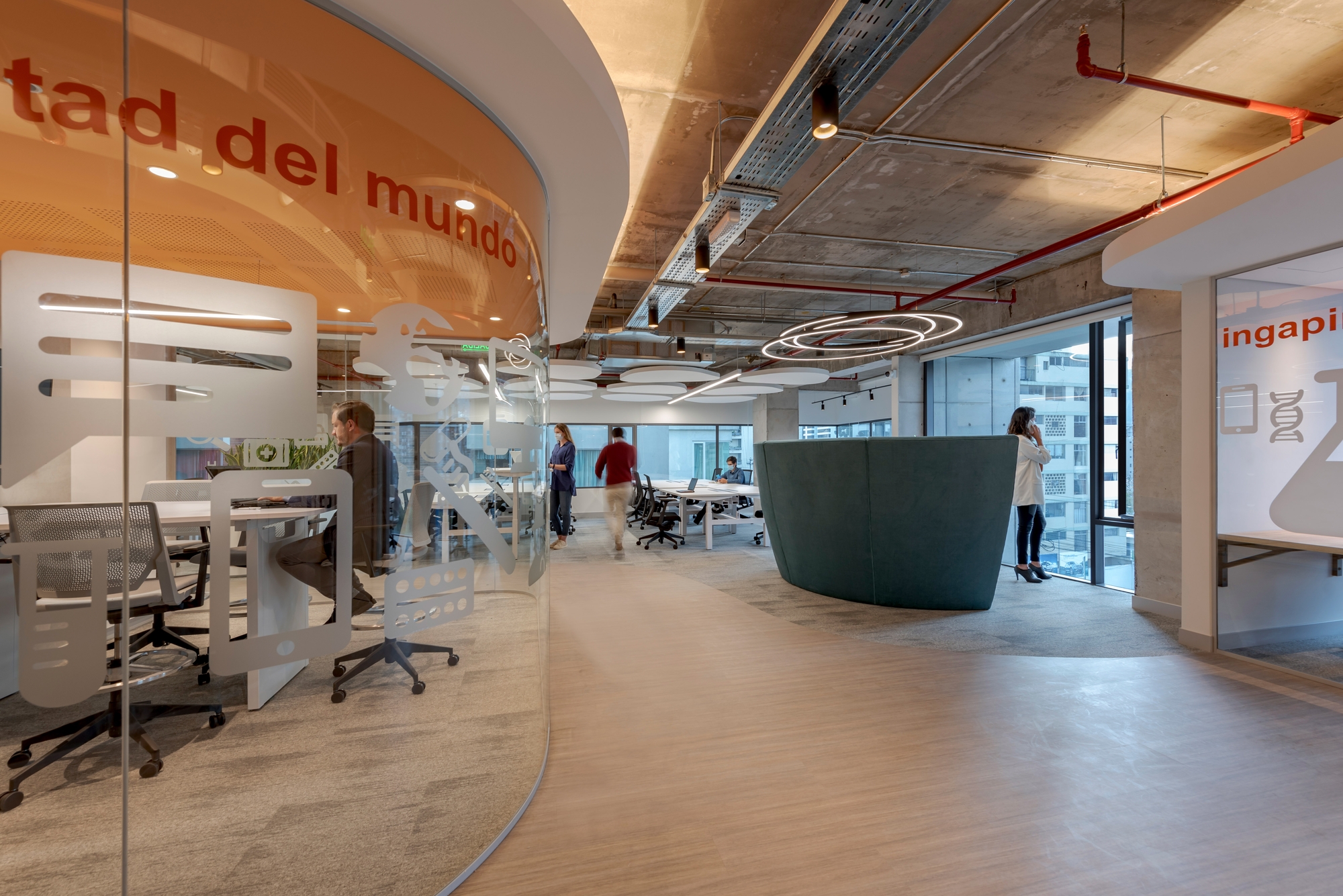
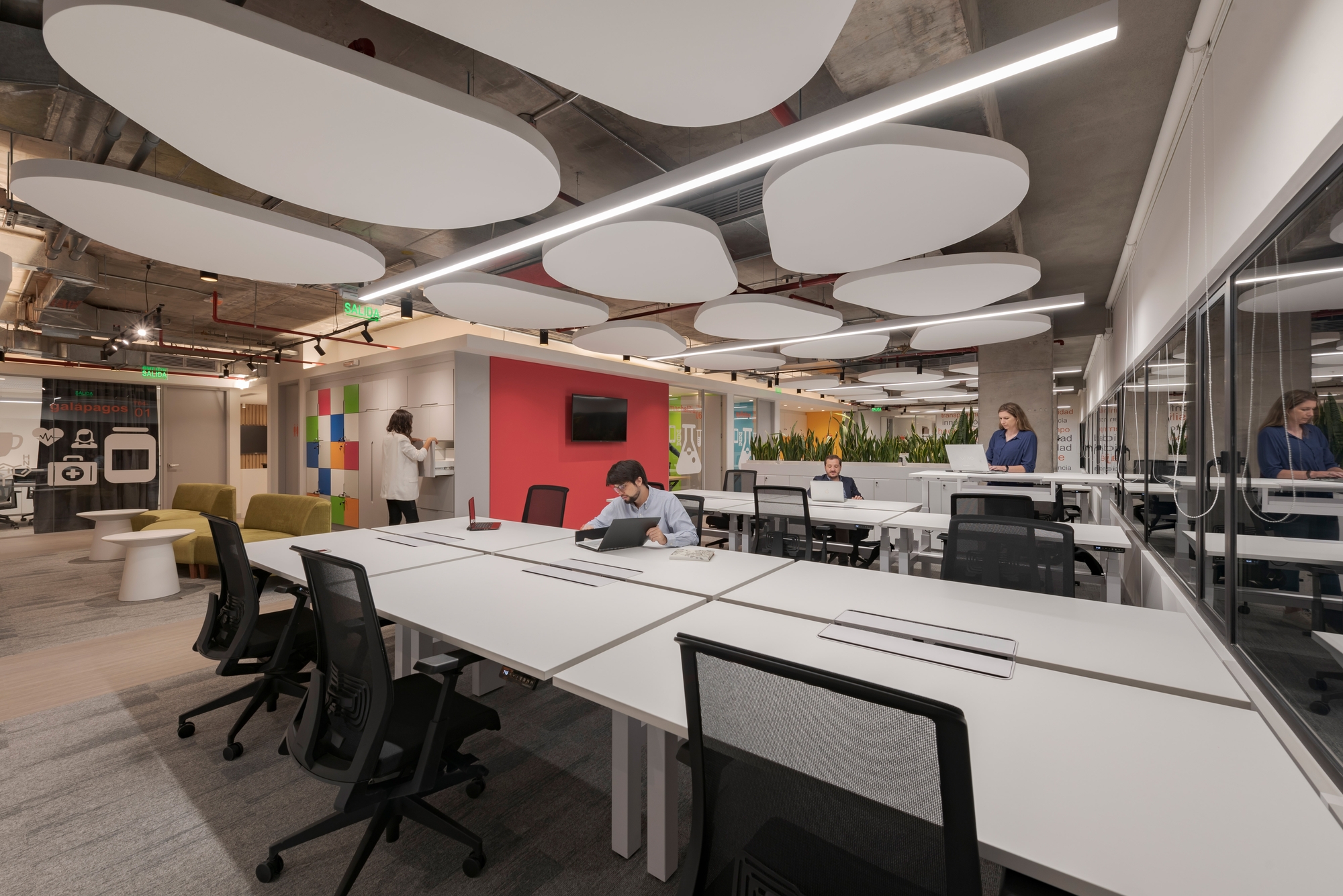
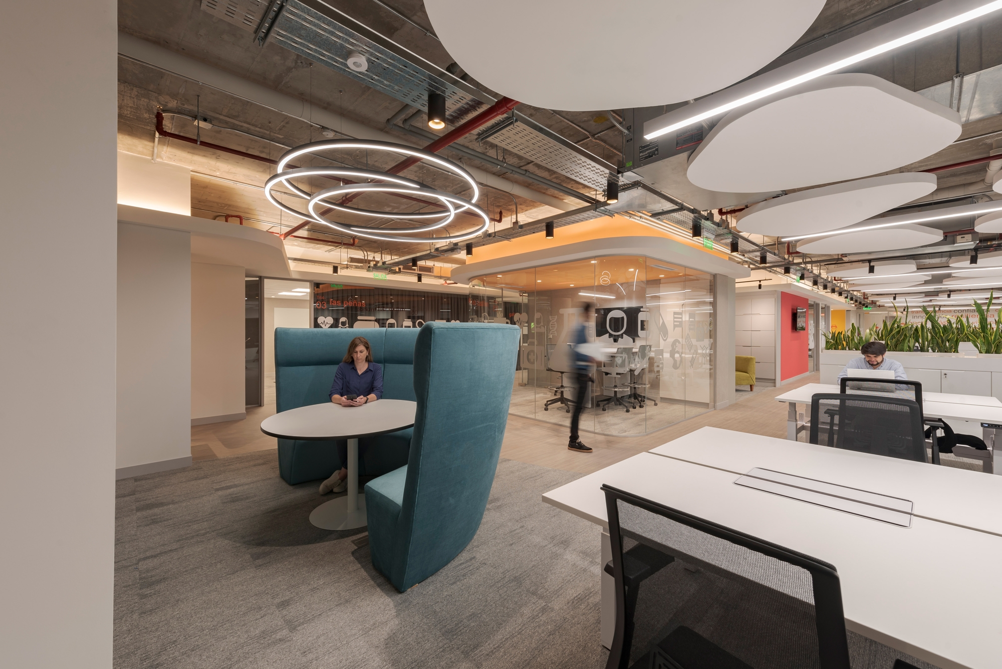
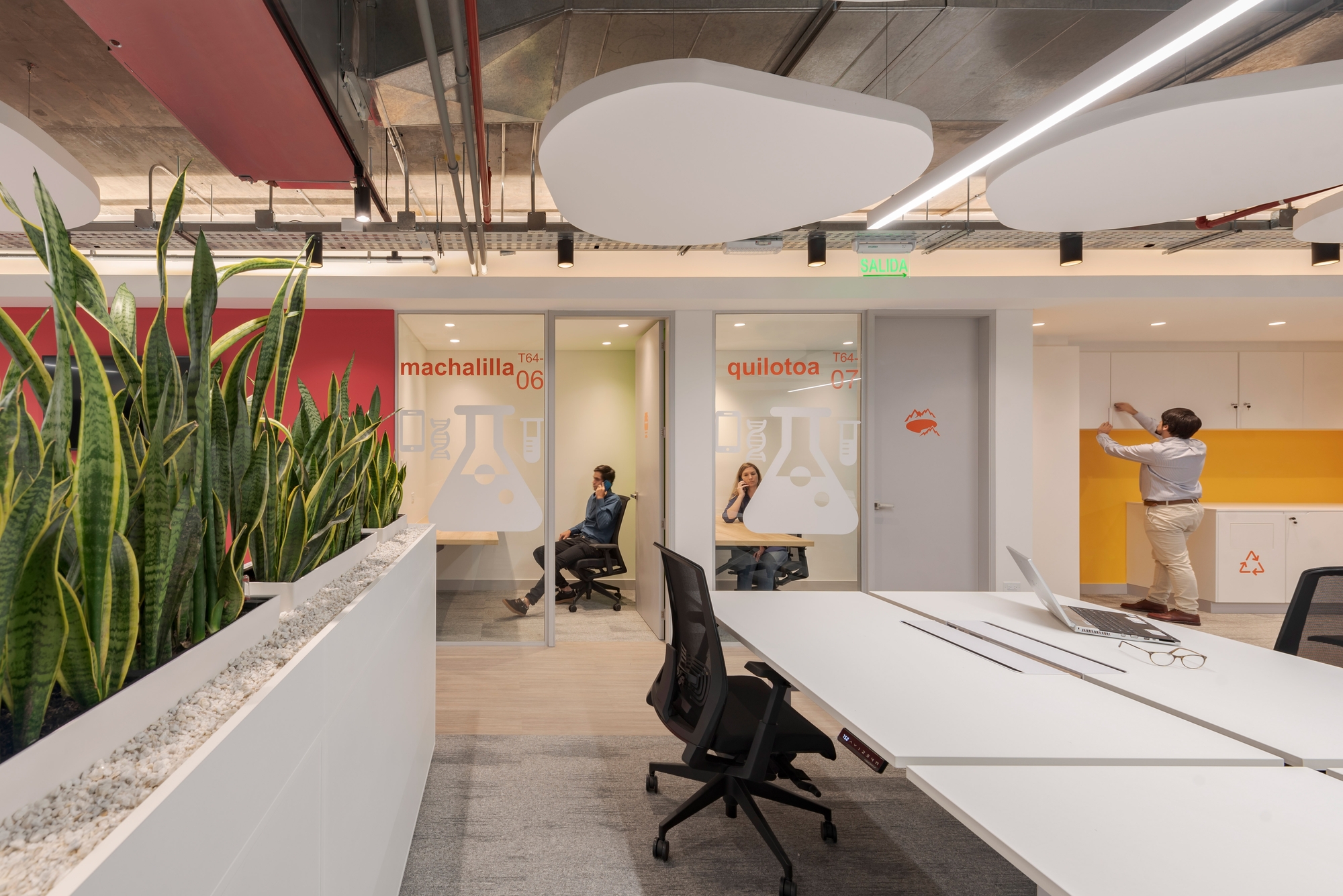
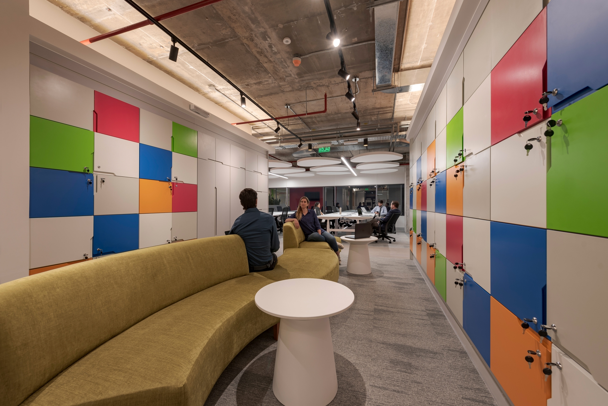
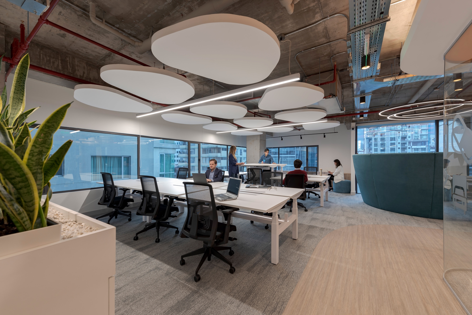
In the semi-public area, the “heart” of the office, the collaboration spaces and operational positions were located as part of the transition to more private areas. The choice of a range of bright colors together with the curved lines of the furniture created a cheerful and pleasant atmosphere that contrasted with the formality of the public area.
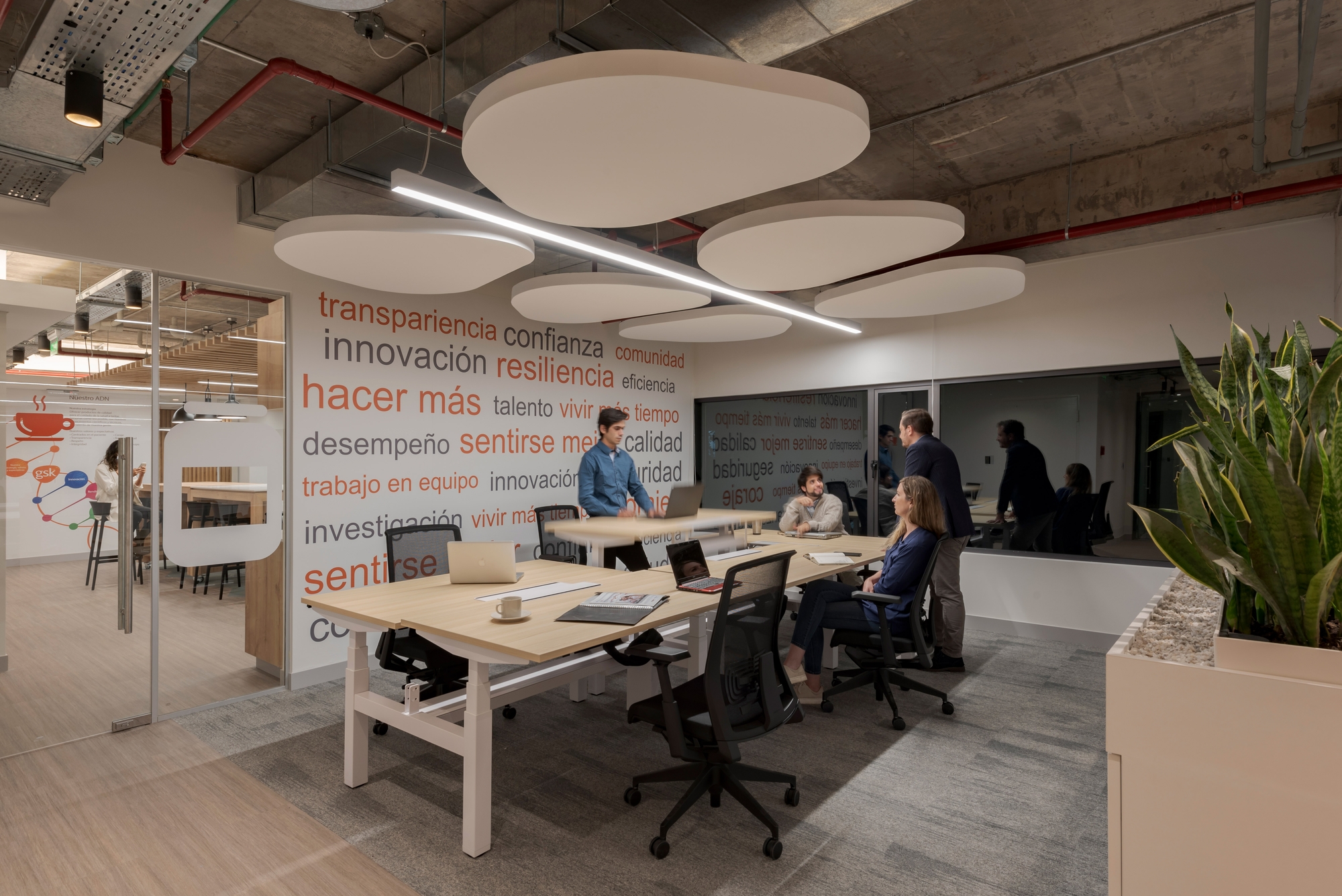
The workstations were located on the ventilated side of the plant in order to take advantage of the natural light. And, to break the linearity of the desks, a counterpoint was proposed with the suspended ceiling formed by heart-shaped clouds located in different directions.
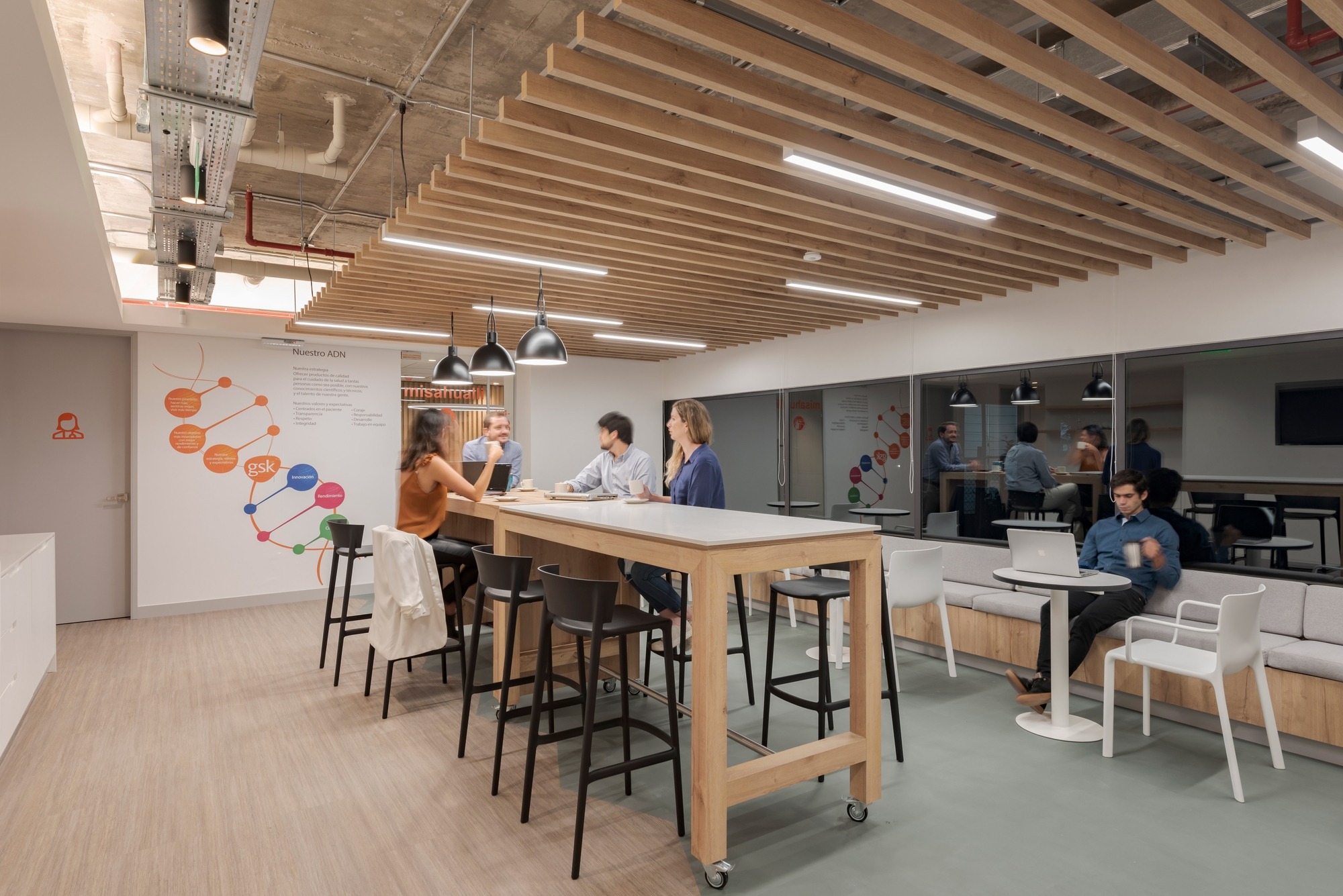
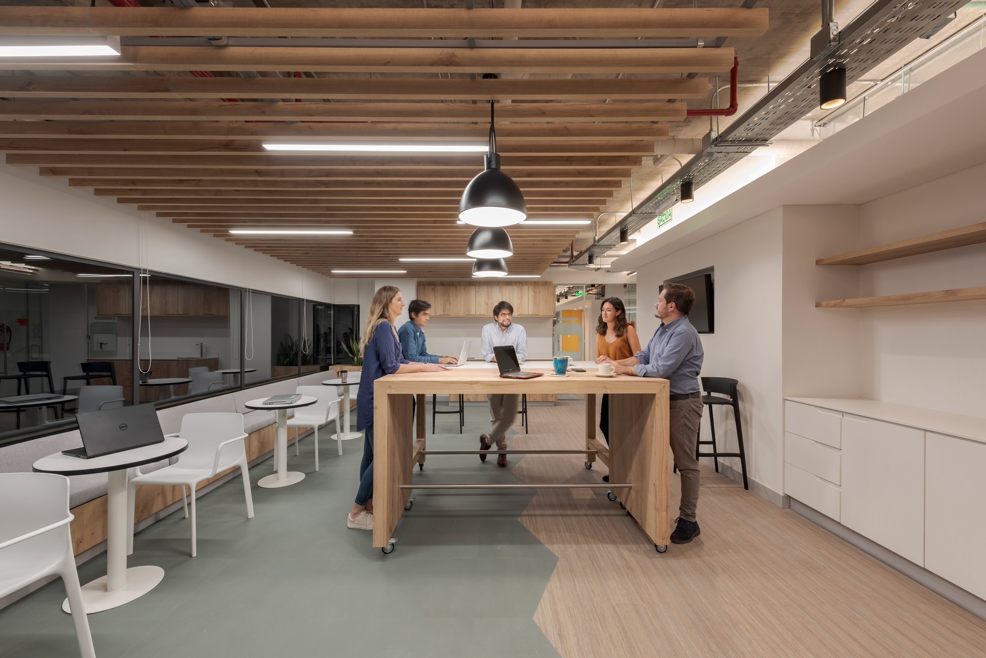
In the private area, the Coffee area offers an atmosphere with a more homely and informal style. In this space, we worked with a palette of tones complemented with various shades of wood in the furniture and ceiling, and with color accents in the graphics.
The search for the best standards in ergonomics and comfort stands out throughout the project. This is true not only in the acoustics of the meeting rooms but also in the choice of furniture, and ranges from the chairs in the operating, waiting and meeting areas, to the desks, all of which are adjustable in height to suit them to the way of working of each user.Regarding the design of the office graphics, and although it was already pre-established by GSK, the proposal to create a more local identity using names and icons from different places in Ecuador in the meeting rooms was gladly accepted.
The end result was a unique, functional and welcoming environment for users, which met the global growth standards of GSK, but with its own personality and charm.
