In recent years, the workspace has undergone major transformations and it is no coincidence that technology companies are at the forefront of new trends.
The promoted model by these companies –based on the design of agile spaces, capable of stimulating collaboration and creativity– was also replicated with very good results in companies of other sectors and today it is almost a standard.
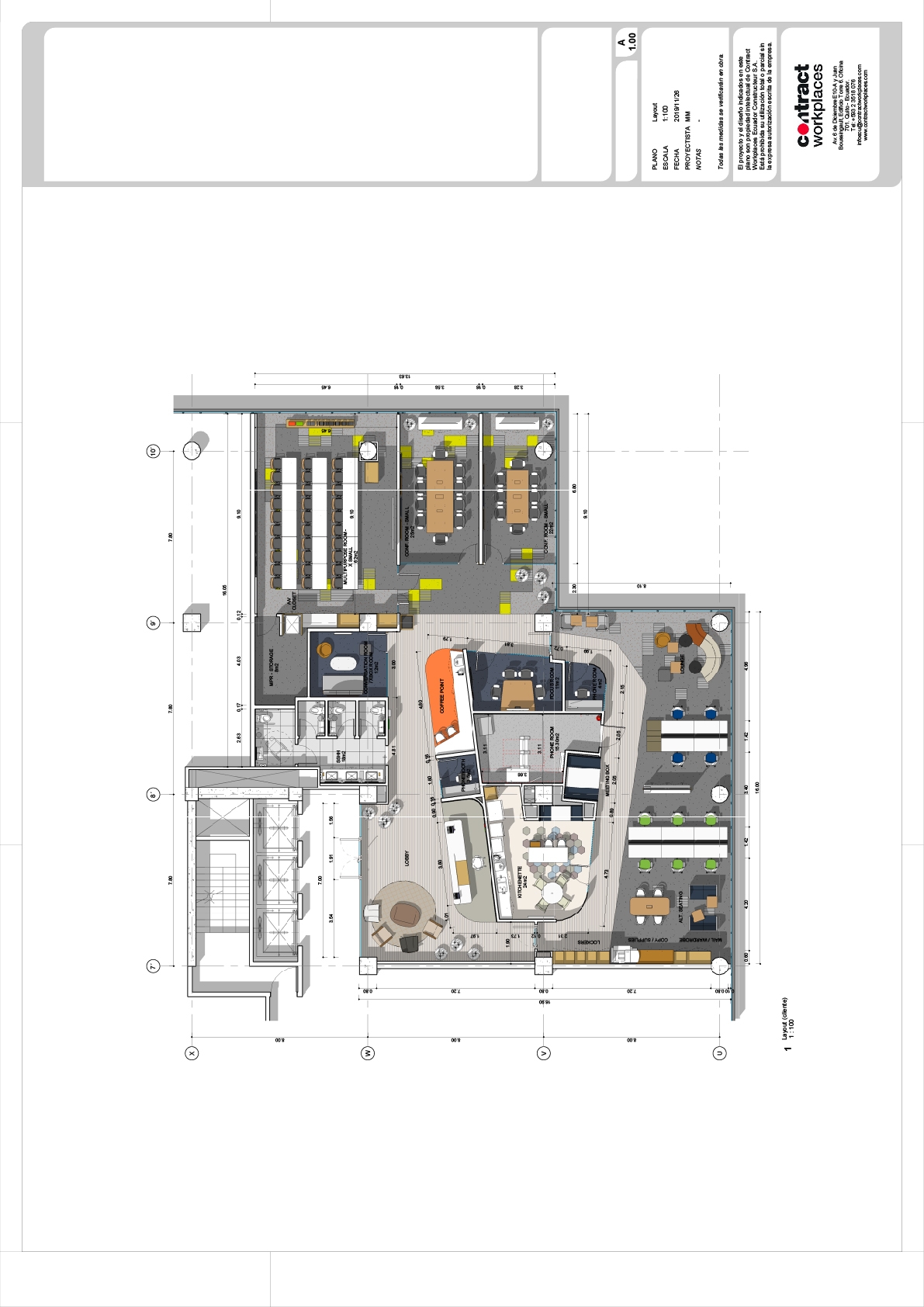
Following this same line, we approached the project of one of the most important technology firms in the world in the city of Quito. The design was developed on a 435 sqm plant located in the EkoPark complex, a well-known international corporate center in the region.
The project was conceptualized from an activity-based approach (Activity Based Working) and part of a layout that includes multiple environments and typologies in order to support the variety of tasks and work dynamics that are developed during the day. Instead of forcing people to work in a single environment, anchored to their desk, this model allows each one to choose the most suitable place to carry out their task. In this way, people can be more productive and can collaborate better both inside and outside the office.
The design was structured around a core that contains service areas and allows a better circulation, while dividing the plant into two large sectors: Client Space and Employee Space.
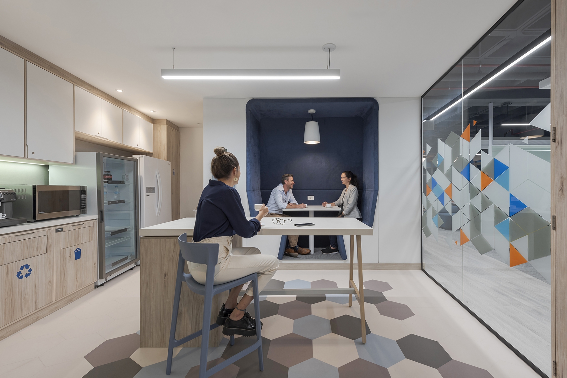
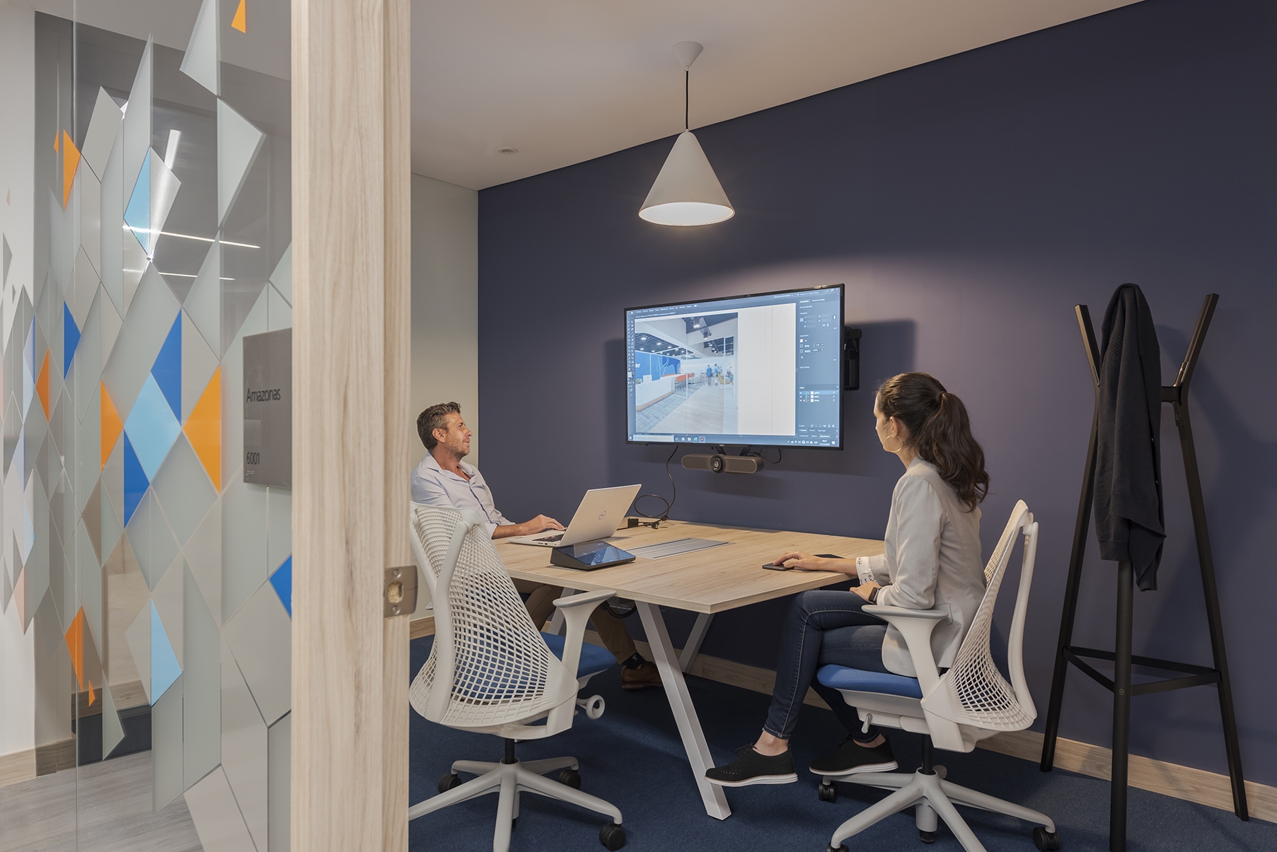
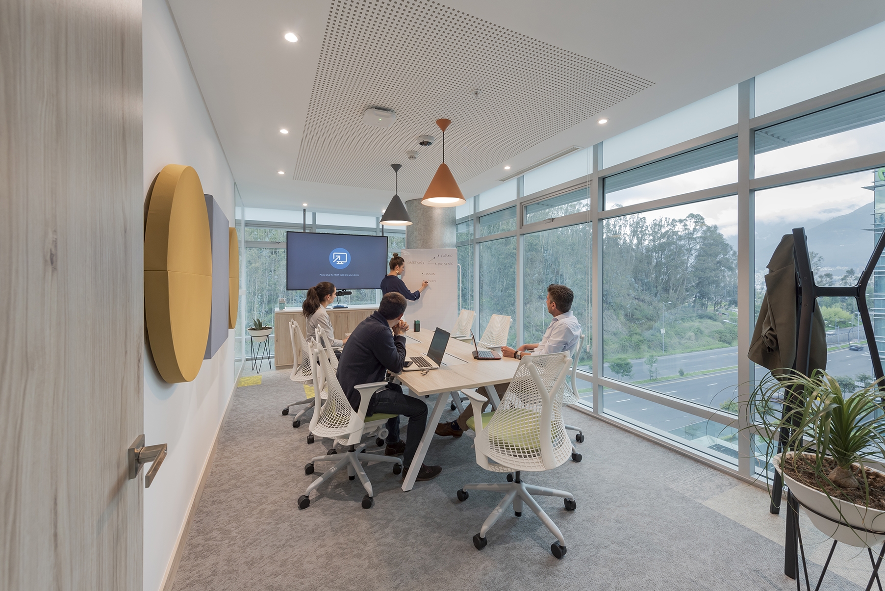
The Client Space was dedicated to customer care and training. It has its own lobby and reception, a Coffee Point, an informal meeting room, two formal meeting rooms and a multipurpose room that can also be used for trainings.
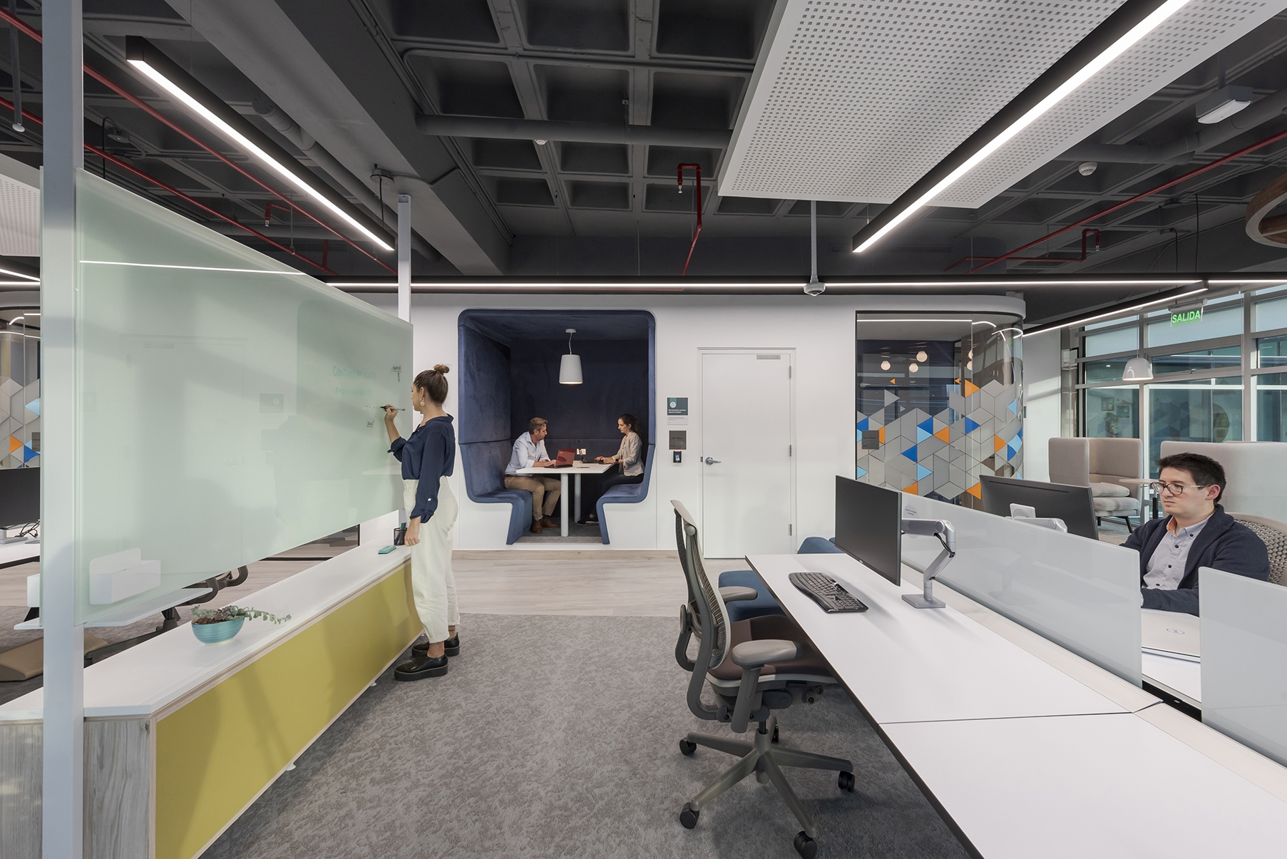
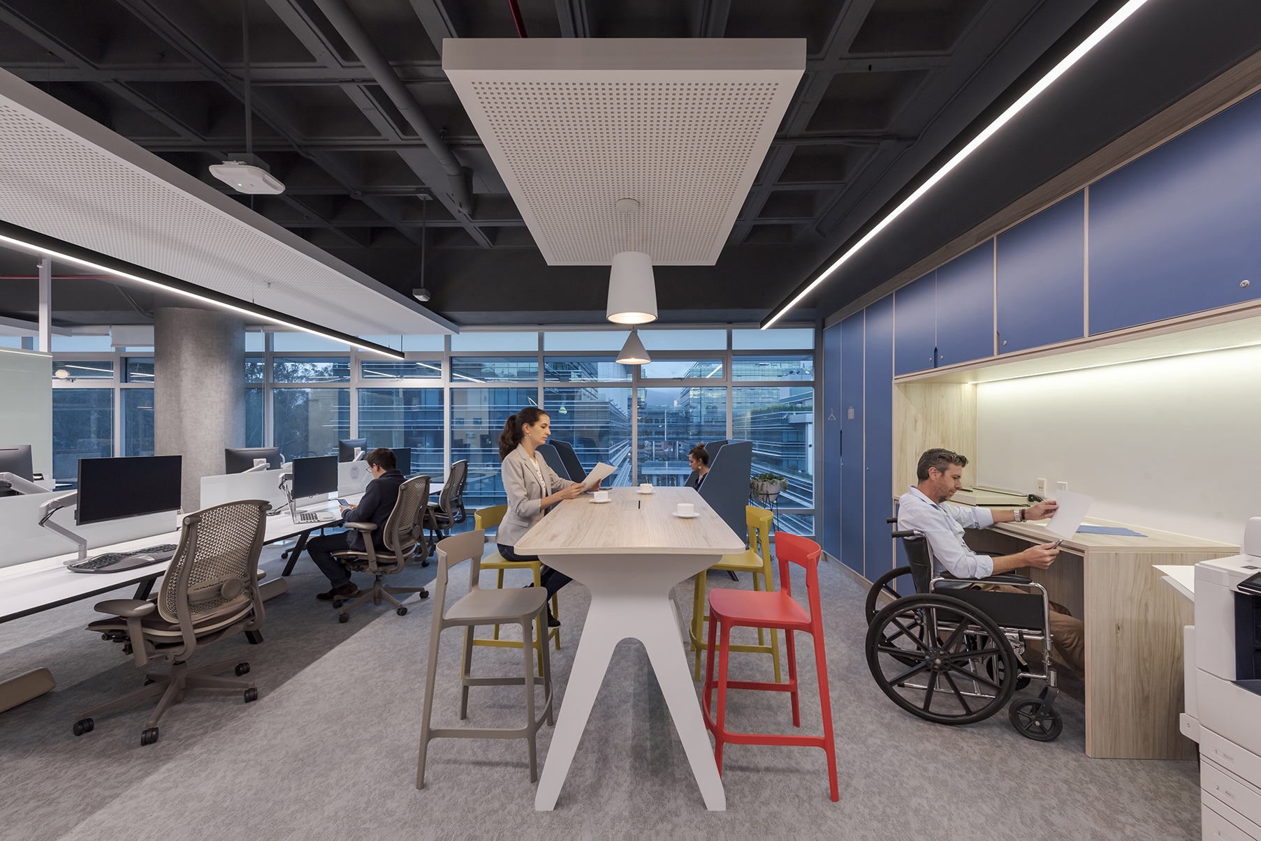
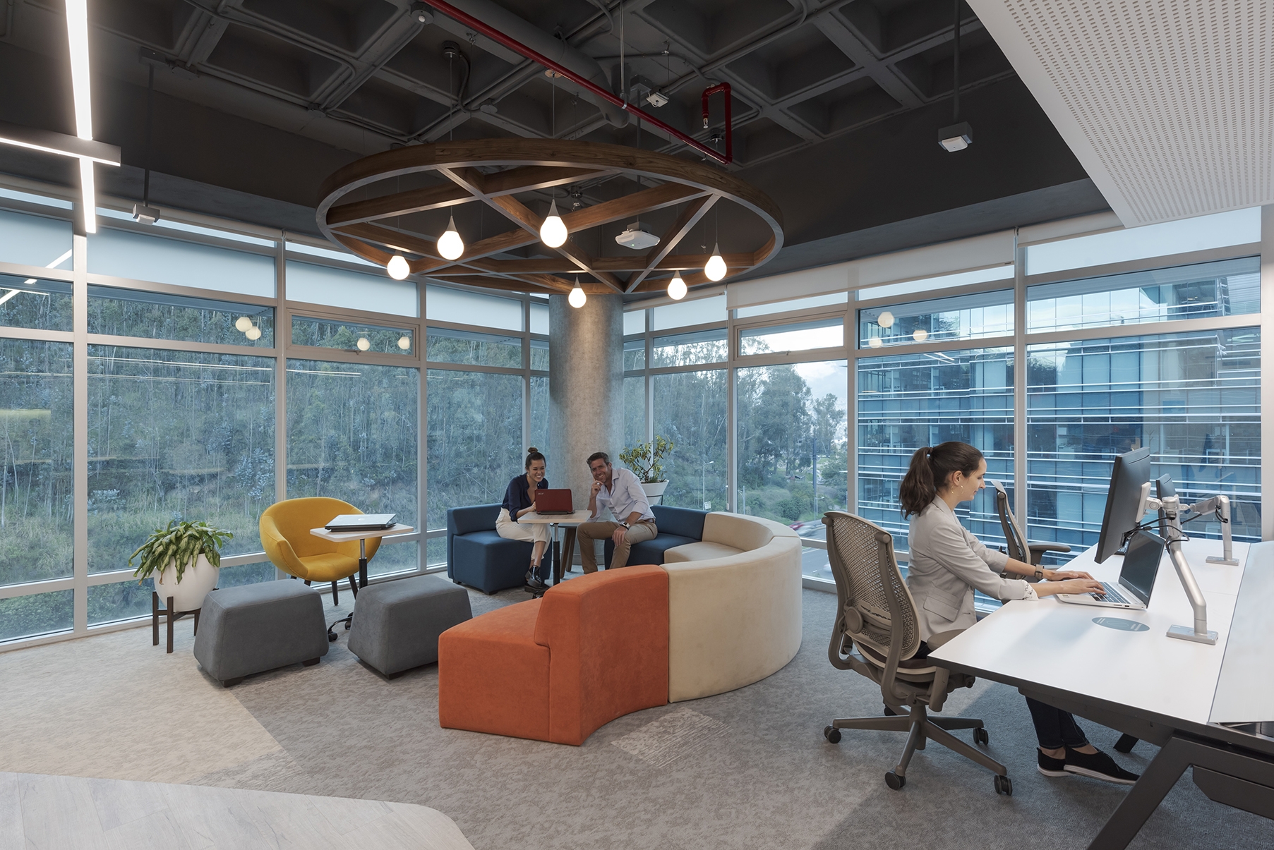
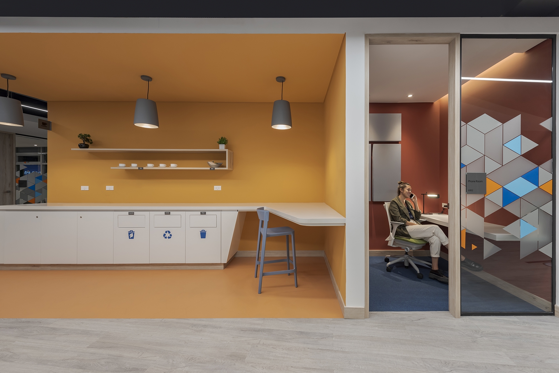
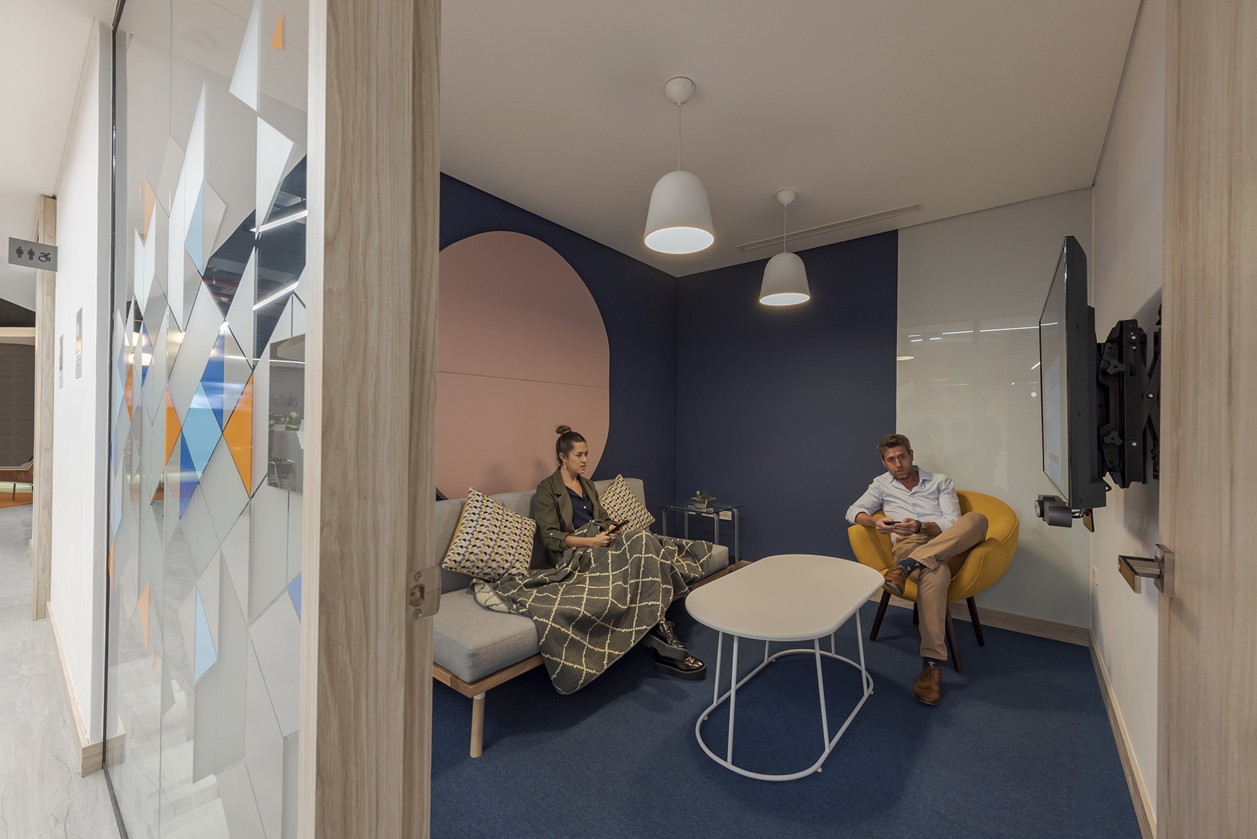
The Employee Space, for its part, was destined for the exclusive use of employees. Given that the company had a strong culture of flexible work even before the pandemic (50% of its payroll works remotely and alternately), the layout was organized in an Open Space scheme where views and natural light are privileged. There, ten unassigned workstations, a lounge for nine people and eight other alternative positions were installed. It also has a kitchenette, Phone Boots, Meeting Boxes and the Copy Point.
The acoustics of the Phone Boots and the meeting and training rooms were carefully planned with special partitions and acoustic panels which, at the same time, work as decorative elements.
All these spaces were designed to allow a suitable development of the activities carried out by people, collaborators and clients, regardless of their characteristics and personal conditions. The easy access to the office was very important for the company. Strategies with inclusive criteria were implemented, such as Braille signage, bathrooms and circulations suitable for people with reduced capacities, automatic taps, variable table heights and automated doors.
In order to create a warm, welcoming and homely image, a soft tones palette was chosen, beyond the use of corporate colors. For this, we worked with different ranges of orange and blue. Decorative elements such as textiles, plants and accessories were also incorporated. They all contributed to generate a “homely” effect capable of combining the brand’s avant-garde stamp with the close and familiar spirit that lives in its work teams.
